
Choosing the perfect paint color for your bedroom isn’t just about aesthetics—it’s about creating a sanctuary that promotes relaxation and reflects your personal style. The right shade can transform your sleep space from ordinary to extraordinary, influencing everything from your mood to your sleep quality.
We’ve researched and tested dozens of paint colors to bring you the absolute best options for bedroom walls in 2023. Whether you’re drawn to calming blues, sophisticated neutrals, or unexpected bold choices, our comprehensive guide will help you navigate the color spectrum with confidence. Our recommendations consider factors like room size, natural lighting, and the psychological effects of different hues to ensure your bedroom becomes the retreat you deserve.
10 Best Paint Colors for Bedroom Walls to Create Your Perfect Sanctuary
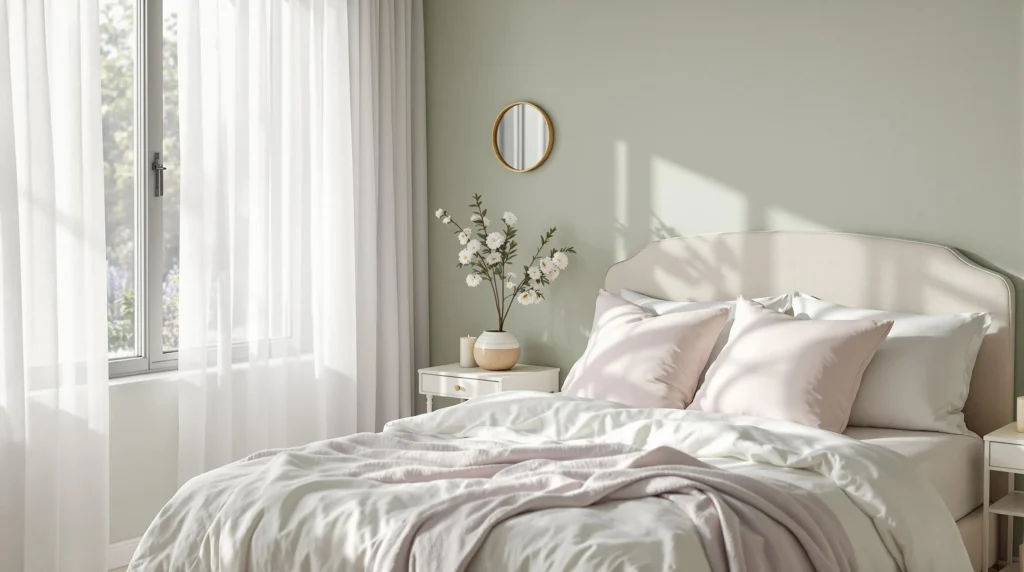
1. Soft Sage Green
Soft sage green creates a naturally calming environment that promotes rest and relaxation. This versatile hue brings the tranquility of nature indoors while maintaining a sophisticated look that works with various décor styles. We love how sage green pairs beautifully with natural wood tones, crisp whites, and gold accents to create a balanced, harmonious bedroom space. Many designers recommend this color for bedrooms facing south or west that receive abundant natural light, as it maintains its soothing quality throughout the day.
2. Tranquil Blue
Tranquil blue consistently ranks among the top bedroom colors due to its proven ability to lower blood pressure and heart rate. This gentle, barely-there blue has subtle gray undertones that prevent it from feeling childish or overly cold. We find this shade particularly effective in smaller bedrooms where it creates an illusion of expanded space while establishing a serene atmosphere conducive to sleep. Pairing tranquil blue with warm whites and natural textures like linen or jute helps balance its cool tones perfectly.
3. Muted Lavender
Muted lavender offers the perfect balance between energizing and relaxing properties, making it ideal for bedroom settings. This sophisticated purple variation has enough gray undertones to keep it from feeling too youthful or feminine. We appreciate how lavender creates a subtle color statement while promoting feelings of calm and reducing anxiety. Designers often recommend this color for north-facing bedrooms that receive less direct sunlight, as it brings warmth and dimension to these spaces.
4. Warm Taupe
Warm taupe provides the perfect neutral foundation for creating a cozy, sanctuary-like bedroom environment. This versatile color bridges the gap between gray and beige, offering more depth than plain white while remaining timeless and sophisticated. We notice that taupe works exceptionally well in both traditional and contemporary bedrooms, adapting to changing décor trends without requiring repainting. Pairing taupe with luxurious textures like velvet or cashmere enhances its inherent warmth and creates an inviting retreat.
5. Soft Charcoal
Soft charcoal delivers dramatic impact while maintaining a soothing quality essential for bedroom spaces. This deep, nuanced gray creates a cocoon-like effect that encourages rest while providing a stylish backdrop for artwork and furnishings. We recommend this bold choice for larger bedrooms with ample natural light, where it creates an intimate atmosphere without feeling oppressive. Adding metallic accents and crisp white linens prevents charcoal from feeling too heavy or dark.
6. Blush Pink
Blush pink offers a subtle yet sophisticated option that flatters all skin tones and creates a gentle glow in bedroom spaces. This muted pink has enough gray undertones to feel mature and elegant rather than juvenile or overly feminine. We appreciate how this color creates a soft, diffused light effect that’s particularly flattering during evening hours. Designers frequently pair blush with natural elements like wood and rattan to balance its inherent sweetness with organic textures.
7. Soft White
Soft white provides a timeless foundation that maximizes natural light while creating a clean, fresh bedroom environment. This versatile neutral comes in countless variations with subtle undertones that can dramatically shift the mood of your space. We recommend choosing warmer whites with yellow or cream undertones for a cozy feel, or whites with gray undertones for a more contemporary look. Adding textural elements through bedding, window treatments, and rugs prevents all-white bedrooms from feeling clinical or sterile.
8. Gentle Terra Cotta
Gentle terra cotta brings earthy warmth and subtle energy to bedroom spaces while creating a distinctive design statement. This muted orange-brown evokes natural elements like clay and sunsets, grounding the space while adding visual interest. We find this color particularly effective in bedrooms with northern exposure, where it counteracts cool light with its inherent warmth. Pairing terra cotta with crisp whites, natural woods, and touches of black creates a balanced, contemporary look.
9. Deep Navy
Deep navy creates a sophisticated, cocoon-like environment that promotes restful sleep while adding dramatic flair. This timeless blue-black shade serves as a perfect backdrop for making lighter elements pop while establishing a sense of safety and security. We recommend this bold choice for master bedrooms where its inherent formality creates a luxurious retreat feel. Adding brass or gold accents helps illuminate navy’s rich depth, while natural woods prevent the color from feeling too cold.
10. Pale Greige
Pale greige offers the perfect compromise between gray and beige, creating a flexible neutral that adapts to changing light conditions. This chameleon-like color shifts throughout the day, appearing warmer in artificial light and cooler in natural daylight. We appreciate how greige complements virtually any accent color or design style, from traditional to ultra-modern. Designers often choose this versatile neutral for master bedrooms shared by couples with different color preferences, as it satisfies both warm and cool color lovers.
Understanding Color Psychology for Bedroom Spaces

Color choices in your bedroom significantly impact your mood, sleep quality, and overall well-being. The science behind color psychology reveals why certain hues work better than others for creating a restful sanctuary.
How Colors Affect Mood and Sleep Quality
Cool-toned colors like blue, blue-green, and blue-gray promote exceptional calmness and actually lower your heart rate, making them perfect choices for improving sleep quality. Research shows that blue specifically is associated with extended, restful sleep periods and reduced blood pressure, helping you achieve deeper, more restorative rest each night.
Green shades evoke natural tranquility that reduces anxiety and encourages renewal. This color connects to feelings of refreshed moods and emotional balance, making it an excellent choice for creating a peaceful bedroom retreat.
Neutral shades including white, light gray, beige, and cream create clean, spacious aesthetics while aligning with Feng Shui principles. These colors minimize visual clutter and support mental calmness, allowing your mind to truly relax at the end of the day.
For a subtle touch of comfort, light pink adds a nurturing quality that fosters relaxation without overwhelming the space. Lighter hues generally enhance tranquility, while darker tones can add coziness when used sparingly but risk feeling oppressive if overused.
Choosing Colors Based on Room Size and Natural Light
Small bedrooms benefit from pale blues, soft whites, or light grays to amplify brightness and create the perception of more space. These colors reflect light effectively, preventing cramped quarters from feeling claustrophobic.
Rooms with limited natural light require special consideration – warm neutrals like beige or ballet pink prevent a dreary atmosphere and add a welcoming glow even without abundant sunshine. These colors compensate for lack of natural brightness without creating an artificial-looking environment.
Large bedrooms offer opportunities to experiment with deeper tones such as muted greens or dusty lavenders to add warmth without overwhelming the space. These richer hues can balance proportions in expansive rooms that might otherwise feel too open or impersonal.
Paint finish matters almost as much as color choice for bedroom spaces. Matte or eggshell finishes reduce glare and maintain a soothing ambiance, creating a more restful visual experience than higher-sheen alternatives that reflect more light.
Calming Blue Tones for Restful Sleep

Blue hues have a scientifically proven link to relaxation and improved sleep quality. While greens are also recommended for bedrooms, blues remain consistently popular for their serene qualities that create the perfect environment for rest and rejuvenation.
Soft Sky Blues for a Tranquil Atmosphere
Soft sky blues evoke a sense of openness and calmness, making them ideal choices for smaller bedroom spaces. These gentle tones create an airy feeling that visually expands your room while promoting a peaceful atmosphere conducive to quality rest. Pairing these light blue shades with white trim and natural wood accents further enhances the sense of spaciousness and brings a balanced warmth to the space. Design experts suggest complementing neutral-leaning blues with warm pastels to create harmonious sleep environments that feel both cohesive and relaxing.
Deep Navy Blues for Sophisticated Bedrooms
Navy blues add remarkable depth and elegance to bedrooms, creating a sophisticated sanctuary that feels both luxurious and comforting. These darker blue tones work best when balanced with warm neutrals such as Benjamin Moore’s White Dove, which prevents the space from feeling too heavy or oppressive. Consider using navy as an accent wall to create a focal point without overwhelming the space. Rooms with ample natural lighting particularly benefit from deeper blues, as the light balances the richness of the color while maintaining a cozy atmosphere. The contrast between dark walls and lighter furnishings creates a dramatic yet soothing backdrop that promotes restful sleep while adding visual interest to your bedroom retreat.
Soothing Green Shades to Connect with Nature

Green paint colors create a powerful connection to the natural industry while promoting tranquility in your bedroom. Research has shown that green shades are particularly effective at creating stress-reducing environments perfect for rest and relaxation.
Sage Green for a Subtle Earthy Vibe
Sage green stands out as one of the most effective bedroom colors for reducing stress thanks to its muted natural tones. This versatile shade brings the calming essence of nature indoors without overwhelming your senses. Many interior designers recommend sage for its ability to create a grounding effect that transitions beautifully from day to night. The earthy undertones work wonderfully with natural materials like wood furniture, woven textiles, and ceramic accessories. You’ll find that sage green walls provide an excellent backdrop for both minimalist and more layered design approaches, allowing your personal style to shine through while maintaining a serene atmosphere.
Mint Green for a Fresh, Rejuvenating Feel
Mint green delivers a fresh yet soothing atmosphere with its soft cool undertones that can transform your bedroom into a rejuvenating retreat. This lighter shade reflects more light than deeper greens, making it particularly suitable for smaller spaces that need brightening. Design experts often pair mint green with crisp whites for a clean look or with natural wood elements to balance the coolness with warmth. Mint creates a subtle energy in your space without being stimulating enough to interfere with sleep quality. The refreshing quality of this color makes it especially appealing in warmer climates or for south-facing bedrooms that receive abundant sunlight throughout the day.
Neutral Paint Colors for Timeless Bedroom Design

Neutral paint colors create an enduring backdrop for bedroom design that transcends passing trends. These versatile shades provide the perfect foundation for a restful sanctuary that can evolve with your style preferences over time.
Snowbound and Alabaster by Sherwin-Williams
Snowbound (Sherwin-Williams) offers a soft, clean neutral that instantly brightens any bedroom space while maintaining a timeless appeal. This versatile shade works beautifully with virtually any design aesthetic, from modern to traditional. Alabaster (Sherwin-Williams) presents a similar approach with its slightly warmer undertone, making it ideal for bedrooms that need a touch of warmth without sacrificing neutrality. These whites create a clean canvas that allows furniture and textiles to take center stage.
Stucco and Cinnamon Slate for Sophisticated Neutrality
Stucco (Sherwin-Williams) provides a warm, muted tone that adapts effortlessly to various bedroom styles while maintaining a sense of subtle sophistication. This neutral shade creates a cozy atmosphere without overwhelming the space. Cinnamon Slate (Benjamin Moore), the 2025 Color of the Year, delivers a unique blend of plum and brown undertones for an elevated neutral that balances depth with warmth. This sophisticated color works particularly well in bedrooms seeking a touch of unexpected richness while remaining firmly in the neutral category.
Warm Beiges and Taupes for Cozy Comfort
Nomadic Desert (Sherwin-Williams) delivers earthy warmth ideal for creating organic, tranquil bedroom spaces that feel naturally inviting. This versatile beige creates a foundation of comfort while complementing a wide range of accent colors and natural materials. Gloucester Sage (Benjamin Moore) adds subtle green-gray undertones for depth without sacrificing the cozy comfort essential in bedroom design. Barnwood (Portola Paints) mimics the inviting tones of natural wood, improving warmth in both minimalist and rustic bedroom designs while providing a grounding presence that encourages rest.
Cool Grays for Modern Minimalist Bedrooms
Rocky River (Sherwin-Williams) balances cool gray with slight blue undertones, creating a serene effect perfect for contemporary bedroom designs. This sophisticated shade provides depth without heaviness, making it ideal for sleep spaces. Sea Salt (Benjamin Moore) offers a soft, gray-green hybrid that brings airy minimalism to bedrooms while maintaining visual interest through its subtle complexity. Rain Cloud (Sherwin-Williams) leans into moody, gray-blue tones that add dramatic depth to contemporary spaces without sacrificing the calming qualities essential for restful sleep environments.
Luxurious Purple Hues for a Romantic Bedroom

Purple tones strike the perfect balance between tranquility and sophistication, making them ideal choices for creating a romantic bedroom atmosphere. These rich hues can transform your sleeping space into a luxurious retreat while maintaining the calming environment essential for quality rest.
Lavender for Subtle Elegance
Lavender paint offers a muted, soft purple with gray undertones that provides subtle elegance without overwhelming your senses. This delicate shade creates a soothing and romantic ambiance that’s perfect for promoting relaxation at bedtime. Many interior designers recommend lavender for its versatility, as it pairs beautifully with both warm and cool accent colors. The gentle purple tone works wonderfully in spaces with ample natural light, where it reflects a soft glow throughout the day. For best results, pair lavender walls with crisp white trim and natural wood elements to enhance its sophisticated yet calming presence in your bedroom sanctuary.
Deep Plum for Dramatic Impact
Deep plum paint adds rich, jewel-toned warmth that instantly elevates your bedroom’s luxury factor. This bold purple shade creates dramatic depth without sacrificing the cozy atmosphere needed for restful sleep. Perfect for accent walls or creating moodier spaces, plum provides a sensual backdrop that feels both indulgent and comforting. The Sleep Foundation notes that darker tones like plum can help signal your brain that it’s time to wind down, potentially improving sleep quality. To balance plum’s intensity, incorporate lighter neutral furnishings and metallic accents that reflect light throughout the space. Deep plum particularly shines in bedrooms with substantial natural light or thoughtfully designed artificial lighting that highlights its complex undertones.
Soft Pink and Blush Tones for Gentle Warmth

Soft pinks and blush tones provide a perfect balance of warmth and subtlety for bedroom spaces, creating an atmosphere that’s both comforting and sophisticated. These quietly colorful hues align with contemporary design trends while offering timeless appeal.
Blush Pink for a Contemporary Touch
Blush pink delivers a modern aesthetic that works beautifully in contemporary bedroom designs. Designer-recommended options like Dulux’s “True Joy” from their 2025 palette offer the perfect amount of warmth without overwhelming the space. Sherwin-Williams’ “Spiced Cider” presents another excellent choice, bringing subtle warmth with sophisticated undertones. For those seeking a softer approach, “Alabaster” (recommended by designer Leah Bailey) provides elegant versatility that complements various decorative styles. These nuanced tones create visual interest while maintaining a serene atmosphere needed for restful sleep. Pair these blush tones with earthy neutrals to enhance their contemporary appeal and ground the overall design.
Dusty Rose for Vintage-Inspired Bedrooms
Dusty rose creates the perfect backdrop for vintage-inspired bedroom aesthetics with its timeless charm and subtle depth. Benjamin Moore’s “Vintage Vogue” perfectly captures this aesthetic with its understated richness that enhances antique furniture and traditional textiles. Portola Paints’ “Wellfleet” offers another excellent option, noted specifically for its dimensional quality that adds character to vintage spaces. These sophisticated shades complement vintage accessories while providing a fresh interpretation of classic design elements. For a complementary approach, consider pairing dusty rose with deep blues like Benjamin Moore’s “Hale Navy” or Sherwin-Williams’ “Rain Cloud” to create a balanced palette that enhances the vintage atmosphere. Testing colors before committing remains essential, with Benjamin Moore’s “Color Portfolio” app providing a helpful visualization tool for seeing how these vintage-inspired hues will appear in your exact space.
Serene White and Off-White Options for Clean Aesthetics

White and off-white paint colors create the perfect foundation for a relaxing bedroom sanctuary. These versatile hues not only make spaces feel larger and more open but also provide a clean canvas that promotes mental clarity and peaceful sleep.
Crisp Whites for Bright, Airy Spaces
Crisp whites excel at maximizing natural light in bedrooms, instantly creating a bright and expansive atmosphere. Benjamin Moore’s White Dove OC-17 stands out as a premium choice with its subtle warm gray undertones that prevent the space from feeling sterile. This sophisticated shade works exceptionally well in smaller bedrooms where it creates an illusion of additional square footage while maintaining a cozy environment. Rooms with abundant natural light benefit most from pure whites, as the sunlight interacts beautifully with these tones to create a fresh and invigorating feel throughout the day. Pairing crisp whites with minimal décor and natural textures results in a timeless bedroom design that supports restful sleep through its clean aesthetic.
Creamy Off-Whites for a Soft, Welcoming Feel
Creamy off-whites infuse bedrooms with gentle warmth that pure whites sometimes lack, creating inviting spaces perfect for relaxation. These sophisticated shades featuring light pink or terracotta undertones add subtle dimension to walls without overwhelming the senses. Many designers recommend creamy off-whites for north-facing bedrooms or spaces with cooler light, as they counterbalance bluish natural light with their inherent warmth. Textural elements like linen bedding and wooden furniture particularly complement these hues, improving their natural, organic quality. The versatility of creamy off-whites allows them to pair beautifully with virtually any accent color, making them an excellent foundation for seasonal décor changes or evolving design preferences over time.
Rich Earth Tones for Grounding Energy

Earth tones bring a sense of stability and connection to nature that few other color families can match. These grounding hues create the perfect backdrop for restful sleep while adding depth and character to your bedroom sanctuary.
Terracotta and Clay for Warmth
Terracotta and clay paint colors add immediate warmth and grounding energy to any bedroom space. These earthy shades foster a natural connection to elemental qualities that promote relaxation and security. Benjamin Moore’s clay-inspired tones create a balanced atmosphere that feels both protective and comforting during nighttime hours. Many sleep experts recommend these natural earth pigments for their ability to transition beautifully from day to night, maintaining their welcoming quality regardless of lighting conditions. Terracotta walls pair exceptionally well with natural materials like wood, rattan, and linen, completing the organic aesthetic that supports restful sleep patterns.
Caramel and Amber for Cozy Retreats
Caramel and amber paint colors transform bedrooms into cozy retreats with their rich golden undertones. These warm hues enhance comfort levels and create an embracing environment that signals the brain it’s time to unwind. Sleep specialists note that these golden-brown shades provide the perfect backdrop for warm, ambient lighting that supports your body’s natural melatonin production. Amber walls reflect a subtle glow that feels particularly inviting during evening hours when you’re preparing for rest. Decorators often recommend these rich tones for north-facing bedrooms that need additional warmth or for creating intentional cocoon-like spaces dedicated to quality sleep. Caramel-toned walls complement both modern and traditional furnishings, making them versatile choices for various bedroom styles.
Unexpected Accent Colors to Express Personality

While neutrals and soft tones dominate bedroom color schemes, adding unexpected accent colors can transform your space into a unique reflection of your personality.
Teal and Turquoise for Vibrant Energy
Teal and turquoise paint colors inject vibrant energy into bedroom spaces while maintaining a sophisticated atmosphere. These jewel-toned shades create focal points that immediately draw the eye and establish a lively mood without overwhelming the senses. Incorporating teal as an accent wall behind your bed provides a stunning backdrop that energizes the room while still allowing for restful sleep. Turquoise accents work beautifully against neutral backgrounds, adding dimension and character to otherwise subdued color schemes. Many designers recommend these blue-green hues for their versatility in complementing both warm and cool color palettes throughout the bedroom. These colors pair exceptionally well with natural wood tones, crisp whites, and metallic accents for a balanced yet expressive aesthetic.
Muted Yellows for Subtle Cheerfulness
Muted yellow paint brings subtle cheerfulness to bedroom environments without creating overstimulation. These softer yellow tones offer warmth that can transform the ambiance of a space, creating a gentle glow that feels both uplifting and comforting. Butter cream yellows and pale ochre shades provide a sophisticated alternative to brighter variations, making them perfect for adult bedrooms seeking a touch of optimism. Using these colors on a single wall creates a focal point that brightens the room without dominating the design scheme. Pairing muted yellows with soft whites and natural textures produces a harmonious balance that feels intentional yet relaxed. These subtle yellow tones can effectively counteract rooms with limited natural light, creating the illusion of sunshine even on dreary days.
How to Test and Select the Perfect Bedroom Paint Color
The perfect bedroom color transforms your space into a personal sanctuary that promotes rest and reflects your unique style. Whether you’re drawn to soothing greens that connect with nature cool blues that enhance sleep quality or luxurious purples that add romance we’ve covered options for every preference.
Remember to consider your room’s size lighting and your desired mood when making your selection. Test your top choices with sample swatches on different walls to see how they look throughout the day. The right finish matters too with matte and eggshell options providing the most relaxing ambiance.
Your bedroom should be your ultimate retreat. Choose a color that speaks to you personally while creating the peaceful atmosphere you deserve for quality rest and rejuvenation.
Frequently Asked Questions
What are the best bedroom paint colors for 2023?
The top bedroom paint colors for 2023 include Soft Sage Green, Tranquil Blue, Muted Lavender, Warm Taupe, Soft Charcoal, Blush Pink, Soft White, Gentle Terra Cotta, Deep Navy, and Pale Greige. Each color is selected for its ability to create a relaxing sanctuary while reflecting personal style and enhancing sleep quality.
How do colors affect sleep quality?
Colors significantly impact sleep quality through psychological effects. Cool-toned colors like blue promote calmness and better sleep, while green shades evoke tranquility and emotional balance. Neutral colors support mental calmness with their clean aesthetics. The right bedroom color creates a restful environment that can improve sleep duration and quality.
What paint colors work best for small bedrooms?
For small bedrooms, opt for pale hues, soft whites, or light colors like Mint Green that reflect light and create an illusion of space. Soft White maximizes natural light, while cool-toned pastels like Pale Greige or light blues can make walls recede visually. Avoid dark colors that can make the space feel confined.
Which paint finish is best for bedroom walls?
Matte or eggshell finishes are ideal for bedroom walls. These low-sheen options create a soothing ambiance by minimizing light reflection and hiding minor imperfections. Matte finishes provide a sophisticated, velvety appearance, while eggshell offers slightly more durability and is easier to clean, making it perfect for creating a peaceful bedroom environment.
How do I choose paint colors based on natural lighting?
Assess your bedroom’s natural light before selecting paint. For north-facing rooms with limited light, choose warm neutrals like Warm Taupe or Gentle Terra Cotta to counteract coolness. South-facing rooms can handle cooler tones like blues and greens. East/west-facing rooms change throughout the day, so test paint samples at different times before deciding.
Are green paint colors good for bedrooms?
Yes, green paint colors are excellent for bedrooms as they create stress-reducing environments and connect to nature. Sage Green offers versatility for both minimalist and layered designs, while Mint Green provides a fresh, rejuvenating feel. Green tones promote tranquility, emotional balance, and restful sleep, making them ideal bedroom choices.
What neutral colors work best in a bedroom?
Versatile neutral colors like Snowbound and Alabaster (bright, clean), Stucco (warm, muted), and Cinnamon Slate (unique depth) work wonderfully in bedrooms. Warm beiges such as Nomadic Desert create inviting atmospheres, while cool grays like Rocky River and Sea Salt provide serene backdrops for minimalist designs while remaining adaptable to various styles.
How can I use purple tones in my bedroom?
Purple tones create romantic bedroom atmospheres by balancing tranquility with sophistication. For subtle elegance, choose Lavender, which pairs beautifully with various décor styles. For dramatic impact, Deep Plum adds warmth and coziness while maintaining an indulgent environment. Purple shades work well as accent walls or as all-over color for luxurious appeal.
What are good white paint options for bedrooms?
Excellent white paint options include Benjamin Moore’s White Dove, which maximizes natural light and creates an airy atmosphere. Creamy off-whites add warmth and dimension without the starkness of pure white. These serene options promote mental clarity and peaceful sleep while providing a versatile backdrop that works with any design style.
How do earth tones impact bedroom ambiance?
Earth tones like terracotta, clay, caramel, and amber create warmth and grounding energy in bedrooms. These rich hues foster a natural connection that promotes relaxation and provides a nurturing environment for unwinding. They’re particularly effective in north-facing bedrooms, adding coziness while supporting restful sleep through their comforting qualities.


