
Choosing the perfect paint color for your bathroom can transform this essential space from purely functional to absolutely stunning. We’ve all experienced bathrooms that feel cramped, cold, or unwelcoming – and often, it’s simply the wrong paint choice that’s to blame. The right color can make a small bathroom feel spacious, create a spa-like retreat, or add personality that reflects your unique style.
Bathrooms present unique challenges when selecting paint colors. High humidity, limited natural light, and varying artificial lighting all impact how colors appear and perform in this space. We understand these complexities and know which colors work best under these conditions.
Whether you’re planning a complete renovation or just want to refresh your bathroom’s look, we’ve researched and tested the most effective paint colors that’ll enhance your space. From timeless neutrals to bold statement hues, we’ll guide you toward colors that not only look beautiful but also create the atmosphere you want every time you step into your bathroom.
Classic White Paint Colors That Never Go Out of Style
White paint colors remain the most popular choice for bathrooms because they create a clean, fresh foundation that works with any design style. These versatile shades reflect light beautifully and make even the smallest bathrooms feel more spacious.
Pure White for Timeless Elegance
Pure white delivers the crispest, most pristine look you can achieve in a bathroom. We recommend Benjamin Moore’s “Chantilly Lace” (OC-65) for its brilliant white finish that maintains its clarity even in humid conditions. This shade works exceptionally well with chrome fixtures, marble countertops, and glass shower doors.
Sherwin Williams “High Reflective White” (SW 7757) offers another excellent pure white option that maximizes light reflection. We’ve seen this color transform windowless bathrooms by bouncing light from artificial sources throughout the space. The paint’s high reflectance value of 91% makes it ideal for bathrooms with limited natural light.
Pure white creates a spa-like atmosphere when paired with natural textures like bamboo, teak, or stone. We suggest using this approach in master bathrooms where you want to achieve a luxury hotel aesthetic. The stark contrast between pure white walls and dark wood vanities creates visual drama without overwhelming the space.
Off-White Shades for Warmth and Sophistication
Off-white colors provide the cleanliness of white while adding subtle warmth that prevents bathrooms from feeling sterile. We favor Benjamin Moore’s “Cloud White” (OC-130) for its soft, creamy undertones that complement both warm and cool lighting. This versatile shade works beautifully in bathrooms with brass fixtures or warm wood elements.
Farrow & Ball’s “Pointing” (No. 2003) brings sophisticated warmth through its subtle gray undertones. We’ve found this shade particularly effective in powder rooms where you want to create an intimate, welcoming atmosphere. The color’s depth prevents the harsh brightness that can occur with pure whites under artificial lighting.
Sherwin Williams “Creamy” (SW 7012) offers a budget-friendly option that delivers warmth without appearing yellow or beige. We recommend this shade for bathrooms with oak or honey-colored wood trim where pure white might create too much contrast. The paint’s slight cream undertones bridge the gap between modern and traditional design styles.
| Paint Color | Brand | Code | Best For |
|---|---|---|---|
| Chantilly Lace | Benjamin Moore | OC-65 | Modern bathrooms |
| High Reflective White | Sherwin Williams | SW 7757 | Low light spaces |
| Cloud White | Benjamin Moore | OC-130 | Traditional bathrooms |
| Pointing | Farrow & Ball | No. 2003 | Powder rooms |
| Creamy | Sherwin Williams | SW 7012 | Warm wood trim |
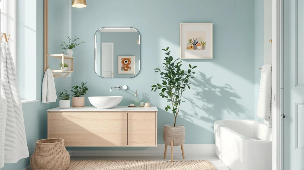
Soothing Blue Tones That Create a Spa-Like Atmosphere

Blue paint colors transform bathrooms into tranquil retreats that evoke the calming essence of water and sky. These versatile hues work exceptionally well in bathroom spaces because they naturally promote relaxation and create that coveted spa-like atmosphere we all crave.
Light Blue for Serenity and Calm
Light blue shades deliver unmatched serenity that makes your bathroom feel like a peaceful sanctuary. This gentle hue promotes a sense of calm that’s perfect for starting your morning routine or unwinding after a long day. We recommend pairing light blue walls with white trim and chrome fixtures to enhance the clean, refreshing quality of the space.
Choosing light blue creates an immediate sense of openness that makes even smaller bathrooms feel more spacious. The soft tone reflects natural light beautifully while maintaining that soothing atmosphere throughout different times of day. Light blue works particularly well with crisp white accents that amplify the spa-inspired aesthetic.
Navy Blue for Bold Sophistication
Navy blue brings dramatic depth and elegant sophistication to bathroom spaces that can handle bolder color choices. This rich, deep shade works exceptionally well in larger bathrooms where the intense color won’t overwhelm the space. We’ve found that navy blue creates a luxurious contemporary appeal that elevates the entire room.
Pairing navy blue with brass or gold fixtures creates a stunning contrast that enhances the sophisticated atmosphere. White accents help balance the boldness while maintaining that clean bathroom aesthetic. Navy blue walls provide the perfect backdrop for statement mirrors and elegant lighting fixtures that complete the upscale look.
Seafoam Green-Blue for Coastal Vibes
Seafoam green-blue introduces nature-inspired elements that bring the tranquil colors of ocean and sky indoors. This coastal shade combines the calming properties of blue with subtle green undertones that create a connection to the natural industry. We love how this color establishes an open, airy feeling that reinforces the bathroom’s role as a relaxation space.
Choosing seafoam green-blue helps establish that coveted coastal living atmosphere right in your own home. The ocean-inspired tone works beautifully with natural materials like bamboo accessories and sea glass accents. This versatile shade complements both modern and traditional bathroom designs while maintaining that essential soothing quality.
Neutral Gray Shades That Add Modern Appeal

Gray tones offer the perfect balance between the crispness of white and the warmth of beige, making them ideal for contemporary bathroom designs. We’ve selected three versatile gray options that’ll transform your bathroom into a sophisticated modern retreat.
Light Gray for Contemporary Clean Lines
Light gray creates the foundation for a contemporary bathroom that feels both spacious and serene. This subtle shade brightens your space while maintaining the sophisticated edge that modern design demands. We recommend pairing light gray walls with white fixtures and chrome accents to enhance that minimalist vibe without overwhelming your senses.
The beauty of light gray lies in its ability to promote a spa-like tranquility that makes your bathroom feel refreshing and inviting. This color choice works particularly well in smaller bathrooms where you need to maximize the sense of openness. Light gray reflects natural light beautifully, creating crisp clean lines that define contemporary aesthetics.
Charcoal Gray for Dramatic Impact
Charcoal gray transforms your bathroom into a bold statement space that commands attention. This darker shade introduces depth and drama to your walls, especially effective in larger bathrooms where you can fully appreciate its sophisticated contrast. We love how charcoal gray creates a cozy yet upscale atmosphere that feels both intimate and luxurious.
Pairing charcoal gray with bright white trim or metallic fixtures like brushed nickel or brass creates striking visual interest. This combination delivers a design-forward statement that elevates your bathroom beyond basic functionality. The dramatic impact of charcoal gray works beautifully when you want to make your bathroom feel like a high-end retreat.
Greige Combinations for Versatile Style
Greige blends the coolness of gray with warm beige undertones, offering the most adaptable option for various decor styles. This versatile color bridges the gap between modern and transitional design, making it perfect when you’re unsure about committing to purely cool or warm tones. We appreciate how greige complements natural materials such as wood and stone while maintaining sleek modern appeal.
The balanced nature of greige provides warmth without sacrificing the sophistication that gray brings to your space. This color performs well under different lighting conditions, ensuring your bathroom feels welcoming throughout the day. Greige creates a timeless look that won’t feel dated as design trends evolve, making it a smart long-term choice for your bathroom renovation.
Warm Earth Tones That Bring Comfort and Coziness

Moving beyond cool grays and blues, warm earth tones create an inviting sanctuary that feels naturally connected to the outdoors. These trending colors for 2025 transform bathrooms into cozy retreats that embrace comfort over stark minimalism.
Soft Beige for Traditional Warmth
Soft beige delivers traditional warmth that works beautifully across various interior styles. This versatile neutral creates a calming atmosphere that makes your bathroom feel instantly more welcoming. Beige tones pair effortlessly with white fixtures and natural wood accents, establishing a foundation that grows more appealing over time. We recommend using soft beige on all four walls for maximum coziness, or try it as an accent wall behind your vanity for subtle warmth.
Taupe Shades for Sophisticated Neutrality
Taupe shades bring sophisticated neutrality that elevates your bathroom’s overall design aesthetic. This earthy tone blends seamlessly with existing bathroom elements like ceramic tiles, brushed nickel fixtures, and natural stone countertops. Sophisticated homeowners choose taupe because it creates a balanced look that feels both current and timeless. We suggest pairing taupe walls with crisp white trim to define architectural details while maintaining that refined, spa-like ambiance.
Warm Brown Accents for Rich Depth
Warm brown accents add rich depth that enhances your bathroom with an unmistakable sense of luxury. These earth tones draw inspiration from natural elements like raw clay and sun-baked terracotta, bringing organic beauty indoors. Brown creates dramatic contrast when paired with lighter neutrals, making your space feel more ever-changing and visually interesting. We love using warm brown on a single feature wall or in built-in storage areas to create focal points that ground the entire room’s color palette.
Bold Color Choices That Make a Statement

We’re ready to explore dramatic paint colors that transform bathrooms into stunning focal points. These daring choices create instant impact and showcase your personal style.
Emerald Green for Luxurious Drama
Emerald green brings vibrant energy and sophisticated glamour to bathroom spaces. This rich jewel tone creates an immediately striking atmosphere that feels both luxurious and refreshing. We recommend using emerald green as an accent wall behind the vanity or bathtub to create maximum visual impact without overwhelming the space.
Professional designers often pair emerald green with brass fixtures and marble countertops for elevated elegance. The combination creates a high-end spa aesthetic that rivals luxury hotels. We’ve seen this color work exceptionally well in powder rooms where guests experience an instant wow factor upon entering.
Natural light enhances emerald green’s depth and richness throughout the day. Morning sunlight brings out the color’s golden undertones while evening lighting emphasizes its deeper forest qualities. We suggest adding white or cream accents to balance the intensity and prevent the space from feeling too enclosed.
Deep Burgundy for Elegant Richness
Deep burgundy offers sophisticated warmth that creates an intimate and cozy bathroom retreat. This wine-inspired hue works particularly well in larger bathrooms where the rich color can breathe and develop its full character. We find burgundy especially effective in master bathrooms where relaxation and luxury are top priorities.
Metallic accents in gold or copper complement burgundy’s inherent richness beautifully. These warm metals enhance the color’s sophisticated appeal while adding luminous touches that prevent the space from feeling heavy. We recommend incorporating these metallics through faucets, light fixtures, and decorative hardware.
Burgundy pairs exceptionally well with cream trim and white fixtures for balanced contrast. This classic combination prevents the bold color from overwhelming while maintaining its dramatic presence. We’ve observed that burgundy creates particularly stunning results when used with vintage-style clawfoot tubs and traditional design elements.
Black Paint for Ultra-Modern Contrast
Black paint delivers bold sophistication that transforms bathrooms into contemporary masterpieces. This dramatic choice works best when balanced with lighter fixtures and strategic white accents to prevent the space from feeling cave-like. We recommend black for homeowners who want to make a fearless design statement.
White vanities and bright chrome fixtures create striking visual contrast against black walls. This high-contrast approach emphasizes clean lines and modern geometry while maintaining functionality. We’ve seen black bathrooms become conversation pieces that guests remember long after their visit.
Proper lighting becomes crucial when using black paint to ensure the space remains functional. Multiple light sources including vanity lighting, overhead fixtures, and accent lighting work together to create depth and prevent shadows. We suggest incorporating mirrors with built-in LED lighting to maximize brightness and create the illusion of expanded space.
Special Considerations for Small Bathroom Spaces

Small bathroom spaces require strategic color planning due to limited square footage. Light colors are universally recognized as the best choice for making compact rooms feel larger and more open.
Light Colors to Maximize Visual Space
Soft whites create an immediate sense of openness in cramped bathroom quarters. These timeless shades reflect both natural and artificial light effectively, preventing the cave-like feeling that darker colors can produce in tight spaces.
Pale grays offer modern sophistication while maintaining the space-expanding benefits of light tones. We recommend these neutral shades for homeowners seeking contemporary style without sacrificing the visual breathing room that small bathrooms desperately need.
Pastel hues deliver subtle personality without overwhelming compact dimensions. Mint green, sky blue, and blush pink are particularly effective options that add gentle color while preserving the bright, airy atmosphere essential for small bathroom success.
| Color Category | Exact Shades | Visual Impact |
|---|---|---|
| Soft Whites | Pure white, cream white | Maximum light reflection |
| Pale Grays | Light gray, silver gray | Modern spaciousness |
| Pastel Hues | Mint green, sky blue, blush pink | Gentle color with openness |
Mirror-Improving Shades for Better Reflection
Cool blue tones work exceptionally well with mirrors to amplify brightness throughout small bathroom spaces. These shades reflect light efficiently and ensure that mirror images appear clear and undistorted, creating the illusion of expanded square footage.
Soft white paint creates seamless integration between wall surfaces and mirror reflections. We’ve found that this color choice eliminates harsh contrasts that can make small spaces feel choppy or disconnected.
Pale gray shades complement mirrors beautifully by providing subtle backdrop tones that don’t compete with reflected images. These cooler tones enhance the perception of space while maintaining the sophisticated aesthetic that many homeowners desire in their bathroom retreats.
Paint Finish Options That Work Best in Humid Environments

Selecting the right paint finish is just as crucial as choosing the perfect color for your bathroom. The high moisture environment demands exact paint characteristics that can withstand humidity while maintaining their beauty and functionality.
Semi-Gloss for Easy Cleaning and Moisture Resistance
Moisture resistance makes semi-gloss finishes our top recommendation for bathroom walls. This paint finish repels water effectively, preventing moisture from seeping into your walls and causing potential damage over time.
Cleaning becomes effortless with semi-gloss paint’s smooth, glossy surface. We can easily wipe away soap residue, water spots, and everyday grime without worrying about damaging the paint or leaving behind stubborn marks.
Durability sets semi-gloss apart from other finish options in high traffic areas. The paint reflects light naturally, making your bathroom appear brighter and more spacious while maintaining its fresh appearance for years.
Light reflection properties enhance the overall ambiance of your space. Semi-gloss finishes bounce light around the room, creating an airy feeling that’s particularly beneficial in smaller bathrooms or those with limited natural light.
Satin Finish for Balanced Durability and Appearance
Balanced performance makes satin finishes an excellent middle ground option for bathroom walls. We appreciate how this finish offers durability without the high shine that some homeowners find too reflective for their taste.
Subtle sheen provides just enough gloss to resist moisture while maintaining a more understated appearance. This finish works particularly well in bathrooms with moderate humidity levels or as an alternative for those who prefer less reflection.
Cleaning capabilities remain strong with satin finishes, though they require slightly more care than semi-gloss options. The surface still wipes clean easily, making maintenance manageable for busy households.
Versatility allows satin finishes to complement various design styles seamlessly. We often recommend this option for guest bathrooms or powder rooms where moisture exposure is less intense than in primary bathrooms with shower and bathtub combinations.
Color Coordination Tips for Fixtures and Accessories

Creating a cohesive bathroom design requires thoughtful coordination between paint colors and existing elements. We’ll guide you through strategic approaches to harmonize your color choices with fixtures and accessories.
Matching Paint with Existing Tile and Hardware
Neutral paint colors serve as the perfect foundation when working with existing tile and hardware combinations. Light grays and soft whites complement most tile colors while providing flexibility for future design changes. We recommend using these versatile shades to create a seamless backdrop that won’t clash with patterned or colorful tiles.
Bold paint colors can enhance patterned tiles by creating visual interest without overwhelming the space. Consider painting one accent wall in a complementary shade that picks up tones from your existing tile work. This approach allows you to introduce personality while maintaining balance throughout the room.
Hardware finishes directly influence paint color selection for optimal coordination results. Chrome fixtures pair beautifully with cool toned paints like soft blues and light grays. Brass and gold hardware harmonize best with warm paint colors such as creamy whites and subtle beiges. We suggest testing paint samples against your exact hardware finishes under different lighting conditions.
Existing tile patterns require strategic paint approaches to avoid visual chaos in smaller spaces. Geometric or busy tile designs work best with solid neutral paint colors that provide visual rest. Simple subway tiles or solid colored tiles offer more flexibility for experimenting with bolder paint choices.
Complementary Colors for Towels and Decor
Cool toned paint colors create stunning combinations with white and light colored towels and decorative accessories. Blues and greens provide a fresh foundation that makes white towels appear crisp and spa like. We recommend incorporating silver or chrome accents to enhance this cool color palette.
Warm paint tones complement earth colored towels and decorations for a cozy bathroom atmosphere. Soft beiges and taupe paint colors pair beautifully with warm colored towels in rust, terracotta, or golden hues. These combinations create an inviting retreat that feels connected to natural elements.
Contrasting towel colors add visual interest when paired with neutral paint backgrounds. Dark navy or charcoal towels create striking contrast against light gray or white painted walls. This approach allows you to introduce bold colors through easily changeable accessories rather than permanent paint choices.
Metallic accents bridge paint and textile colors for sophisticated coordination throughout the space. Gold towel bars and accessories warm up cool painted walls while maintaining elegant balance. We suggest limiting metallic finishes to two types maximum to avoid overwhelming the coordinated color scheme.
Conclusion
We’ve explored paint colors that’ll transform your bathroom from ordinary to extraordinary. Whether you prefer timeless whites classic neutrals or bold statement colors there’s a perfect shade waiting to enhance your space.
Remember that successful bathroom painting goes beyond color selection. The right finish matters just as much as the hue itself and coordination with existing fixtures creates a cohesive design that feels intentional and polished.
Your bathroom should reflect your personal style while serving its practical purpose. With these color options and expert tips you’re equipped to create a space that’s both beautiful and functional for years to come.
Frequently Asked Questions
What are the best paint colors for small bathrooms?
Light colors like soft whites, pale grays, and pastel hues (mint green, sky blue, blush pink) work best for small bathrooms. These colors maximize visual space and create an open, airy atmosphere. Cool blue tones and mirror-improving shades also help create the illusion of expanded space while maintaining brightness.
Which paint finish should I use in a bathroom?
Semi-gloss finish is recommended for bathrooms due to its moisture resistance and easy cleaning properties. It reflects light well, enhancing smaller spaces. Satin finish offers a balanced alternative with good durability and a more understated appearance, making it suitable for guest bathrooms or areas with moderate humidity.
Are bold colors suitable for bathroom walls?
Yes, bold colors like emerald green, deep burgundy, and black can create stunning focal points. However, they work best in larger bathrooms or as accent walls. Pair bold colors with proper lighting and lighter fixtures to prevent overwhelming the space and maintain balance.
What classic colors never go out of style for bathrooms?
Classic white paint colors remain timeless choices for bathrooms. Benjamin Moore’s “Chantilly Lace” offers a clean, fresh foundation, while Sherwin Williams’ “High Reflective White” maximizes light in windowless spaces. Off-white shades like “Cloud White” add warmth while maintaining sophistication.
How do I coordinate paint colors with existing bathroom fixtures?
Use neutral paint colors as a foundation to complement existing tile and hardware. Bold colors can enhance patterned tiles when used strategically. Consider how hardware finishes influence color selection, and incorporate contrasting towel colors and metallic accents to create a cohesive, sophisticated design.
What earth tones work well in bathrooms?
Warm earth tones like soft beige, taupe, and warm brown create cozy, inviting atmospheres. These trending 2025 colors bring comfort and connect the bathroom to outdoor elements. Soft beige offers traditional warmth, taupe provides sophisticated neutrality, and brown accents add rich depth.
Can I use gray paint in my bathroom?
Gray shades are excellent modern choices for contemporary bathrooms. Light gray creates spacious, serene environments, while charcoal gray adds dramatic impact in larger spaces. Greige (gray-beige blend) offers versatile appeal that bridges modern and transitional styles effectively.
What blue tones create a spa-like bathroom atmosphere?
Light blue shades provide calming effects perfect for spa-like atmospheres. Navy blue works as a bold choice for larger spaces, while seafoam green-blue evokes coastal tranquility. These soothing blue tones help transform functional bathrooms into relaxing retreats.


