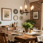
Choosing the right paint color for your home is an exciting journey that doesn’t just enhance your interior but also reflects your values.
In a world that’s becoming more eco-conscious, selecting eco-friendly paint colors is a must for homeowners who want stylish yet sustainable interiors. From serene greens to soft earth tones, the right paint can create an inviting atmosphere while ensuring we’re not hurting the planet.
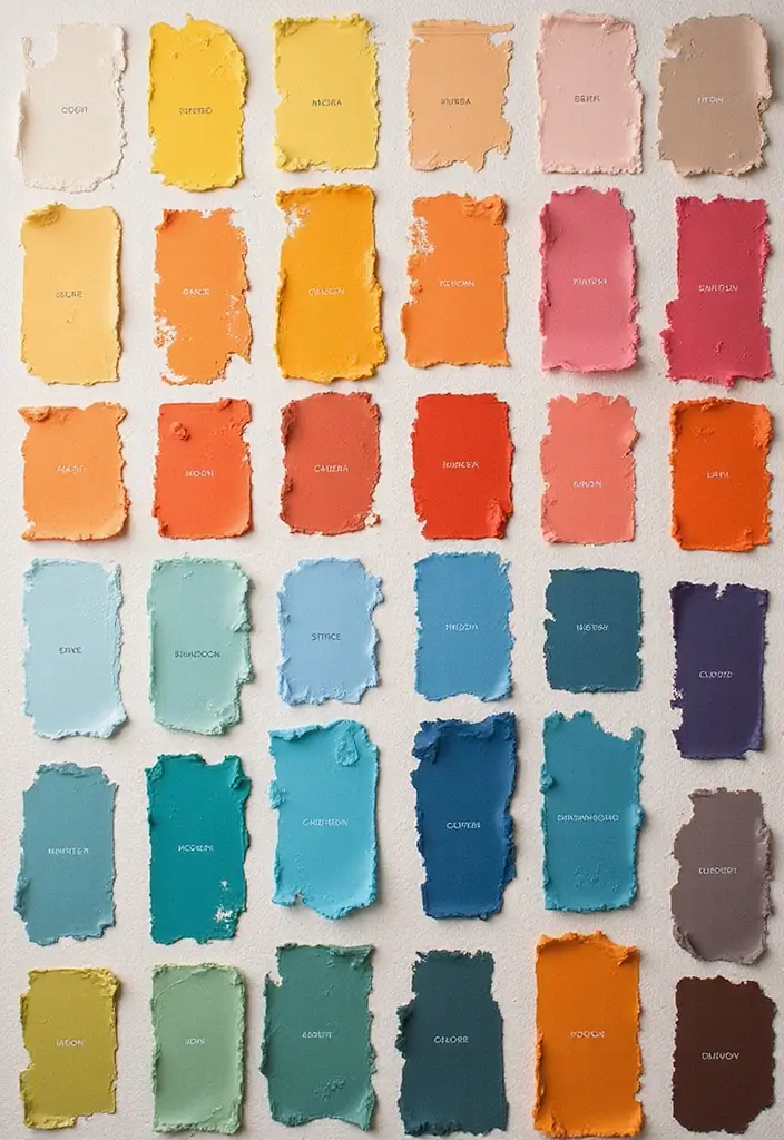
Here, we present a curated list of the 25 best paint colors that are both loved by homeowners and gentle on the environment. Each option is a testament to modern interior design trends, blending style with sustainability beautifully.
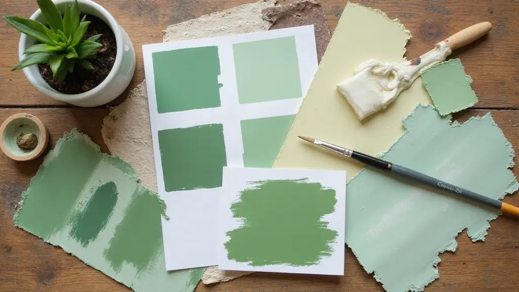
1. Soft Sage Green
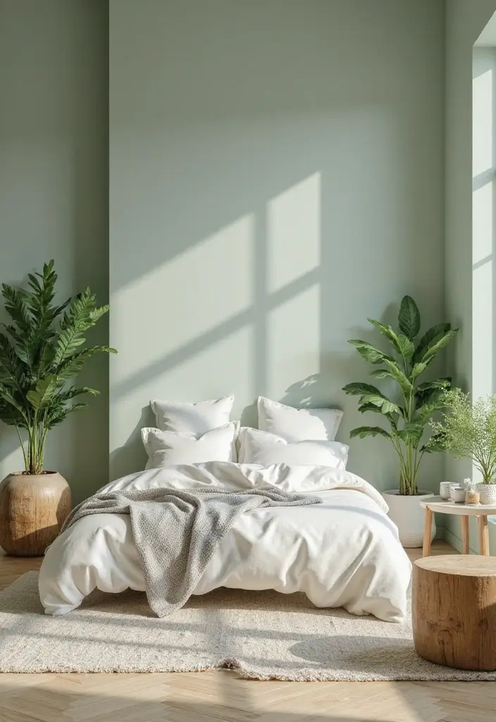
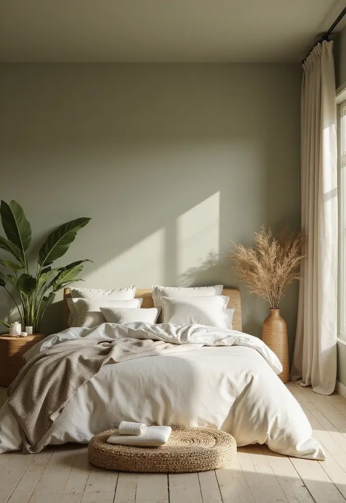
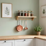
Soft sage green is the go-to color for creating a calm and refreshing atmosphere.
It resonates with nature, making it perfect for eco-friendly homes. This color works beautifully in living rooms or bedrooms, paired with natural wood accents and white trims.
Benefits of Soft Sage Green:
– Evokes tranquility and peace.
– Complements plants and natural décor.
– Pairs well with soft whites and warm browns.
Consider using it in a matte finish for a more muted look or glossy for a modern vibe. This shade is not just popular; it’s a timeless classic that helps bring elements of the outdoors in, making spaces feel larger and more connected to nature.
2. Terracotta
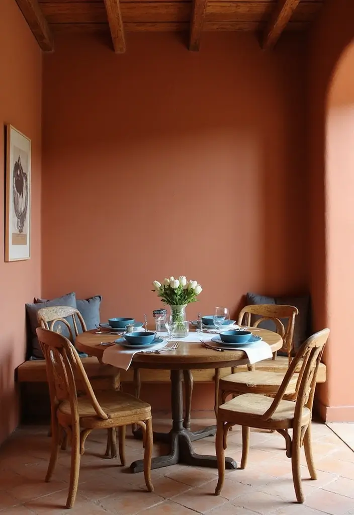
Terracotta brings warmth and vibrancy into any space, reminiscent of clay pots and rustic earthiness.
It’s perfect for kitchens or dining areas where a cozy atmosphere is essential. This color works especially well with white or cream accents, helping to create a warm, inviting environment.
Highlights of Terracotta:
– Invokes a sense of warmth and hospitality.
– Great for accent walls or full rooms.
– Pairs beautifully with blues and greens for a balanced palette.
When using terracotta, try mixing different textures, like a matte wall finish contrasted with glossy kitchen tiles, to enhance the visual appeal while keeping your space eco-friendly.
Embrace the warmth of terracotta – it’s like a cozy hug for your home! Perfect for kitchens and dining areas, this earthy hue invites hospitality and pairs beautifully with white, blues, and greens.
3. Soft Blue
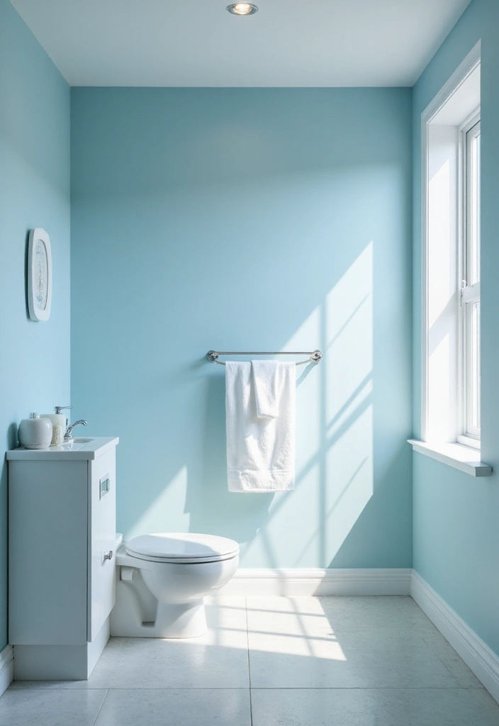
Soft blue is a classic choice that embodies serenity and calm.
This shade can transform any room into a peaceful haven, ideal for bedrooms and bathrooms. It pairs beautifully with whites and light greys, creating a fresh and airy ambiance.
Advantages of Soft Blue:
– Promotes relaxation and calmness.
– Complements natural light beautifully.
– Works great with ocean-themed decor.
Opt for this shade in a satin finish to reflect light subtly without overwhelming your space. Soft blue can also be combined with deeper blues for added depth and interest in larger rooms.
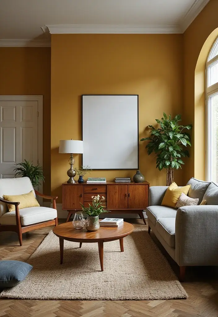
4. Muted Mustard
Muted mustard is a trendy yet warm tone that adds a pop of fun to any environment.
It’s perfect for accent walls or cozy corners, giving spaces an eclectic vibe while remaining sophisticated. This color pairs well with dark woods and deep greens.
Key Traits of Muted Mustard:
– Energizes any space without being overwhelming.
– Pairs well with vintage and modern styles alike.
– Works great in family rooms or artistic spaces.
Try combining muted mustard with charcoal greys for a chic contrast that still feels warm and inviting. A matte finish can enhance its depth and richness.
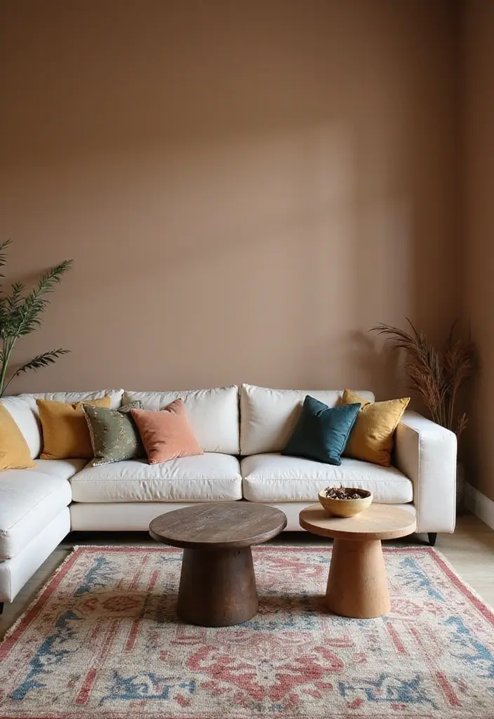
5. Warm Taupe
Warm taupe is a versatile neutral that provides a cozy backdrop for any room.
This earthy shade is perfect for living rooms or dining spaces, where you want to create a welcoming environment. Warm taupe can be paired with a variety of colors, making it an excellent choice for accentuating furniture or décor.
Benefits of Warm Taupe:
– Creates a sophisticated and timeless feel.
– Pairs beautifully with both bold and pastel colors.
– Perfect for creating harmony in open spaces.
Choose this shade for a matte finish to keep the look soft and inviting. It also works great as a base color to allow brighter accents to shine.
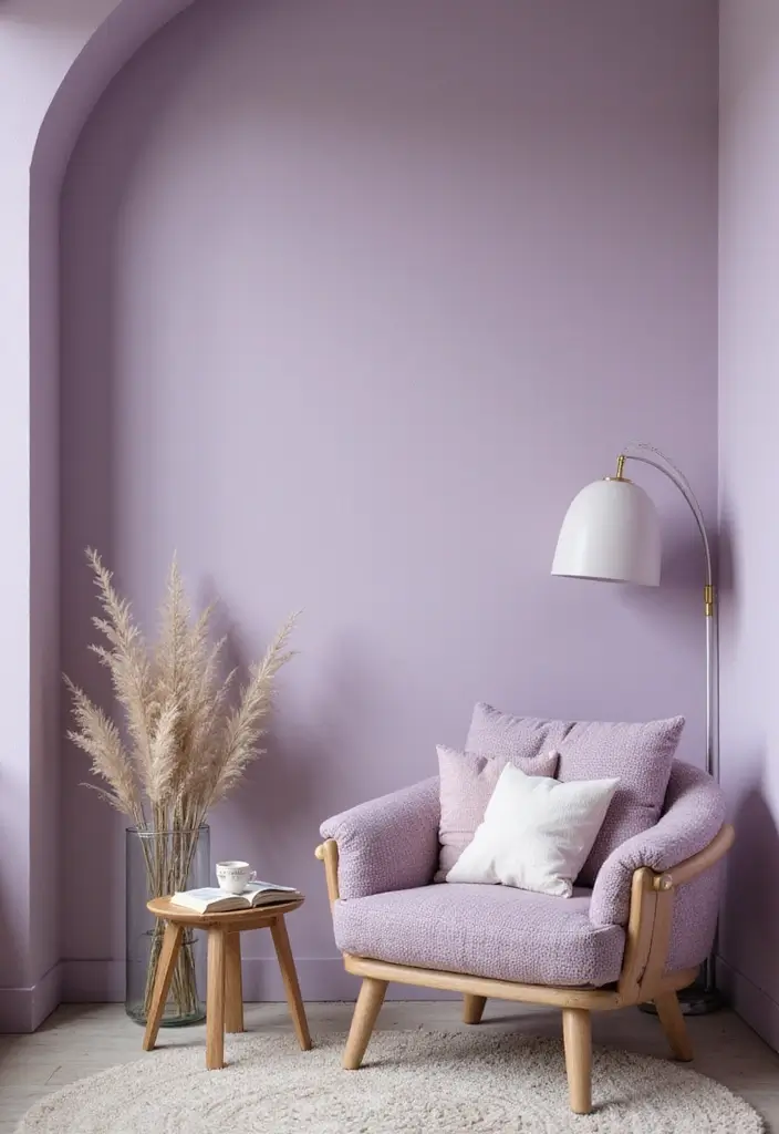
6. Dusty Lavender
Dusty lavender is a soft, understated color that adds a touch of elegance to any space.
Ideal for bedrooms or reading nooks, this soothing shade encourages relaxation while also feeling sophisticated. Pair it with whites and soft greens for a dreamy palette.
Highlights of Dusty Lavender:
– Evokes a sense of calm and serenity.
– Works well with vintage decor styles.
– Pairs perfectly with metallic accents for a modern touch.
Consider using dusty lavender in a satin finish to reflect light and highlight its subtle undertones, creating a calming oasis in your home.
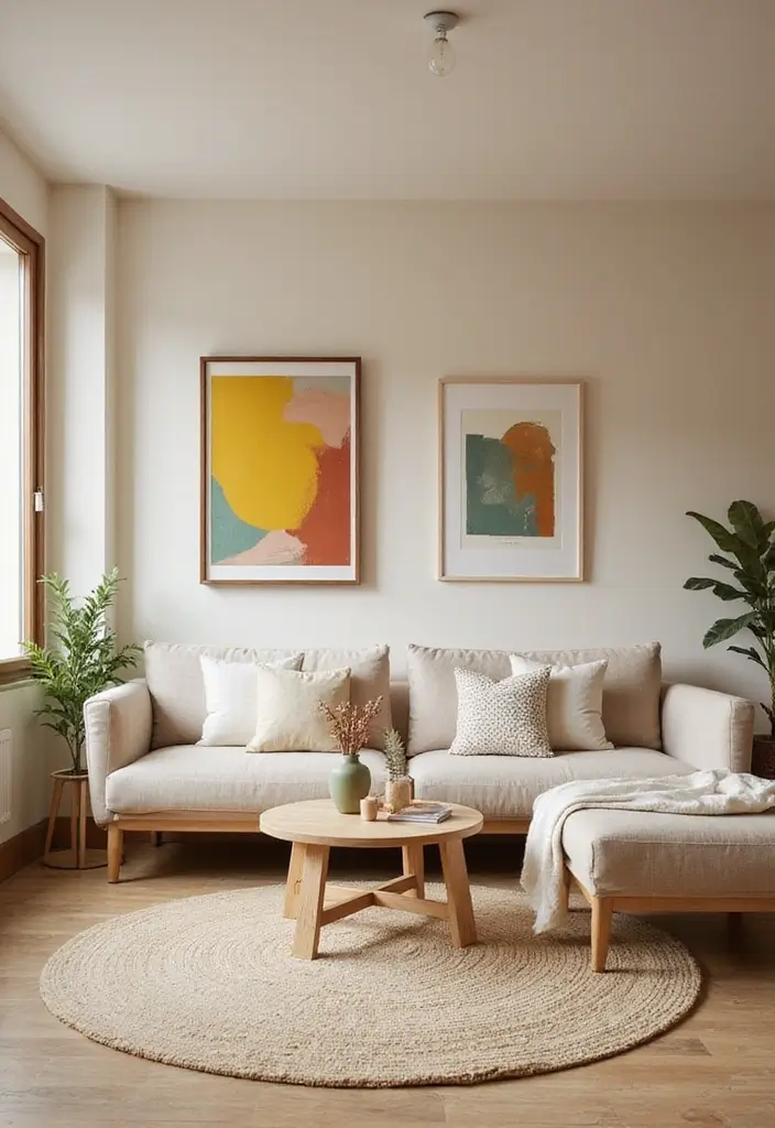
7. Neutral Beige
Neutral beige is a classic and timeless choice that acts as a blank canvas for your interior design dreams.
This warm hue blends effortlessly with various styles, making it ideal for any room in your home. Whether you go for a modern or rustic design, neutral beige serves as a perfect background to highlight your décor.
Benefits of Neutral Beige:
– Highly versatile and complements almost any color.
– Can make a room feel larger and more open.
– Pairs beautifully with natural materials like wood and stone.
Opt for a matte finish to create a soft, inviting atmosphere, allowing you to easily infuse your personality with colorful accents and art pieces.
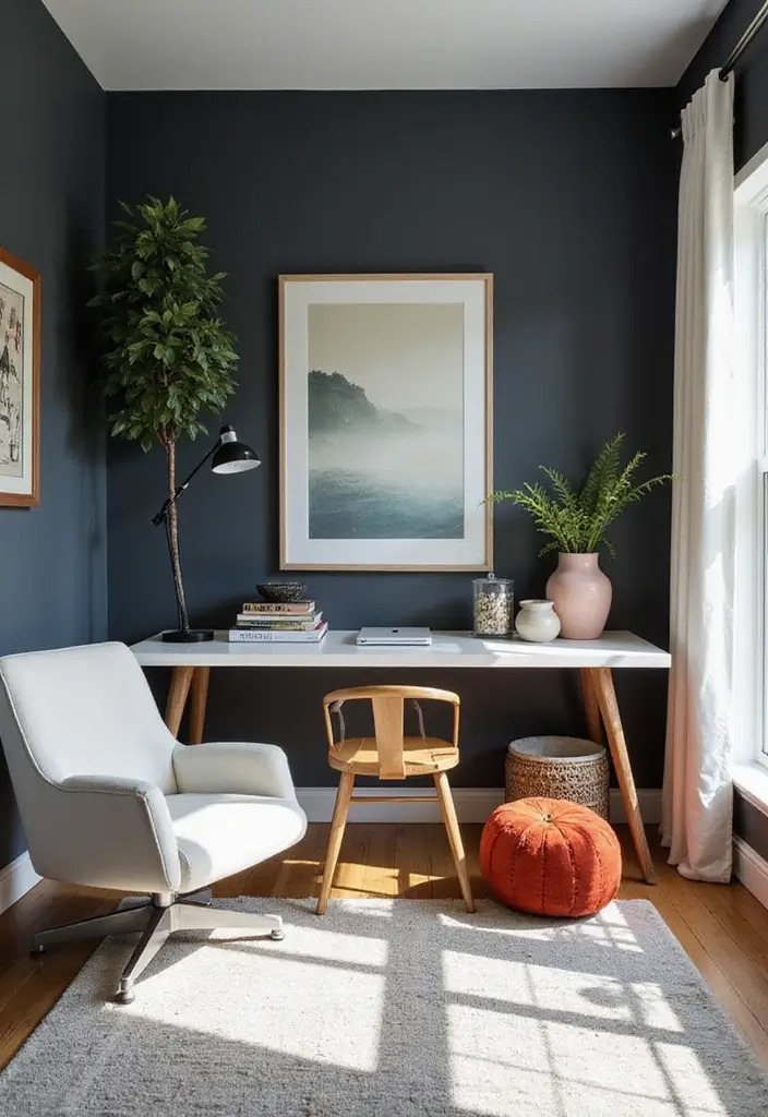
8. Deep Charcoal
Deep charcoal is a bold choice that adds drama to any space, perfect for accent walls or modern interiors.
This rich, dark hue brings sophistication and intensity, easily paired with lighter colors for contrast. It’s ideal for gourmet kitchens or stylish home offices.
Advantages of Deep Charcoal:
– Creates a striking focal point in any room.
– Works well with various materials, including metals and textiles.
– Adds depth without feeling heavy when paired correctly.
Using deep charcoal in a glossy finish can create an elegant effect, enhancing the room’s light play while maintaining a cozy atmosphere.
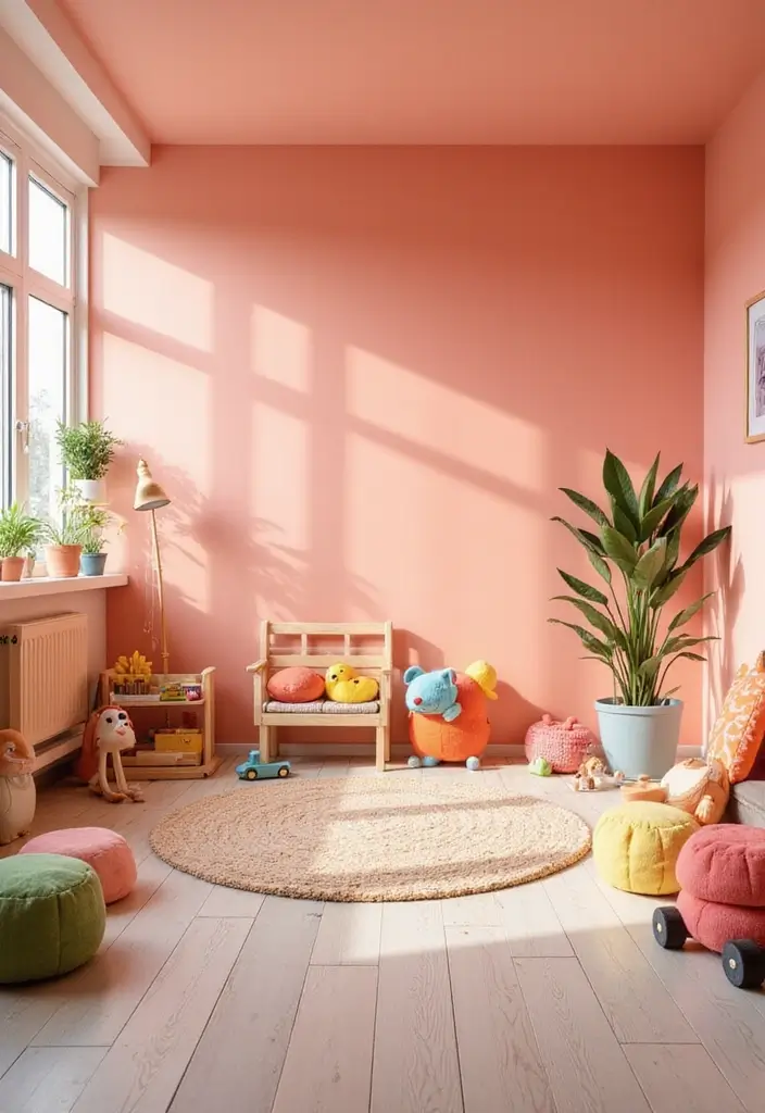
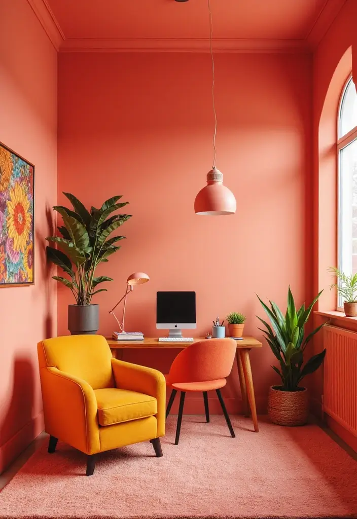
9. Soft Coral
Soft coral is a playful yet graceful color that can brighten up any room.
Ideal for children’s spaces or creative studios, this hue brings warmth and energy without being too overwhelming. It pairs beautifully with light greens and blues for a cheerful palette.
Key Benefits of Soft Coral:
– Invokes happiness and creativity.
– Great for playful and welcoming spaces.
– Pairs well with neutral accents for balance.
Consider using soft coral in a satin finish to enhance its lively tones, making your space feel more vibrant and inviting, perfectly reflecting a cheerful ambiance.
Soft coral isn’t just a color; it’s an invitation to joy! Perfect for creative spaces, this hue sparks happiness and pairs beautifully with nature’s greens and blues. Let your walls inspire your imagination!
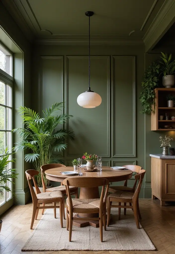
10. Olive Green
Olive green is a sophisticated and rich color that exudes warmth and a connection to nature.
This tone works wonderfully in living rooms or dining areas, creating an organic feel that welcomes family and friends. Pair it with wood and cream accents for a grounded look.
Highlights of Olive Green:
– Adds a touch of elegance and depth.
– Pairs beautifully with natural textures and materials.
– Great for creating cozy, inviting atmospheres.
Using olive green in a matte finish creates a soothing environment, perfect for relaxing spaces. This color complements various styles, from rustic to contemporary, making it a perfect choice for your home.
Olive green isn’t just a color; it’s a feeling. Embrace its warmth to create cozy spaces that draw loved ones in, making your home a sanctuary of elegance and nature.
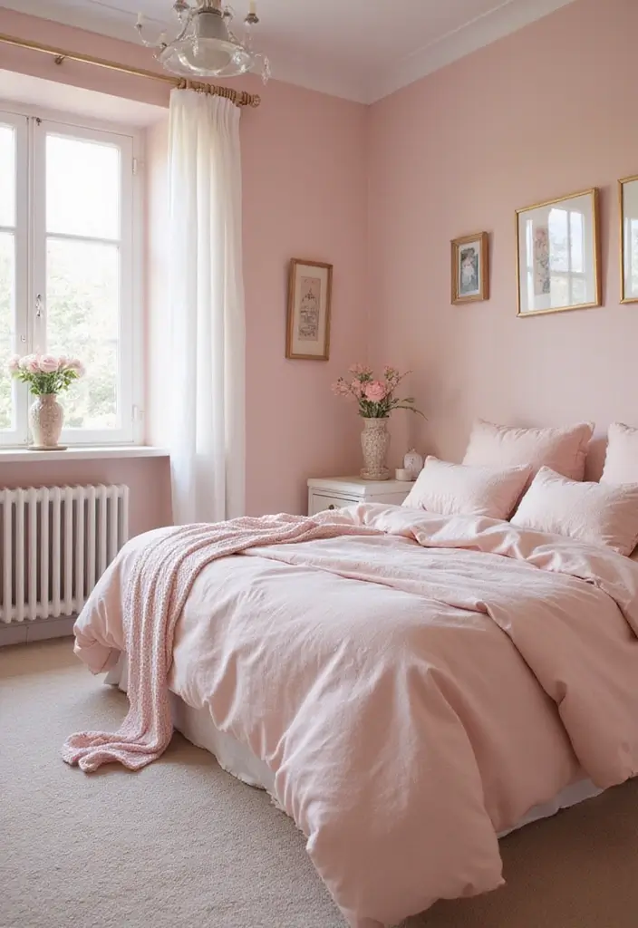
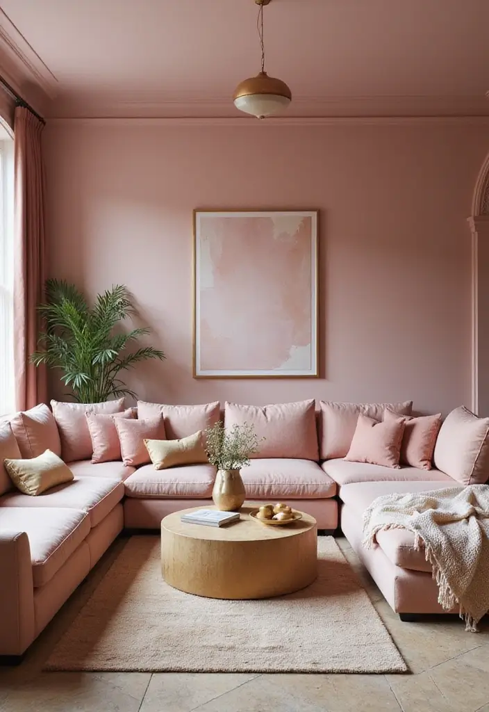
11. Pale Pink
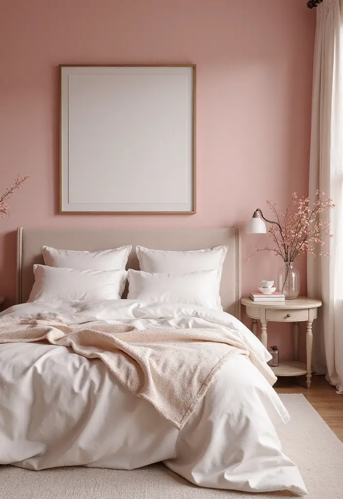
Pale pink adds a soft, romantic touch to any space, making it perfect for bedrooms or cozy reading areas.
This gentle hue brings warmth while maintaining a fresh vibe, allowing for a stylish yet understated elegance. Pair it with whites and soft greys for a beautiful, cohesive look.
Benefits of Pale Pink:
– Encourages feelings of love and comfort.
– Works beautifully with both modern and vintage styles.
– Provides a subtle backdrop for vibrant decor pieces.
Choose a matte finish to keep the look soft and inviting, creating a peaceful sanctuary that feels both stylish and cozy.
12. Dusty Rose
Dusty rose is a sophisticated and trendy shade that brings warmth and depth into your space.
It’s perfect for living rooms and bedrooms, where a touch of elegance is desired. This color harmonizes beautifully with neutrals and metallics, making it an excellent choice for modern, stylish homes.
Highlights of Dusty Rose:
– Evokes a sense of warmth and comfort.
– Pairs beautifully with grey, white, and gold accents.
– Great for adding a touch of luxury.
Using dusty rose with a satin finish will reflect light subtly while bringing warmth to your decor, perfect for creating inviting and stylish atmospheres.
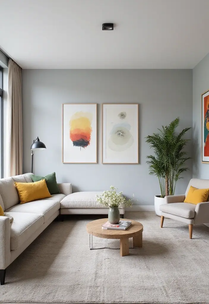
13. Light Gray
Light gray is a versatile and modern choice that can elevate the look of any room without overwhelming it.
This neutral shade creates a clean slate, perfect for showcasing art and other décor. It pairs effortlessly with almost any color, making it a homeowner favorite.
Benefits of Light Gray:
– Creates an airy and spacious feel.
– Complements both warm and cool tones.
– Ideal for contemporary and classic styles alike.
Opt for a matte finish to maintain a soft, subtle look that can easily be accessorized with various colors, textures, and materials.
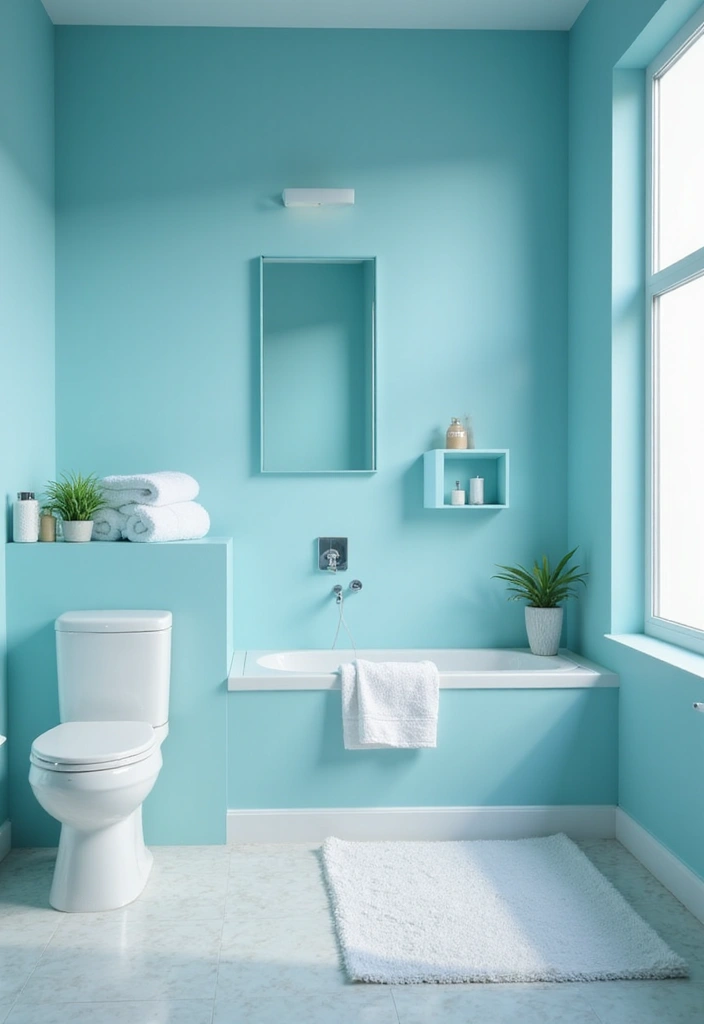
14. Aqua Blue
Aqua blue is a vibrant and refreshing color that can transform a dull space into a lively oasis.
It’s perfect for bathrooms and kitchens, reflecting a sense of calm reminiscent of the ocean. Pair it with white accents for a crisp, clean look.
Highlights of Aqua Blue:
– Evokes a sense of tranquility and freshness.
– Great for creating coastal or tropical-themed decor.
– Brightens up any space without being overwhelming.
Consider using aqua blue in a semi-gloss finish for added shine and light reflection, enhancing the feeling of spaciousness in your areas.
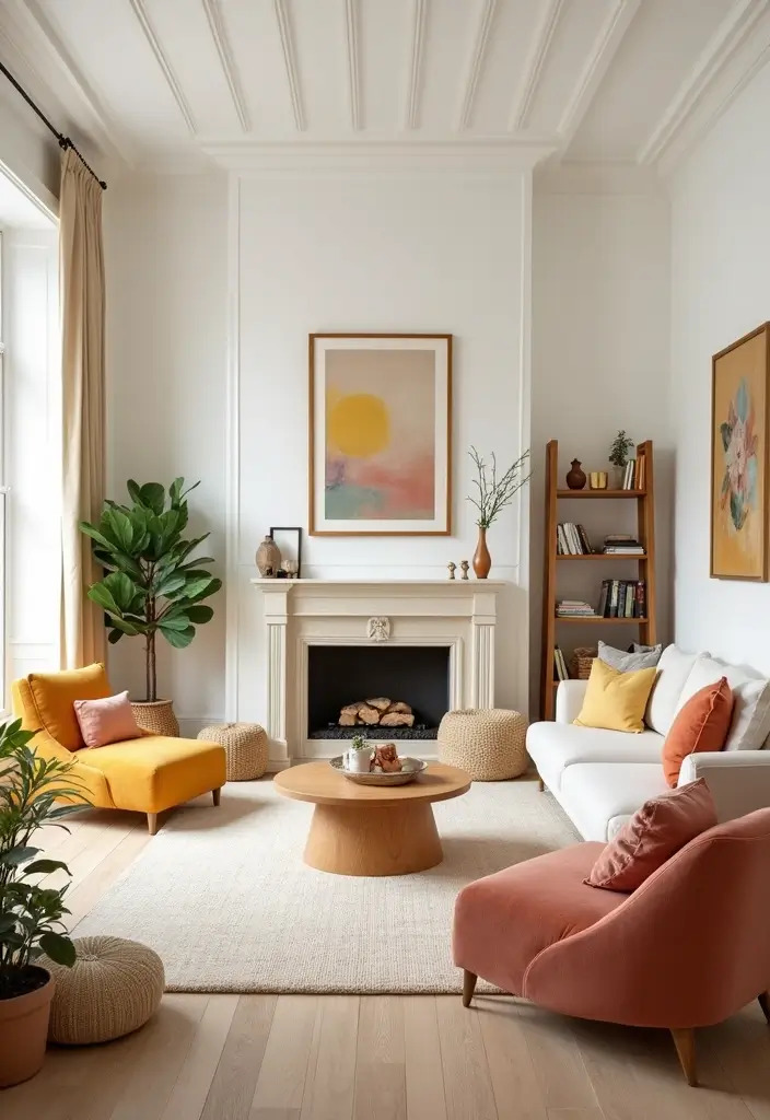
15. Creamy White
Creamy white is an ideal choice for homeowners who want a clean, bright look while maintaining warmth.
This soft white hue works beautifully in any room, providing a neutral backdrop that complements all styles. It pairs excellently with richer colors, bringing them to life while creating a cozy feel.
Benefits of Creamy White:
– Makes spaces feel larger and more open.
– Pairs beautifully with any accent color.
– Provides a warm and inviting atmosphere.
Opt for a matte or eggshell finish to create inviting, soft light reflections, making your spaces feel warm and welcoming.
16. Warm Coral
Warm coral brings a joyful touch to any space, making it ideal for bedrooms or creative work areas.
This cheerful hue adds vibrancy without overwhelming the senses. It works beautifully with neutrals and greens for a balanced palette.
Advantages of Warm Coral:
– Encourages creativity and positivity.
– Works with vintage and modern designs alike.
– Pairs beautifully with white and gold for a sophisticated touch.
A satin finish can enhance its vividness, making warm coral a perfect choice for settings that need a splash of life and energy.
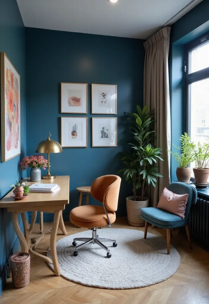
17. Steel Blue
Steel blue is a sophisticated choice that combines elegance with a touch of modernity.
This cool tone works great in home offices or living areas, providing a calming and focused environment. It pairs well with whites and natural woods for a balanced look.
Highlights of Steel Blue:
– Evokes tranquility while adding a stylish edge.
– Perfect for contemporary designs and accents.
– Complements natural light beautifully.
Using steel blue in a matte finish can enhance its depth and warmth while also creating a smooth transition between different color areas in your home.
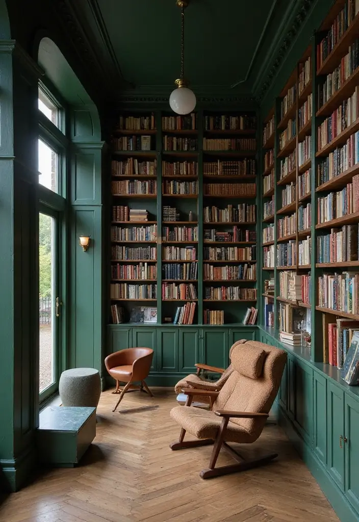
18. Forest Green
Forest green is a lush, rich color reminiscent of nature that brings a grounding feel to interiors.
This deep shade is perfect for living rooms or libraries, creating an inviting atmosphere that encourages relaxation and conversation. It pairs beautifully with wood tones and neutrals for a warm, earthy vibe.
Benefits of Forest Green:
– Creates a cozy and organic ambiance.
– Excellent for balancing bright or colorful decor.
– Pairs well with natural materials, enhancing the eco-friendly feel.
Choose a satin finish to reflect light subtly, bringing out the natural beauty of the shade while creating an inviting space.
Embrace the calming embrace of forest green! This rich hue not only brings nature indoors but also creates the perfect backdrop for cozy conversations and relaxation. Pair it with wood tones and watch your space come alive!
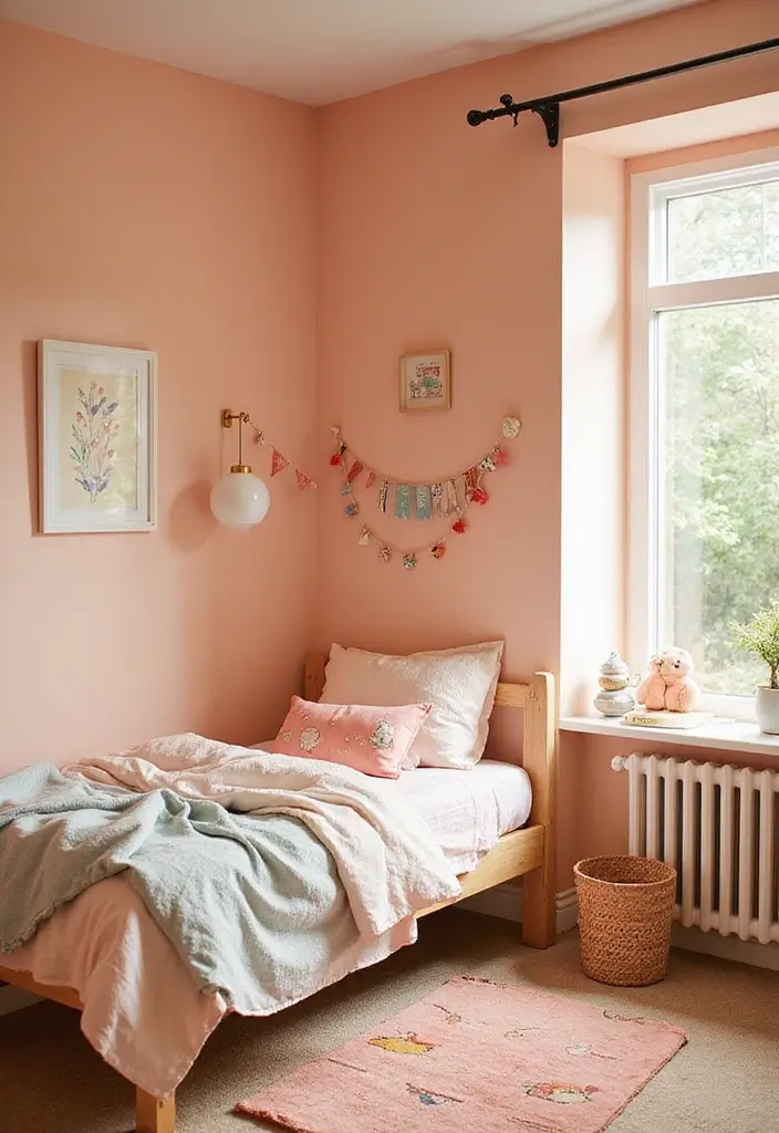
19. Soft Peach
Soft peach is a warm and inviting color that can brighten up any room.
Ideal for children’s rooms or cozy reading nooks, this gentle hue evokes a sense of warmth and happiness. It pairs beautifully with whites and greys for a harmonious look.
Highlights of Soft Peach:
– Encourages feelings of warmth and happiness.
– Works well with both modern and traditional styles.
– Provides a subtle backdrop for colorful decor.
Choosing soft peach in a matte finish will enhance its warm glow, making your space feel inviting and cheerful—a perfect choice for nurturing creativity and relaxation.
20. Light Olive
Light olive is a refreshing and calming color, perfect for creating a serene environment.
This soft hue works great in bedrooms or relaxation areas, fostering a peaceful atmosphere. It pairs well with warm whites and earthy tones, bringing nature indoors.
Benefits of Light Olive:
– Invokes feelings of tranquility and balance.
– Great for creating a fresh, airy vibe.
– Pairs beautifully with wooden accents for an organic look.
Using light olive in a matte finish can help enhance its softness, making it an excellent choice for those looking to create a cozy retreat at home.
21. Ivory
Ivory is a timeless classic that brings warmth and elegance to any space.
This soft, creamy tone works wonderfully in any room, offering a beautiful backdrop that can enhance your decor. It pairs beautifully with all colors, making it incredibly versatile.
Benefits of Ivory:
– Creates a light, airy feel.
– Enhances natural light in any room.
– Offers a sophisticated touch to both modern and traditional designs.
Opt for an eggshell finish to provide just the right amount of softness and depth, ensuring your space feels welcoming and elegant.
22. Bright Turquoise
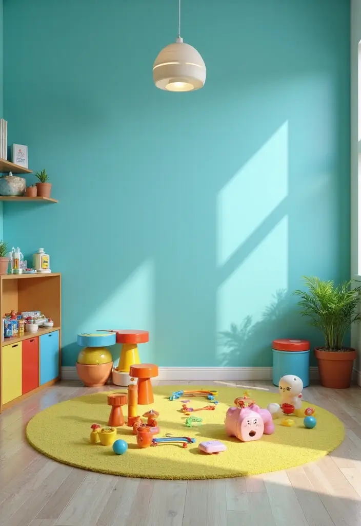
Bright turquoise is a vibrant and fun color that can inject life into any room.
Ideal for playrooms, kitchens, or creative spaces, this lively hue creates an energetic vibe while still feeling fresh and modern. Pair it with white or light wood for a crisp look.
Highlights of Bright Turquoise:
– Evokes feelings of joy and enthusiasm.
– Works beautifully with both neutrals and complementary colors.
– Adds a playful touch to modern or eclectic spaces.
Using bright turquoise in a semi-gloss finish will enhance its vibrancy, making it a fantastic choice for spaces that aim to inspire energy and creativity.
23. Blush Pink
Blush pink is a soft, romantic color that can add a touch of elegance to any room.
This soothing hue is perfect for bedrooms, nurseries, or creative spaces, creating an inviting and peaceful environment. Pair it with whites and golds for a luxurious feel.
Advantages of Blush Pink:
– Encourages feelings of love and warmth.
– Works beautifully with modern and vintage aesthetics.
– Provides a subtle backdrop for bolder accent colors.
Opt for a satin finish to reflect light gently, enhancing the softness of the blush while creating a cozy atmosphere.
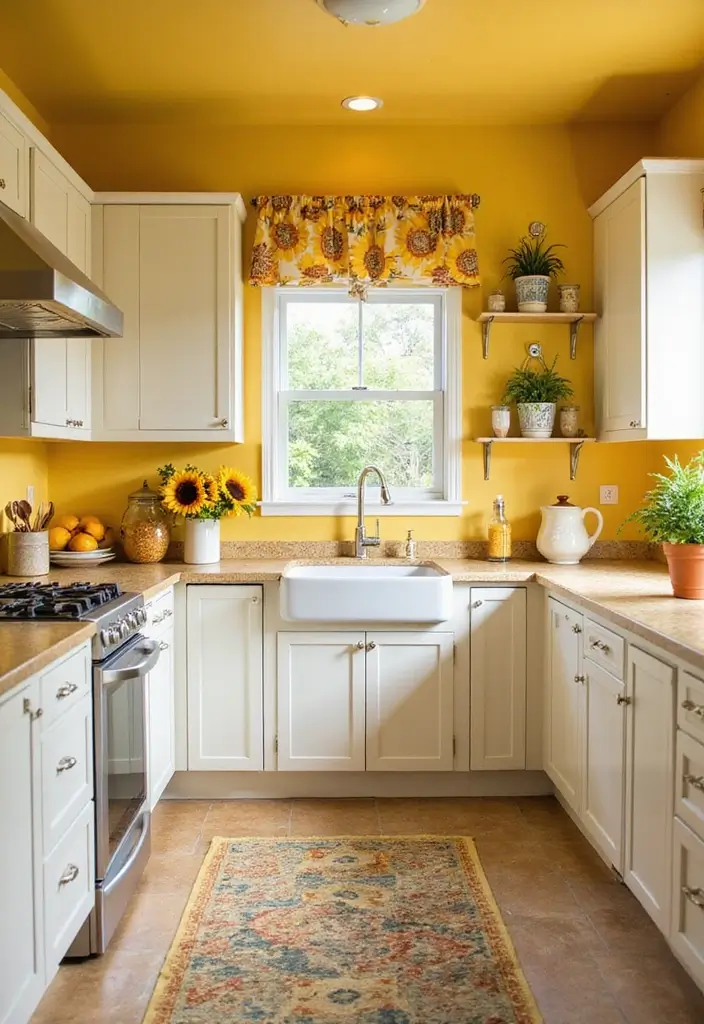
24. Sunflower Yellow
Sunflower yellow is a cheerful and vibrant color that can brighten up any space.
This uplifting hue is perfect for kitchens, dining areas, or family rooms, creating a welcoming and joyful atmosphere. Pair it with whites or greys for a balanced look.
Highlights of Sunflower Yellow:
– Evokes happiness and positivity.
– Works beautifully with various color schemes.
– Adds a dynamic touch to modern or rustic styles.
Using sunflower yellow in a matte or eggshell finish will enhance its warmth, making your home feel sunny and bright, even on the cloudiest days.
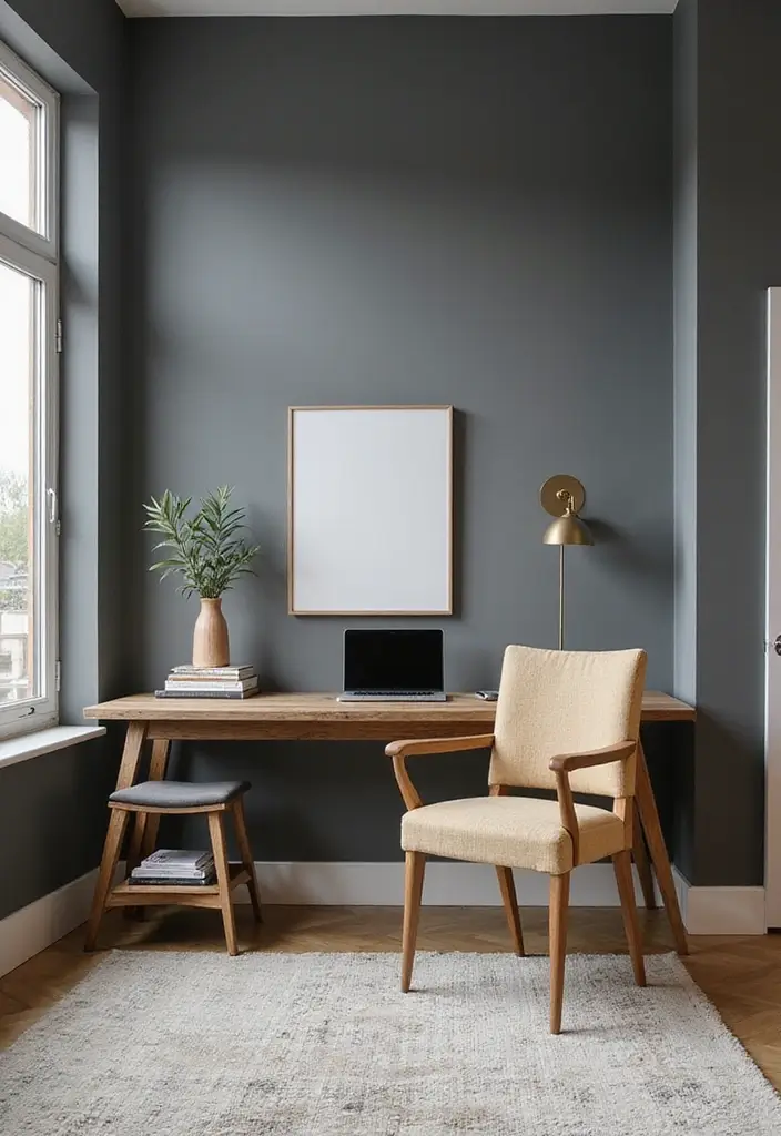
25. Steel Gray
Steel gray is a contemporary color that adds sophistication and modernity to interiors.
This cool tone works wonderfully in living areas or home offices, creating a sleek and professional environment. It pairs well with pops of color for added interest.
Benefits of Steel Gray:
– Creates a modern, chic atmosphere.
– Works beautifully with both warm and cool accents.
– Provides depth and contrast in any space.
Opt for a satin finish to enhance the color’s depth and create a stylish, inviting ambiance, perfect for a contemporary home.
Conclusion
Choosing the right paint color can truly transform your home and reflect your eco-conscious lifestyle.
With these 25 eco-friendly paint colors, you can create beautiful, sustainable spaces that resonate with your personality and values. Embrace these trends and make your home a vibrant representation of your commitment to a green lifestyle!
Frequently Asked Questions
What are the top eco-friendly paint colors for home interiors?
If you’re looking to refresh your home with sustainable choices, consider colors like Soft Sage Green for a calming vibe, or Terracotta for warmth and vibrancy. These shades not only enhance your home’s aesthetic but also align with eco-conscious values. For a serene atmosphere, Soft Blue is a classic choice, while Warm Taupe offers versatility as a neutral backdrop.
How do I choose the right paint colors for my home?
Choosing the right paint colors involves considering the mood you want to create in each room. For example, soothing hues like Dusty Lavender are perfect for relaxing spaces, while vibrant shades like Sunflower Yellow can energize common areas. Think about how colors interact with natural light and your existing decor to create a cohesive look.
Are eco-friendly paint colors more expensive than regular paint?
While eco-friendly paint options can sometimes be pricier, the benefits often outweigh the costs. These paints are typically made without harmful chemicals, which can enhance indoor air quality and have a lower environmental impact. Plus, investing in quality eco-friendly paints can lead to longer-lasting results, making them a worthwhile addition to your home decor.
What are some popular wall color trends for 2023?
This year, trends are leaning towards earthy tones and soft pastels. Shades like Aqua Blue and Olive Green are gaining popularity for their natural feel. Additionally, muted colors like Muted Mustard and Dusty Rose are great for adding a touch of vibrancy without overwhelming a space. These colors reflect both modern trends and eco-friendly values.
How can I create a cohesive color palette for my home decor?
To create a cohesive color palette, start by choosing a base color that resonates with your style, such as a neutral like Neutral Beige or Creamy White. From there, select complementary shades for accents, like Steel Blue or Soft Coral, to add depth. Consider the overall feel you want to achieve, and use swatches to visualize how the colors work together across different rooms.

