
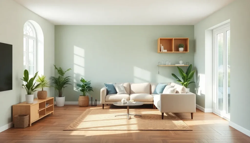
Looking to transform your living room into a tranquil sanctuary? We’ve discovered that the right accent wall can make all the difference. While neutral palettes dominate peaceful interior design, a thoughtfully chosen accent wall color can enhance relaxation while adding personality to your space.
In our experience, selecting the perfect hue isn’t just about following trends—it’s about creating harmony with your existing décor while promoting a sense of calm. From soft sage greens that bring nature indoors to muted blues that evoke clear skies, the right accent wall color can dramatically shift your living room’s energy without overwhelming the senses.
Top Accent Wall Colors That Create a Peaceful Living Room Atmosphere
1. Soft Sage Green
Soft sage green creates an immediate connection to nature, making it one of the most calming accent wall colors available. This versatile hue works beautifully with neutral furniture and natural materials like wood and rattan. Studies show that green tones can reduce stress and promote feelings of renewal. We’ve noticed that sage green pairs exceptionally well with cream, beige, and light gray components in a living room, creating a harmonious balance that doesn’t overwhelm the senses.
2. Dusty Blue
Dusty blue evokes the tranquil feeling of clear skies and gentle water, instantly bringing serenity into your living space. This sophisticated color has enough depth to make a statement without being too bold or stimulating. Many interior designers recommend dusty blue for north-facing rooms that need warmth while maintaining a peaceful atmosphere. We find this shade particularly effective when complemented with natural wood tones and soft textiles for a balanced, cohesive look.
3. Muted Lavender
Muted lavender offers subtle sophistication while promoting relaxation through its gentle purple undertones. This understated hue has been shown to reduce anxiety and promote better sleep quality, making it perfect for living rooms that transition into evening relaxation spaces. We recommend pairing lavender with warm neutrals like taupe or light gray to prevent the space from feeling too cool or feminine.
4. Warm Taupe
Warm taupe delivers cozy comfort while maintaining the neutrality needed for a peaceful environment. This versatile color bridges the gap between gray and beige, creating a sophisticated backdrop that works with virtually any design style. Interior design experts frequently choose taupe for its ability to make spaces feel larger and more open while providing subtle warmth. We’ve found that taupe accent walls complement both cool and warm color schemes, making them incredibly adaptable for evolving living room designs.
5. Pale Blush
Pale blush introduces a gentle touch of color that promotes feelings of nurturing and comfort without overpowering the space. This subtle pink hue has gained popularity for its ability to function essentially as a neutral while adding dimension and interest to living rooms. Research indicates that soft pink tones can have a calming effect on the nervous system. We love how pale blush pairs beautifully with gray, cream, and natural wood elements for a balanced, peaceful aesthetic.
6. Soft Charcoal
Soft charcoal creates a cocooning effect that feels both sophisticated and deeply relaxing when used on an accent wall. This muted dark tone absorbs light rather than reflects it, reducing visual stimulation and promoting a sense of groundedness. Designers often use charcoal to add depth without the starkness of black. We suggest balancing this deeper color with lighter furnishings and plenty of texture to maintain an inviting, peaceful atmosphere.
7. Misty Seafoam
Misty seafoam instantly evokes coastal tranquility through its subtle green-blue tones that mirror the ocean’s surface. This refreshing color promotes feelings of escape and vacation-like relaxation in everyday living spaces. Studies have linked blue-green hues to improved focus and reduced blood pressure. We’ve observed that seafoam works particularly well in rooms with plenty of natural light, where it shifts subtly throughout the day, keeping the space feeling alive yet peaceful.
8. Terracotta
Terracotta brings earthy warmth that creates a grounding, peaceful atmosphere even though its richer color profile. This natural shade connects us to the earth, promoting feelings of stability and security in living spaces. Design professionals increasingly recommend warmer earth tones for their ability to make spaces feel both cozy and calm. We find terracotta particularly effective in rooms that lack natural warmth or in spaces where you want to create a subtle focal point without disrupting tranquility.
Serene Blue Tones for Living Room Accent Walls

Blue tones are renowned for their ability to create peaceful, calming environments in our homes. When used on an accent wall, these hues can transform your living room into a tranquil retreat where stress melts away.
Powder Blue for Gentle Tranquility
Powder blue offers a soft, pale shade that instantly creates a calming and soothing atmosphere in any living room. This gentle tone serves as an ideal accent wall color for homeowners seeking subtle yet effective ways to promote relaxation in their space. Many interior designers recommend powder blue for its versatility, as it pairs beautifully with white trim, natural wood furniture, and various textile patterns. Research shows that lighter blue tones can actually lower blood pressure and heart rate, making your living room a true sanctuary after a long day. For maximum effect, we suggest applying powder blue on the wall you face most often while relaxing, allowing its tranquil properties to fully envelop you.
Navy Blue for Sophisticated Calm
Navy blue delivers a powerful combination of sophistication and serenity when used as an accent wall color in living rooms. This deeper blue tone creates dramatic contrast with lighter furnishings while maintaining the calming effects associated with the blue color family. Interior design experts often incorporate navy blue to add depth and elegance to living spaces without sacrificing the peaceful ambiance. The rich wavelength of navy blue is perceived as particularly calming by the human eye, making it perfect for spaces where you want both visual impact and relaxation. We find that navy blue accent walls work exceptionally well with brass fixtures, cream-colored sofas, and natural wood elements to create a balanced, sophisticated living area where guests feel immediately at ease.
Relaxing Green Shades to Transform Your Living Space

Green shades have become increasingly popular for accent walls due to their natural connection to the outdoors and their ability to create a peaceful atmosphere. We’ve compiled the most effective green tones that can transform your living room into a tranquil retreat.
Sage Green for Natural Harmony
Sage green stands out as one of the most effective accent wall colors for creating a peaceful living environment. This versatile shade draws its calming influence from nature, bringing the serenity of the outdoors into your home. Many interior designers recommend sage green specifically for its ability to pair beautifully with warm neutrals, creating a balanced and cohesive look. The subtle gray undertones in sage green prevent it from overwhelming your space while still providing enough visual interest to make your accent wall a focal point. Furniture in cream, beige, or light wood tones complements sage green particularly well, improving the natural harmony this color establishes in your living room.
Mint Green for Refreshing Serenity
Mint green offers a refreshing approach to creating a tranquil living space, distinguished by its cool, calming properties. This lighter green shade infuses rooms with a sense of airiness and vitality without sacrificing the peaceful atmosphere you’re seeking. Design experts note that mint green works exceptionally well in spaces that need brightening, as it reflects natural light effectively while maintaining its soothing character. The versatility of mint green allows it to pair wonderfully with both modern furnishings and vintage pieces, making it adaptable to various design styles. Natural materials like rattan, jute, and light woods enhance mint green’s connection to nature, further amplifying its serene effect on your living environment.
Neutral Accent Wall Colors for Ultimate Peace

Neutral colors create the perfect foundation for a peaceful living room, offering subtle sophistication while maintaining tranquility. These versatile shades provide the ideal backdrop for relaxation without overwhelming your senses.
Warm Beige for Cozy Comfort
Warm beige accent walls instantly transform your living room into a cozy sanctuary that feels both inviting and peaceful. This classic neutral adds natural warmth while creating a balanced and calming environment that promotes relaxation. Beige perfectly complements various textures, particularly natural elements like wood furnishings and stone accents, improving the organic feel of your space. Many designers recommend beige for its timeless appeal and ability to work with virtually any décor style without disrupting the serene atmosphere. The understated elegance of beige walls allows your furniture and accessories to stand out while maintaining an overall sense of harmony and peace throughout the room.
Soft Gray for Modern Tranquility
Soft gray accent walls deliver a contemporary peaceful vibe that feels both sophisticated and serene. This versatile neutral creates a modern backdrop that maintains a fresh, airy feel when paired with lighter furnishings and natural textures. Gray tones provide the perfect balance between warmth and coolness, making them adaptable to various lighting conditions and complementary to most color palettes. Interior design experts often recommend soft gray for its ability to create depth without heaviness, allowing the space to feel expansive and calm. The understated elegance of gray accent walls works particularly well in living rooms where you want to establish a peaceful atmosphere while maintaining a current, stylish aesthetic that won’t quickly go out of fashion.
Earth Tones That Ground Your Living Room Design

Earth tones create a foundation for peaceful living spaces by connecting your interior to the natural industry. These colors evoke stability and comfort while maintaining a sophisticated aesthetic that works with virtually any design style.
Terracotta for Warm Serenity
Terracotta brings an instant warm serenity to living rooms with its rich, earthy appeal. This distinctive color adds depth without overwhelming the space, creating a cozy atmosphere that naturally calms the senses. Many designers choose terracotta for accent walls because it pairs beautifully with neutral furnishings while adding visual interest. The warm undertones of this color reflect natural light in a way that enhances the room’s comfort factor throughout different times of day. We’ve noticed that spaces featuring terracotta accents often feel more grounded and inviting, making them perfect for areas where you want to unwind after a busy day.
Muted Olive for Natural Balance
Muted olive provides natural balance and harmony that few other colors can match in a living space. This understated green tone works seamlessly with various interior designs while creating a calming ambiance that promotes relaxation. Furniture in light woods or cream upholstery stands out beautifully against a muted olive accent wall without creating visual tension. The subtle depth of this color changes subtly throughout the day as natural light shifts, adding dimension to your space without requiring additional decorative elements. Designers often recommend muted olive for living rooms that serve multiple purposes because it creates a backdrop that supports both social gatherings and quiet moments of reflection. We find that this versatile earth tone connects indoor spaces to the natural industry, reinforcing the peaceful atmosphere that makes a living room truly livable.
Calming Purple Hues for Elegant Relaxation

Purple tones offer a unique blend of tranquility and sophistication that can transform your living room into a peaceful sanctuary. These calming hues strike the perfect balance between serenity and elegance, making them ideal choices for accent walls.
Lavender for Gentle Sophistication
Lavender stands out as one of the most soothing purple shades available for accent walls. This gentle hue creates an instantly serene atmosphere while adding a touch of refined elegance to any living room space. Designers often recommend lavender for its versatility and ability to complement a wide range of interior styles. The color pairs exceptionally well with neutral tones such as crisp whites and soft beiges, creating a tranquil contrast that enhances the overall peaceful ambiance. Natural light brings out lavender’s subtle complexity, allowing it to shift beautifully throughout the day and maintain its calming presence regardless of lighting conditions.
Mauve for Subtle Luxury
Mauve delivers an understated luxury that few other colors can match in a peaceful living room setting. This sophisticated purple-gray hybrid adds important depth to your space without overwhelming it, striking the perfect balance between statement and serenity. The color’s rich undertones complement earthy design elements and muted wood accents beautifully, establishing an elegant yet peaceful environment. Many interior designers choose mauve for its ability to create warmth while maintaining a sense of refinement and calm. Furniture pieces in complementary neutral tones stand out gracefully against a mauve accent wall, improving the room’s overall design coherence while preserving its tranquil character.
How to Choose the Perfect Peaceful Accent Wall Color for Your Living Room

Selecting the perfect accent wall color requires thoughtful consideration of several key factors to create a truly peaceful living room. We’ve gathered evidence-backed recommendations to help you make the best choice for your space.
Top Color Choices for Tranquility
- Muted Blues create an instantly calming atmosphere in your living room. Colors like Midnight Blue and Silver Strand (a sophisticated gray-green-blue hybrid) have been psychologically linked to reduced stress levels. These shades work particularly well in spaces that receive ample natural light.
- Earthy Greens transform your living room into a nature-inspired sanctuary. Olive Green and sage tones promote balance and relaxation, creating a spa-like ambiance that helps you unwind after a long day.
- Neutral Whites and Beiges offer timeless appeal without overwhelming your senses. Simply White (a warm cream) and Accessible Beige (a versatile taupe-greige) enhance coziness while providing an unobtrusive backdrop for your existing décor.
- Soft Pinks add gentle warmth to your living space. Blush Pink maintains a soothing effect while introducing a subtle touch of color that complements many design styles.
- Dark Neutrals provide depth and contrast in modern living rooms. Dark Charcoal creates a grounded feeling when balanced with lighter furnishings, making it ideal for contemporary spaces.
Key Selection Factors
Lighting dramatically affects how color appears on your walls. Cooler tones like blue-green Silver Strand adapt beautifully to both natural and artificial light, shifting from airy to muted depending on the time of day.
Room Size should influence your color selection process. Rich hues such as Midnight Blue suit larger walls but can overwhelm smaller spaces, so use them as focal points in appropriately sized rooms.
Complementary Colors play an essential role in maintaining balance. Pairing neutrals with Canary Yellow accents can add vibrancy without disrupting the overall calmness of your living room.
Psychological Impact matters significantly when designing peaceful spaces. Studies consistently associate blues and greens with lowered heart rates and improved mental clarity, making them excellent choices for relaxation areas.
Material Harmony creates cohesive, organic aesthetics throughout your living room. Matching colors to textures, such as pairing olive green with wood or stone elements, enhances the natural, peaceful feeling in your space.
For maximum tranquility, we recommend selecting low-saturation hues in matte finishes to minimize glare and enhance the restful quality of your accent wall. These thoughtful choices will help you create a living room that truly serves as your peaceful retreat.
Tips for Pairing Furniture with Your Peaceful Accent Wall

Creating harmony between your accent wall and furniture is essential for maintaining that peaceful atmosphere you’ve worked to establish. We’ve compiled these practical tips to help you achieve a balanced and tranquil living space.
Balance with Neutral Colors
Maintaining balance is crucial when working with accent walls. We recommend using neutral colors for the remaining walls to prevent the space from feeling overwhelming. This approach creates a perfect canvas that allows your accent wall—whether it’s midnight blue, olive green, or blush pink—to shine without competing with other elements in the room.
Choose Complementary Furniture
Selecting furniture that complements your accent wall color enhances the overall cohesion of your space. Natural wood furniture pairs exceptionally well with green accent walls, creating an organic connection that feels calming and intentional. For rich navy or midnight blue walls, light-colored upholstery provides beautiful contrast while maintaining the room’s peaceful character.
Add Texture
Incorporating different textures adds depth and interest to your living room without disrupting its tranquil vibe. We suggest introducing varied textures through rugs, throw pillows, or cozy blankets that complement your accent wall color. These textural elements create visual interest while reinforcing the peaceful atmosphere of your space.
Consider Lighting
Proper lighting is essential for highlighting your accent wall and preserving the room’s peaceful ambiance. Strategic placement of floor lamps, table lamps, or wall sconces can enhance the color’s true nature and create the perfect mood. With colors like golden ecru or cloud grey, warm lighting can amplify their calming properties and make the space feel even more inviting.
Minimize Clutter
Keeping your living room free from clutter significantly enhances the calming effect of your accent wall. We strongly recommend adopting a minimalist approach to décor and furnishings when working with statement walls. This clutter-free environment allows the eye to rest on the beautiful color you’ve chosen, whether it’s the sophisticated richness of navy or the serene quality of olive green, maximizing its peaceful impact on your space.
Conclusion: Creating Your Perfectly Peaceful Living Room Retreat
Transforming your living room into a peaceful sanctuary is all about thoughtful color selection. Whether you’re drawn to the natural tranquility of sage green and mint, the serene qualities of powder blue and navy, or the grounding presence of terracotta and olive, your accent wall can become the foundation of your calm space.
Remember that the perfect peaceful color responds to your room’s unique lighting, complements your existing décor, and resonates with your personal sense of tranquility. With the right hue and thoughtful furniture pairing, you’ll create a living room that not only looks beautiful but also feels like a genuine retreat from the outside industry.
Trust your instincts and choose colors that bring you joy and relaxation. After all, true peacefulness comes when your living space authentically reflects your ideal sanctuary.
Frequently Asked Questions
What is an accent wall and why is it important for a living room?
An accent wall is a single wall painted in a different color than the rest of the room to create visual interest. In living rooms, it serves as a focal point that can transform the space into a tranquil sanctuary while adding personality. When chosen carefully, accent wall colors can enhance relaxation, complement existing décor, and positively impact the room’s energy without overwhelming the space.
Which colors work best for creating a peaceful accent wall?
The most calming accent wall colors include soft sage green (connects to nature), dusty blue (evokes serene skies), muted lavender (promotes relaxation), warm taupe (creates coziness), pale blush (adds dimension), soft charcoal (creates a cocooning effect), misty seafoam (evokes coastal tranquility), and terracotta (brings warmth and stability). These colors are specifically chosen for their ability to enhance relaxation and create harmony.
How does lighting affect accent wall color selection?
Lighting dramatically impacts how accent wall colors appear throughout the day. North-facing rooms benefit from warmer tones like terracotta or soft blush to counterbalance cooler light. South-facing rooms can accommodate cooler tones like dusty blue or sage green. Always test paint samples under different lighting conditions (morning, afternoon, and evening) before committing to ensure the color maintains its calming effect.
Can dark colors like soft charcoal create a peaceful atmosphere?
Yes, soft charcoal can create a sophisticated and peaceful atmosphere when used correctly. This darker tone absorbs light, creating a relaxing cocooning effect that feels like a gentle embrace. The key is balance—pair charcoal with lighter furnishings, introduce adequate lighting, and limit it to one wall to prevent the space from feeling cramped or gloomy.
How do blue tones affect mood in a living room?
Blue tones scientifically promote relaxation by lowering blood pressure and heart rate. Powder blue creates a soft, airy atmosphere ideal for rest, while navy blue adds depth and elegance while maintaining calmness. Blue’s psychological association with clear skies and water makes it naturally soothing. When used on an accent wall, blue establishes a peaceful foundation that helps reduce stress and anxiety.
What makes green shades good choices for accent walls?
Green shades connect us to nature, which innately promotes relaxation and stress reduction. Sage green offers a grounding effect that pairs beautifully with warm neutrals, while mint green creates a refreshing, airy atmosphere that effectively reflects natural light. Green accent walls create a visual connection to the outdoors, helping to reduce stress hormones and create a more balanced living environment.
How do I choose furniture that complements my accent wall?
Select furniture in colors that harmonize with your accent wall—either complementary (opposite on the color wheel) or analogous (similar) shades. For darker accent walls, choose lighter furniture to create balance. Incorporate natural materials like wood, linen, and cotton to enhance the peaceful vibe. Keep the furniture arrangement simple and uncluttered, with pieces positioned to highlight the accent wall without competing with it.
Should the other walls be completely neutral with an accent wall?
Yes, keeping other walls neutral creates visual balance and prevents the space from feeling overwhelming. Whites, creams, light grays, or very pale versions of your accent color work best. This approach allows the accent wall to be the focal point while maintaining a cohesive look. The neutral walls also help reflect light throughout the room, enhancing the overall peaceful atmosphere.
How do earth tones like terracotta affect a living room’s feel?
Earth tones like terracotta and muted olive create a grounding effect that promotes stability and comfort. Terracotta adds warmth and depth, creating a cozy atmosphere that enhances relaxation. These colors’ connection to nature evokes feelings of security and permanence. Earth tones also tend to stay visually relevant longer than trendy colors, making them practical choices for accent walls in living spaces.
What role does finish play when painting an accent wall?
The paint finish significantly impacts how peaceful an accent wall feels. Matte or eggshell finishes minimize glare and reflection, enhancing the restful quality of the space. These low-sheen finishes also hide minor wall imperfections better than glossier options. For dark colors like soft charcoal, matte finishes can reduce the intensity while maintaining depth. Save higher sheens for trim or architectural details.


