
Transforming your master bedroom with the right paint color can completely change its atmosphere. It’s not just about picking a shade you like—it’s about creating the perfect retreat where you’ll spend nearly a third of your life. The right color choice can turn your bedroom from merely functional to genuinely restorative.
We’ve researched and compiled the most stunning paint colors that designers consistently recommend for master bedrooms. From soothing blues that promote better sleep to sophisticated neutrals that create a timeless backdrop, our list covers options for every style preference and bedroom size. Whether you’re planning a complete renovation or simply refreshing your space, these expert-approved colors will help you create the sanctuary you deserve.
Why Paint Color Matters in Your Master Bedroom
Your master bedroom’s paint color significantly impacts more than just aesthetics—it influences your mood, sleep quality, and overall wellbeing. Paint serves as the foundation for your bedroom’s entire design scheme, affecting how other elements like furniture and décor appear in the space. The right color creates a personal sanctuary that reflects your style while promoting relaxation and rest.
Studies show that certain colors can lower heart rate and blood pressure, making them ideal choices for a space dedicated to relaxation. Blue tones, for instance, have been proven to reduce stress and slow breathing, which explains why they’re often recommended for bedrooms. Selecting the appropriate shade involves considering practical factors like room size, natural light exposure, and ceiling height—all affecting how color presents itself.
Color psychology plays a crucial role in bedroom design, with warm hues (reds, oranges) energizing the space while cool tones (blues, greens) create calm environments. Many designers recommend selecting bedroom colors that complement your existing furniture rather than requiring all-new pieces. Testing paint samples on your walls before committing allows you to see how colors interact with your exact lighting conditions throughout the day.
The perfect master bedroom color should evoke feelings of tranquility while still expressing your personal style. Current trends indicate a shift toward softer, more nature-inspired colors that create cocoon-like environments. Beyond wall color, considering coordinating ceiling paint can dramatically transform the room’s dimensions, making small spaces feel larger or high ceilings feel more intimate.
Best Neutral Paint Colors for a Serene Master Bedroom

Neutral paint colors create the perfect backdrop for a peaceful master bedroom retreat, offering versatility while promoting relaxation and rest.
Soft Whites and Creams for Timeless Elegance
Sherwin-Williams’ Neutral Ground stands out as an exceptional warm white that instantly creates coziness in any master bedroom. This versatile neutral provides a soft backdrop that works with virtually any design style or accent color. Farrow & Ball offers two remarkable options – Wevet and Cornforth White – both delivering airy, relaxed neutrals that promote tranquility and timeless appeal. For those seeking balance between subtle pigment and warmth, Benjamin Moore’s Classic Gray delivers a soft, warm gray-white tone that brightens spaces without feeling sterile or cold.
Warm Beiges and Taupes for Cozy Comfort
Benjamin Moore specifically recommends selecting warm neutrals containing yellow, red, or orange undertones to create inviting bedroom spaces with natural comfort. These warm-leaning shades contribute to the feeling of being enveloped in comfort, perfect for creating a sanctuary-like atmosphere. Farrow & Ball’s Purbeck Stone offers a sophisticated greige option that brings earthy depth to bedroom walls without overwhelming the space. Another excellent choice is Farrow & Ball’s Ammonite, a stone gray with warm undertones that provides subtle depth while maintaining a clean, calming aesthetic.
Sophisticated Grays for Modern Appeal
Benjamin Moore Gray Owl features a green-gray undertone that beautifully adapts to natural light conditions throughout the day. This chameleon-like quality makes it particularly versatile, offering fresh appeal when lightened for spacious bedrooms. Sherwin-Williams’ Willowleaf introduces a green-neutral tone that adds subtle vibrancy while maintaining the calming properties essential for a restful bedroom. For those seeking slightly more depth, Sherwin-Williams’ Celestial introduces cool violet undertones that create a serene contrast in modern bedroom designs. Farrow & Ball’s Warm Neutrals collection, including standout Old White No.4, expertly blends timeless coziness with understated elegance for a sophisticated yet comfortable master bedroom retreat.
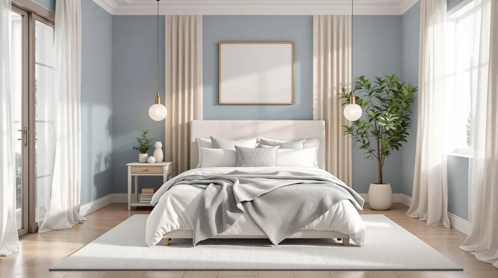
Best Blue Paint Colors for a Tranquil Master Bedroom

Blue paint colors remain one of the most popular choices for master bedrooms, creating a naturally peaceful atmosphere that promotes rest and relaxation. The right shade of blue can transform your sleeping space into a personal sanctuary.
Pale Sky Blues for a Soothing Atmosphere
Pale sky blues offer an excellent option for creating a serene, calming environment in your master bedroom. Dew Drop by Sherwin-Williams provides a soft, gentle feel that instantly soothes the senses and helps reduce stress. Stargazer presents a beautiful mid-tone, dusty gray-blue with subtle green undertones, perfect for establishing a peaceful ambiance that encourages quality sleep. For those seeking ultimate tranquility, Sleepy Blue by Sherwin-Williams delivers exactly what its name suggests – a light, gentle blue that promotes relaxation and creates an atmosphere conducive to rest.
Navy Blues for Drama and Depth
Navy blues bring sophistication and drama to a master bedroom while maintaining a restful quality. New Providence Navy by Benjamin Moore creates a bold, sophisticated look with its deep navy tone that adds impressive depth to any bedroom space. In the Navy by Portola offers a rich, sumptuous blue that establishes a cozy yet luxurious atmosphere, making your bedroom feel like a high-end retreat. These darker blues work particularly well in larger bedrooms or spaces with abundant natural light, where they create an enveloping sense of comfort without making the room feel small.
Teal Blues for a Touch of Luxury
Teal blues combine the calming qualities of blue with the refreshing aspects of green, creating a unique luxury feel. Embellished Blue features light, minty-green blue tones with warm undertones that bring a luxurious yet relaxing vibe to any bedroom setting. Mount Saint Anne 1565 by Benjamin Moore offers a sophisticated blue-green with a gray base, adding distinctive character to your space while maintaining a serene atmosphere. Teal blues pair beautifully with metallic accents like brass or gold, elevating the overall design of your master bedroom while still promoting restful sleep.
Best Green Paint Colors for a Refreshing Master Bedroom

Green paint colors offer a perfect balance of tranquility and rejuvenation for master bedrooms, connecting your space to nature while creating a refreshing atmosphere conducive to rest.
Sage Greens for Natural Calm
Sage greens bring an earthy serenity to any master bedroom with their subtle, grounded appeal. Benjamin Moore’s Saybrook Sage delivers a soft, earthy green tone that effortlessly harmonizes with natural textures like jute rugs and wooden furniture. October Mist, another standout from Benjamin Moore, offers a muted gray-green palette that serves as an ideal neutral base for various bedroom styles. Sherwin-Williams’ Evergreen Fog enriches spaces with its sophisticated gray-green depth, creating an inviting atmosphere perfect for unwinding after long days. For those seeking a lighter touch, Benjamin Moore’s Meadow Mist provides a breezy, light green option that enhances relaxation potential. These calming hues work beautifully alongside warm cream accents and subtle black fixtures to create a balanced, restful environment.
Mint Greens for a Fresh Approach
Mint greens infuse bedrooms with energizing freshness while maintaining a soothing quality ideal for sleep spaces. Johnstone’s Julep Green offers a soft aqua tone that can revitalize even the smallest master bedrooms, pairing exceptionally well with cool grays or crisp whites. Benjamin Moore’s Halo OC-46 delivers a silvery green finish that adds airiness and brightness to master suites, making spaces feel more expansive and welcoming. Gray Cashmere 2138-60, also from Benjamin Moore, strikes the perfect balance between blue and green with its muted, tranquil tone that fosters peaceful sleep environments. These mint variations provide versatile options for creating refreshing bedroom retreats that still promote restfulness and relaxation.
Olive Greens for Earthy Connection
Olive greens establish a profound connection to nature while adding sophisticated depth to master bedrooms. Farrow & Ball’s Treron brings a soft olive tone that bridges traditional and modern design styles, creating timeless appeal in any bedroom setting. Green Smoke, another Farrow & Ball favorite, delivers a smoky juniper quality that adds dramatic flair while maintaining earthy groundedness. These rich hues complement cognac leather accents and black fixtures beautifully, creating striking contrast in bedroom designs. Benjamin Moore’s muted olive tones work exceptionally well with organic textures like wood paneling, helping establish a natural aesthetic that feels both luxurious and connected to the outdoors. The earthy undertones in these paints create cocooning spaces that invite relaxation while adding character and depth to master bedroom retreats.
Best Warm Paint Colors for an Inviting Master Bedroom

Warm paint colors can transform your master bedroom into a cozy sanctuary that welcomes you at the end of each day. These hues create an atmosphere of comfort and intimacy, perfect for unwinding and relaxation.
Blush Pinks for Subtle Warmth
Benjamin Moore’s Pomegranate offers a sophisticated approach to pink, presenting a muted pink-red tone that brings warmth without overwhelming intensity. This versatile shade works beautifully in both traditional and contemporary bedroom designs. We recommend pairing Pomegranate with neutral tones like soft whites or light grays to maintain a soothing ambiance while adding a touch of understated elegance. Many designers appreciate how blush tones create a flattering glow that complements various skin tones and makes the space feel more inviting.
Terracotta and Clay for Grounded Energy
Jotun’s Natural Clay delivers a burnt orange hue that provides earthy comfort with its muted yet cheerful tone. This shade particularly complements bedrooms with terracotta floors or warm beige accents, creating a cohesive and rustic warmth throughout the space. Benjamin Moore’s Autumn Orange brings a golden orange depth that evokes the cozy feeling of sitting beside a fireplace. These clay-inspired colors connect your bedroom to natural elements, promoting feelings of stability and comfort that enhance sleep quality while adding visual interest through their rich undertones.
Muted Yellows for Gentle Sunshine
Warm yellows with ochre undertones can bathe your bedroom in what feels like permanent soft sunlight. Sherwin-Williams’ Neutral Ground provides a warm white base that serves as an excellent foundation for layering sun-inspired accents throughout your space. This approach allows you to adjust the intensity of yellow in your bedroom design while maintaining a versatile palette. Yellow tones psychologically promote optimism and energy, making them ideal for master bedrooms that double as morning reading or meditation spaces.
Additional Warm Neutrals
Sherwin-Williams Willowleaf introduces subtle green-neutral energy to your bedroom without sacrificing the tranquil atmosphere essential for restful sleep. Farrow & Ball Cola, a deep rich brown, creates striking contrast when paired with their pink-white Tailor Tack, establishing a sophisticated rural-inspired coziness. Roman Column offers a warm white that harmonizes beautifully with beige and black accents, creating a refined atmosphere that balances warmth with elegance.
For those seeking bold statements, Benjamin Moore Caliente energizes bedroom spaces with its radiant red presence. Their Raspberry Blush, the 2023 Color of the Year, adds vibrant warmth that transforms ordinary bedrooms into passionate retreats. We advise balancing these intense hues with neutrals or cooler tones on adjacent walls to prevent visual overwhelm while still enjoying their energizing qualities.
Best Dark Paint Colors for a Dramatic Master Bedroom

Dark paint colors create a cocoon-like atmosphere that transforms your master bedroom into a sophisticated retreat. These deeper hues add instant drama while promoting relaxation and rest—perfect for creating your nighttime sanctuary.
Deep Charcoals for Modern Sophistication
Dark grey stands as the quintessential choice for adding depth and intimacy to a master bedroom, creating a modern and sophisticated backdrop that works with virtually any design style. This versatile neutral pairs beautifully with both bold accent colors and soft neutrals like beige or ivory, allowing flexibility in your bedroom’s overall palette. Sherwin Williams’ Naval offers a compelling alternative with its dark navy blue tone that introduces strong, dramatic flair while maintaining the restful qualities essential for a bedroom space. These charcoal and near-black options serve as perfect canvases for highlighting architectural features or creating a cozy atmosphere that encourages quality sleep and relaxation.
Rich Burgundies for Classic Luxury
Middlebury Brown delivers a warm, rich shade that instantly evokes classic luxury when applied to bedroom walls, creating a timeless elegance that never feels trendy or dated. This deep hue provides a sophisticated foundation that elevates the entire room, complementing both traditional and transitional furniture styles with equal grace. Benjamin Moore’s Dark Olive presents another option within this color family, offering deeper, richer tones that add substantial warmth and depth to your master bedroom retreat. These rich, saturated colors work particularly well in rooms with ample natural light or in spaces where you want to create an intimate, enveloping atmosphere that feels both luxurious and comforting.
Dark Teals for Jewel-Toned Elegance
Seaworthy paint transforms a master bedroom with its darker, bluer shade that brings dramatic luxury while maintaining a connection to nature’s calming elements. This sophisticated color creates a perfect backdrop for gold or brass accents, allowing metallic elements to shine against the rich teal depth. Behr’s Hosta Leaf, though leaning more green than teal, offers another jewel-toned option that adds remarkable elegance and character to bedroom walls. Additional deep blue options like Behr Ink Black (featuring gray undertones) and Behr Starless Night provide alternatives that create dramatic yet calming ambiances ideal for master bedrooms. These jewel-toned colors work exceptionally well when balanced with light-colored bedding and natural wood tones, creating a harmonious space that feels both opulent and restful.
How to Choose the Perfect Paint Color for Your Master Bedroom

Selecting the ideal paint color for your master bedroom involves more than just picking a shade you like. The right choice can transform your space into a personal sanctuary that promotes relaxation and restful sleep.
Consider Your Room’s Natural Light
Natural light dramatically affects how paint colors appear on your walls. North-facing bedrooms receive cooler light that works beautifully with warm neutrals like Sherwin-Williams’ Neutral Ground, creating a balanced atmosphere. South-facing rooms have the flexibility to accommodate cooler tones such as Benjamin Moore’s Simply White OC-117 or soft grays without feeling cold. Rooms with limited natural light benefit significantly from light-reflecting colors like Studio McGee’s Westhighland White, which can make your space feel brighter and more open. The direction your windows face creates unique lighting conditions that will interact differently with various paint colors throughout the day.
Coordinate with Existing Furniture and Decor
Neutral palettes including whites, beiges, and light grays create versatility and seamlessly coordinate with most furniture styles and decor elements. For a subtle refresh that maintains harmony, consider green-gray neutrals like Sherwin-Williams’ Willowleaf or Benjamin Moore’s earthy Coriander Seed, which enhance natural materials such as wood or linen. Bold or statement furniture pieces pair exceptionally well with more muted wall tones to prevent visual competition and maintain a serene environment. Your bedroom’s existing color scheme should guide your paint selection, ensuring a cohesive look that feels intentional rather than disjointed.
Test Before Committing with Sample Swatches
Evaluating paint colors under various lighting conditions is essential before making your final decision. Both Behr and Benjamin Moore recommend applying sample swatches on multiple walls to observe how the colors appear throughout the day and night. Colors like Sherwin-Williams’ Celestial (a cool violet) may appear bluer during daylight hours and take on warmer undertones under artificial lighting, highlighting the importance of thorough testing. Paint at least a 2′ x 2′ section on different walls to accurately assess how the color interacts with your exact space. Many paint brands now offer peel-and-stick samples that make this testing process neater and more convenient than traditional paint samples.
Emerging Bedroom Paint Color Trends to Consider

Earth-Inspired Neutrals
Earth-inspired neutrals are dominating the 2025 color forecast with their subtle elegance and versatility. Benjamin Moore’s Cinnamon Slate 2113-40, named Color of the Year 2025, offers a sophisticated blend of heathered plum and velvety brown tones that create understated refinement in master bedrooms. Sherwin-Williams contributes to this trend with their 2025 Collection featuring Snowbound and Stucco, providing versatile and calming base options that work beautifully in spaces of any size. These earthy neutrals create a grounding effect that promotes restful sleep while maintaining design flexibility.
Deep Blues
Deep blue hues continue to gain momentum for their ability to create serene bedroom environments. Benjamin Moore’s Hale Navy delivers a timeless depth that works particularly well as an accent wall behind the bed, while Sherwin-Williams’ Rain Cloud offers a softer approach to this trend. Blue-black tones present an excellent opportunity for creating modern contrast when paired with vibrant artwork or textiles. These deeper shades absorb light rather than reflect it, making them perfect for bedrooms where quality sleep is a priority.
Vibrant Yellows
Vibrant yellow tones are bringing optimistic energy to bedroom designs without overwhelming the senses. Sherwin-Williams’ Brittlebush and Sun Salutation introduce mustard and saffron-adjacent shades that add warmth while maintaining a sophisticated aesthetic. Dulux’s True Joy, part of their 2025 forecast, delivers a similar earthy yellow that inspires positivity and comfort. These yellows work beautifully in bedrooms that receive plenty of natural light, creating a gentle sunshine effect that energizes the space during daylight hours.
Soft Greens
Soft green tones are emerging as popular choices for their connection to nature and calming properties. Sherwin-Williams’ Sea Salt introduces a muted blue-green serenity that adapts beautifully to changing light throughout the day. Benjamin Moore’s Herb Garden blends forest green with subtle yellow undertones, creating depth and interest that works well in both traditional and contemporary bedroom designs. These gentle green hues promote restoration and balance, making them ideal choices for master bedrooms functioning as personal sanctuaries.
Bold Accents
Bold accent colors are making their way into bedroom design through strategic applications that avoid overwhelming the space. Chartreuse balances yellow-green energy with soft blue accents, creating ever-changing contrast that adds personality to neutral foundations. Peachy pink tones offer a universally flattering option that remains calming while introducing warmth and character. These bold choices are best implemented through accent walls or decorative elements rather than painting the entire room, allowing for expression without compromising the bedroom’s restful atmosphere.
Color Psychology: How Your Paint Choice Affects Sleep and Mood

The Science Behind Color Impact
Colors affect us on both physiological and psychological levels. Studies show that our brains process color information immediately, triggering exact responses that influence our mood, heart rate, and even sleep patterns. Cool colors like blues and greens typically lower blood pressure and heart rate, creating ideal conditions for rest. Warm colors such as reds and oranges, on the other hand, tend to stimulate the mind and increase energy levels, which might not be optimal for a space dedicated to sleep.
Cool Colors for Better Sleep
Blue tones consistently rank as the best bedroom colors for promoting quality sleep. Sherwin-Williams’ Celestial exemplifies the type of soft blue that creates a tranquil atmosphere conducive to falling asleep faster. Green shades like Willowleaf from Sherwin-Williams offer a refreshing feel while maintaining the calming benefits of cool colors. Purple variations, especially lighter lavenders, combine the restfulness of blue with a touch of warmth, fostering both relaxation and comfort in your sleeping environment.
Warm Colors for Comfort and Coziness
Warm neutrals provide comfort without the stimulating effects of brighter warm hues. Benjamin Moore’s Coriander Seed introduces a gentle warmth while preserving the calm ambiance essential for a master bedroom. Light beiges and soft browns create a cozy cocoon effect that feels embracing rather than overwhelming. These colors work exceptionally well in bedrooms with northern exposure, where natural light tends to be cooler and less intense throughout the day.
Neutrals for Versatility and Balance
White and light gray paint colors like Benjamin Moore’s Simply White and Sherwin-Williams’ Westhighland White create serene environments that promote mental clarity. These neutral backdrops allow for versatility in décor while maintaining a clean, uncluttered feeling that reduces mental stimulation. Taupe shades bridge the gap between cool and warm, offering the perfect balance for those who want the benefits of both color families while maintaining a sophisticated aesthetic appropriate for a master retreat.
Avoiding Sleep Disruptors
Bright, saturated colors can disrupt sleep patterns by preventing the brain from properly downshifting at night. Very dark colors might create a cozy atmosphere but can sometimes feel oppressive or make the room appear smaller. We recommend avoiding highly stimulating colors like bright red or neon shades in master bedrooms, as these can increase alertness and make it harder to transition to sleep. Instead, opt for muted versions of your favorite colors if you want to incorporate them into your bedroom design.
Creating Color Combinations: Accent Walls and Trim Options

Strategic Accent Walls
Accent walls serve as powerful focal points in master bedrooms, creating visual interest without overwhelming the space. We recommend using a deeper or bolder version of your main color to create striking contrast that still maintains harmony. For instance, if you’ve chosen light blue for most walls, a navy accent wall like Benjamin Moore’s Hale Navy can add rich dimension to your bedroom sanctuary. Accent walls work particularly well behind headboards or on walls with architectural features you want to highlight.
Complementary Trim Options
Trim selections dramatically influence how your wall colors appear and can elevate your entire bedroom design. White or light-colored trim provides a clean, sophisticated look that works exceptionally well against earthy tones or dark backgrounds. Crown molding, baseboards, and door frames in crisp white create definition and structure when paired with deeper wall colors like Valspar’s Encore blue. Natural wood trim offers warmth and organic texture that beautifully complements soft greens and earthy neutrals.
Winning Color Combinations
These tried-and-tested color pairings deliver designer-worthy results in master bedrooms:
- Blue and White – Hale Navy blue walls with white trim create a timeless, sophisticated atmosphere that promotes relaxation and better sleep quality.
- Neutral and Yellow – Earthy neutral walls paired with vibrant yellow accent features (like Sherwin-Williams’ Sun Salutation) introduce warmth and positive energy without overwhelming the senses.
- Green and Wood – Soft green walls such as Sherwin-Williams’ Sea Salt combined with natural wood trim establish a harmonious, nature-inspired environment that feels both calming and refreshing.
Ceiling Considerations
The ceiling presents another opportunity to enhance your color scheme. A slightly lighter version of your wall color applied to the ceiling can make the room feel cozier and more cohesive. Alternatively, a crisp white ceiling paired with colorful walls creates a sense of height and airiness. For a bold statement in rooms with good height, consider painting the ceiling in a complementary accent color that ties into your overall palette.
Balancing Bold and Neutral
When incorporating vibrant colors like Dulux’s True Joy yellow, we recommend balancing them with neutrals to maintain a restful environment. A bright accent wall can invigorate a space predominantly painted in soothing neutrals. This approach lets you enjoy the psychological benefits of energetic colors while preserving the tranquil atmosphere essential for quality sleep. The 60-30-10 rule works well here—60% neutral base color, 30% secondary color, and 10% accent color.
Conclusion: Finding Your Perfect Master Bedroom Paint Color
The perfect paint color transforms your master bedroom into a personalized sanctuary where you can truly unwind. Whether you’re drawn to calming blues green neutrals or warm earth tones the right shade should reflect your personality while promoting rest.
Remember to consider your room’s lighting furniture and your own color preferences. Don’t hesitate to test samples in different lighting conditions before making your final decision. Color psychology plays a important role too—choose hues that support your sleep and emotional wellbeing.
We’ve shared designer favorites and upcoming trends but eventually the best color is one that makes you feel at home. Your master bedroom should be your retreat from the industry and the right paint color is your first step toward creating that peaceful haven.
Frequently Asked Questions
What impact does paint color have on a master bedroom?
Paint color sets the foundation for your bedroom’s atmosphere, influencing mood, sleep quality, and overall wellbeing. The right color transforms your space into a personal sanctuary that promotes relaxation and rest. Studies show certain colors like blues can actually lower heart rate and blood pressure, creating a more calming environment.
Which paint colors are best for promoting sleep?
Cool colors like blues and greens are scientifically proven to promote better sleep by lowering blood pressure and heart rate. Specific recommendations include Sherwin-Williams’ Celestial and lighter lavenders for their calming effects. Avoid bright, saturated colors that can disrupt sleep patterns and instead choose muted, softer tones for your bedroom.
How should I choose paint colors for a north-facing bedroom?
North-facing bedrooms typically receive cooler, less direct light, making colors appear more muted. Warm neutrals like Benjamin Moore’s Coriander Seed or Sherwin-Williams’ Neutral Ground work well to counterbalance the cool light. Always test paint samples on your walls to see how they look throughout the day before making a final decision.
What are the trending bedroom paint colors for 2025?
The 2025 trends favor earth-inspired neutrals like Benjamin Moore’s Cinnamon Slate, deep blues such as Hale Navy, vibrant but controlled yellows like Sherwin-Williams’ Brittlebush, and soft greens including Sea Salt. These colors balance current design preferences with timeless appeal while creating peaceful bedroom environments.
How do I create an accent wall in my bedroom?
Choose a deeper or bolder version of your main wall color for your accent wall, typically the wall behind your bed. Ensure it complements your bedroom’s overall color scheme and existing furniture. For sophisticated combinations, try pairing blue with white, neutrals with yellow, or green with wood tones for designer-worthy results.
Should ceiling paint match the walls in a bedroom?
Not necessarily. While a lighter ceiling than your walls can make a room feel more spacious, painting the ceiling the same color as walls can create coziness in larger rooms. For a bold statement, consider a contrasting or complementary color, but be mindful that darker ceiling colors can make a room feel smaller.
How do neutral paint colors affect bedroom atmosphere?
Neutrals create versatile, timeless backdrops that promote relaxation. Soft whites and creams like Farrow & Ball’s Wevet offer elegant simplicity, warm beiges provide cozy comfort, and sophisticated grays like Benjamin Moore’s Gray Owl deliver modern appeal. Neutrals also allow flexibility with changing decor and furniture styles over time.
What’s the best way to test paint colors before committing?
Purchase sample pots and paint large swatches (at least 2 feet square) on multiple walls. Observe these samples at different times of day to see how natural and artificial lighting affects the color. Consider how the color appears next to your furniture, flooring, and textiles before making your final decision.
How can I use color psychology to improve my bedroom?
Understand how colors affect your personal response: blues and greens promote calm, warm neutrals create comfort, and soft whites establish serenity. Consider your specific needs—if you struggle with sleep, choose cooler tones; if your room feels cold, add warmer colors. The right color should make you feel relaxed when you enter the room.
What is the 60-30-10 rule for bedroom color distribution?
This designer guideline suggests using your primary color on approximately 60% of the room (usually walls), a secondary color on 30% (bedding, furniture), and an accent color on 10% (accessories, artwork). This balanced approach creates visual interest while maintaining a cohesive, restful environment in your master bedroom.


