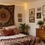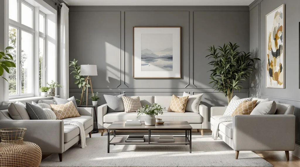
Choosing the perfect gray paint color for your living room can transform an ordinary space into a sophisticated haven. We’ve seen how this versatile neutral creates the ideal backdrop for any décor style, whether you’re aiming for modern minimalism or cozy traditional comfort.
But not all grays are created equal. The wrong shade can leave your living room feeling cold and unwelcoming, while the right one enhances natural light and complements your furnishings beautifully. We’ll guide you through the top gray paint colors that interior designers consistently recommend, helping you navigate undertones, lighting considerations, and complementary color schemes to find your perfect match.
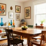
The Timeless Appeal of Gray in Living Room Design
Gray has established itself as a cornerstone in interior design, offering unmatched versatility that withstands changing trends. Unlike fleeting color fads, gray paint creates a sophisticated foundation that allows furniture and accessories to take center stage. Many designers favor gray for its ability to bridge traditional and contemporary styles, making it an ideal choice for homeowners seeking longevity in their living room design.
The psychological impact of gray can’t be overlooked when considering paint colors. This neutral hue promotes calmness and balance, transforming living rooms into serene sanctuaries after hectic days. Studies show that gray environments can reduce visual noise and create spaces conducive to relaxation. Professional designers often recommend gray walls for clients seeking a space that feels both elegant and restful.
Lighting interacts uniquely with gray paint, creating ever-changing environments that shift subtly throughout the day. Morning light brings out warmer undertones, while evening illumination can enhance cooler aspects of the same color. This chameleon-like quality gives gray-painted living rooms visual interest without requiring additional decorative elements. Natural light particularly complements gray walls, highlighting architectural features while maintaining a consistent aesthetic.
Decorating with gray offers unprecedented flexibility that few other colors can match. Gray walls provide the perfect backdrop for virtually any accent color—vibrant jewel tones, soft pastels, or bold primaries all work harmoniously against gray backgrounds. Many homeowners appreciate how gray paint allows them to update their decor seasonally without repainting. Design magazines regularly showcase gray living rooms precisely because of this adaptability to diverse styling approaches.
10 Best Light Gray Paint Colors for a Bright, Airy Living Room

Selecting the perfect light gray paint can transform your living room into a bright, welcoming space that feels both modern and timeless. These top ten light gray options offer versatility while creating an airy atmosphere.
Benjamin Moore’s “Gray Owl”
Benjamin Moore’s Gray Owl stands out as a classic, soft gray that creates an ideal backdrop for any living room design. This versatile shade features complementary undertones that work harmoniously with both warm and cool color schemes. Designers frequently recommend Gray Owl for its ability to adapt to changing light conditions throughout the day. Furniture pieces of various styles and colors pop beautifully against this balanced neutral background. The subtle depth of Gray Owl allows it to appear slightly different depending on your room’s natural light exposure, making it a sophisticated choice for open-concept living spaces.
Sherwin-Williams’ “Repose Gray”
Sherwin-Williams’ Repose Gray delivers exceptional versatility with its warm undertones that prevent spaces from feeling cold or sterile. This popular shade works remarkably well in both bright rooms flooded with natural light and spaces with limited windows. Repose Gray creates a welcoming atmosphere that complements wood furniture and decorative elements with ease. Many interior designers favor this shade for its ability to bridge traditional and contemporary design styles. The paint’s warm characteristics make it particularly suited for north-facing living rooms that need additional warmth and depth.
Behr’s “Silver Drop”
Behr’s Silver Drop offers a crisp, light gray finish that instantly enhances the brightness of any living room. This refreshing shade reflects natural light beautifully, making it perfect for smaller spaces that need to feel more expansive. Silver Drop features subtle warm undertones that prevent it from appearing too cool or clinical. The paint creates an excellent neutral foundation that allows your furniture and accessories to take center stage. Homeowners appreciate how this adaptable color transitions smoothly between different lighting conditions while maintaining its airy quality throughout the day.
8 Perfect Mid-Tone Gray Paint Colors for Balanced Living Spaces

Looking for that perfect middle-ground gray that works in any lighting condition? Mid-tone grays offer exceptional versatility, providing enough depth to create interest while maintaining a neutral backdrop for your living room design.
Benjamin Moore’s “Stonington Gray”
Benjamin Moore Stonington Gray HC-170 stands out as a sophisticated mid-gray with subtle blue undertones that come alive in natural light. With an LRV of 59.74, this shade strikes the perfect balance between light absorption and reflection, making it remarkably versatile across different times of day. We’ve found Stonington Gray particularly effective when used on accent walls where its distinctive character can shine without overwhelming the space. This shade pairs beautifully with wood trim, creating a refined contrast that enhances architectural features throughout your living room.
Sherwin-Williams’ “Agreeable Gray”
Sherwin-Williams Agreeable Gray SW 7029 lives up to its name as one of the most accommodating gray paint colors available today. This greige-leaning gray boasts an LRV of 60, offering warmth without introducing strong or distracting undertones. Agreeable Gray functions brilliantly as a neutral base for diverse decor schemes, from minimalist modern to classic traditional styles. The color’s balanced nature allows it to adapt seamlessly to changing light conditions throughout the day, maintaining its inviting character whether bathed in morning sunlight or evening lamp light. Many designers choose this shade for its exceptional ability to complement nearly any accent color or furniture style.
Farrow & Ball’s “Pavilion Gray”
Farrow & Ball Pavilion Gray No. 242 delivers authentic historical character with contemporary appeal, making it a favorite among designers seeking a balanced stone gray. This timeless shade provides the perfect mid-tone depth for living spaces where you want color with restraint. Pavilion Gray showcases the exceptional pigment quality Farrow & Ball is known for, resulting in a rich, nuanced finish that creates depth even in smaller living rooms. The color’s adaptability allows it to shift subtly throughout the day, appearing slightly warmer in artificial light and crisper in natural daylight. We recommend Pavilion Gray for homes where architectural authenticity matters, as it complements both traditional moldings and contemporary furnishings with equal sophistication.
6 Dramatic Dark Gray Paint Colors for Sophisticated Living Rooms

When you’re ready to make a bold statement in your living space, dramatic dark gray paint colors deliver unmatched sophistication and depth. These rich hues create an elegant backdrop that can transform an ordinary living room into a luxurious retreat.
Benjamin Moore’s “Kendall Charcoal”
Benjamin Moore’s Kendall Charcoal stands as one of the most rich and saturated charcoal options available today. This dramatic shade features perfectly balanced undertones that prevent it from leaning too cool or warm, making it exceptionally versatile. Interior designers frequently recommend Kendall Charcoal for statement accent walls that command attention without overwhelming the space. The depth of this color works beautifully on cabinetry and built-ins, creating architectural interest even in simpler rooms. Many homeowners appreciate how this paint color pairs effortlessly with both natural wood elements and metallic accents for a sophisticated look that feels both timeless and contemporary.
Sherwin-Williams’ “Dorian Gray”
Sherwin-Williams’ Dorian Gray delivers a deep, warm gray that instantly elevates any living space with its sophisticated character. This sumptuous shade carries subtle brown undertones that prevent it from feeling cold or stark, creating an inviting atmosphere even in larger rooms. Designers appreciate how Dorian Gray maintains its warmth throughout the day, adapting beautifully to changing light conditions while maintaining its rich personality. The color works exceptionally well in traditional living spaces with classic architectural details, highlighting moldings and trim without competing with them. Many homeowners find that Dorian Gray provides the perfect backdrop for displaying artwork and collectibles, as it offers enough depth to feel substantial without overwhelming curated pieces.
Behr’s “Dark Pewter”
Behr’s Dark Pewter offers remarkable versatility as a dramatic gray that bridges modern and traditional design aesthetics. This balanced dark gray maintains neutral undertones that avoid skewing overtly cool or warm, making it suitable for diverse interior styles and color schemes. Homeowners particularly value Dark Pewter for its ability to anchor a space without creating a heavy or oppressive feeling, even when used on all four walls. The paint’s excellent coverage and rich pigmentation deliver a professional-looking finish that transforms ordinary living rooms into sophisticated gathering spaces. Interior designers often pair Dark Pewter with lighter neutrals and pops of jewel tones to create ever-changing, layered living rooms that feel both timeless and on-trend.
Farrow & Ball’s “Downpipe”
Farrow & Ball’s Downpipe has earned cult status among interior designers for its complex, dark graphite quality that shifts dramatically with lighting conditions. This sophisticated charcoal gray contains subtle blue-green undertones that create remarkable depth and character impossible to achieve with flat, one-dimensional grays. Downpipe transforms living rooms into moody, intimate spaces perfect for both daytime relaxation and evening entertaining. The color works brilliantly in both contemporary spaces with clean lines and traditional rooms with ornate architectural details. Many homeowners find that this rich hue makes furniture and artwork stand out more vividly, particularly pieces featuring cream, gold, or burgundy tones.
PPG’s “Knight’s Armor”
PPG’s Knight’s Armor delivers a powerful charcoal gray with exceptional depth that creates instant drama in any living space. This bold shade carries subtle blue undertones that feel contemporary and sophisticated without becoming too cold or industrial. Designers frequently use Knight’s Armor on feature walls behind fireplaces or entertainment centers to create a natural focal point within the room. The color’s rich pigmentation allows it to maintain its distinct character even in spaces with abundant natural light, rather than washing out like lesser dark grays. Homeowners appreciate how Knight’s Armor pairs beautifully with brass fixtures and natural materials, creating a balanced look that feels both grounded and luxurious.
Benjamin Moore’s “Chelsea Gray”
Benjamin Moore’s Chelsea Gray offers a perfectly balanced medium-dark gray that delivers sophistication without the heaviness of deeper charcoals. This versatile shade maintains its warm, inviting quality throughout the day, adapting beautifully to both natural and artificial lighting conditions. Interior designers frequently recommend Chelsea Gray for living rooms that need grounding without appearing too somber or dramatic. The paint’s exceptional formulation delivers a smooth, even finish that highlights architectural details while creating a cohesive backdrop for diverse decorating styles. Many homeowners find Chelsea Gray creates the perfect canvas for layering textiles and accent pieces, allowing furniture and accessories to take center stage while still providing rich character to the space.
5 Warm Gray Paint Colors (Greige) for Cozy Living Rooms

Warm gray paints, often called greige (a blend of gray and beige), create the perfect balance of sophistication and comfort in living spaces. These versatile neutrals offer warmth without feeling too beige or too cool, making them ideal choices for creating inviting living rooms.
Benjamin Moore’s “Revere Pewter”
Benjamin Moore’s “Revere Pewter” stands as one of the most timeless greige options available today. This exceptional shade features subtle brown undertones that bring natural warmth and coziness to any living room. Homeowners love its versatility across different lighting conditions, maintaining its welcoming character throughout the day. Interior designers frequently recommend this shade for its ability to complement various décor styles from traditional to contemporary. The color’s balanced warmth makes it particularly suitable for north-facing rooms that need additional warmth to counter cooler natural light.
Sherwin-Williams’ “Mindful Gray”
Sherwin-Williams’ “Mindful Gray” delivers a gentle warmth that transforms living spaces into serene retreats. Its beige undertones create a soothing atmosphere that feels both contemporary and timeless. Designers appreciate how this versatile greige pairs beautifully with both cool and warm accent colors, allowing for flexible decorating options. The paint’s depth provides enough character to stand on its own while remaining neutral enough to serve as a backdrop for statement furniture pieces. Many homeowners report that “Mindful Gray” helps create a calm, peaceful environment that perfectly balances modern aesthetics with cozy comfort.
Behr’s “Sculptor Clay”
Behr’s “Sculptor Clay” combines earthy richness with subtle gray tones, creating an exceptionally warm and inviting living room environment. This distinctive greige incorporates natural clay-like qualities that add dimension and character to walls without overwhelming the space. Decorators frequently choose this shade for rooms that need additional warmth and grounding elements. The color’s unique composition makes it particularly effective at improving wood tones and natural textiles throughout the living area. Performance reviews consistently highlight how “Sculptor Clay” maintains its warm properties even in spaces with limited natural light, preventing the dreary feeling that can occur with cooler grays.
Sherwin-Williams’ “Repose Gray”
Sherwin-Williams’ “Repose Gray” offers remarkable versatility with its balanced warm undertones. Though not technically a pure greige, this shade leans warm enough to create cozy living environments while maintaining a sophisticated gray appearance. The paint performs exceptionally well in low-light conditions, where it retains its warmth rather than turning flat or dull. Decorators frequently pair “Repose Gray” with cream, navy, or sage green accents to maximize its adaptable nature. Homeowners particularly value how this color creates a comfortable ambiance while still providing the contemporary appeal of a gray palette.
Benjamin Moore’s “Galveston Gray”
Benjamin Moore’s “Galveston Gray” delivers a welcoming earth-tone hue that instantly creates a warm atmosphere in living rooms. This rich greige incorporates subtle warm undertones that make spaces feel intentionally designed and inviting. Designers often recommend this shade for creating cohesive open-concept spaces where the living room flows into other areas. The color’s depth provides excellent coverage while maintaining a neutral versatility that complements various decorating styles. Many homeowners find that “Galveston Gray” creates the perfect cozy backdrop for family gatherings and relaxation, embodying the ideal balance between sophisticated gray and welcoming warmth.
4 Cool Gray Paint Colors for Modern Living Spaces

Cool gray tones create a sleek, contemporary look in living spaces, offering a perfect backdrop for modern furniture and decor. These sophisticated shades provide a crisp aesthetic that works beautifully in spaces with plenty of natural light.
Benjamin Moore’s “Wickham Gray”
Benjamin Moore’s “Wickham Gray” stands as a perfectly balanced medium gray that transforms any living room into a sophisticated retreat. This versatile shade provides a clean backdrop that complements various design styles while maintaining a distinctly modern feel. Many designers choose Wickham Gray for its ability to shift subtly throughout the day, appearing slightly cooler in morning light and warmer as the sun sets. The color’s balanced undertones prevent it from leaning too blue or green, making it an excellent choice for open-concept living areas where color continuity matters.
Benjamin Moore’s “Storm”
Benjamin Moore’s “Storm” delivers a cool, light gray that instantly modernizes living spaces without feeling cold or clinical. This sophisticated shade creates a perfect backdrop that makes furniture and decorative elements visually pop against its subtle surface. Interior designers frequently recommend Storm for its airy quality that expands smaller living rooms while maintaining depth and character. The color’s versatility allows it to pair beautifully with both bold accent colors and more neutral palettes, making it ideal for homeowners who like to refresh their decor seasonally.
Sherwin-Williams’ “Repose Gray”
Sherwin-Williams’ “Repose Gray” offers a remarkably neutral tone with just enough warm undertones to prevent it from feeling stark or industrial. This adaptable gray performs exceptionally well in living rooms with varying light conditions, maintaining its character throughout the day. Designers frequently select Repose Gray for its chameleon-like quality that complements both cool and warm decor elements with equal ease. The color creates a sophisticated foundation that works beautifully with modern furnishings while still feeling timeless enough to transition through changing design trends.
Sherwin-Williams’ “Comfort Gray”
Sherwin-Williams’ “Comfort Gray” creates a soothing environment that balances contemporary style with inviting warmth. This distinctive shade adds depth to living spaces without overwhelming the room or making it feel closed in. Interior stylists often choose Comfort Gray for its unique ability to feel both fresh and grounded simultaneously, making it perfect for family living rooms that need to be both stylish and livable. The color pairs exceptionally well with natural materials like wood and stone, creating an elegant harmony that enhances modern architectural features while maintaining a comfortable, relaxed atmosphere.
How to Choose the Perfect Gray Paint for Your Living Room

Selecting the ideal gray paint requires careful consideration of several key factors to ensure your living room achieves the sophisticated look you desire. Let’s explore the essential elements that will guide you to the perfect shade.
Consider Your Natural Light
The amount of natural light your living room receives dramatically impacts how gray paint will appear on your walls. Rooms with limited sunlight benefit from lighter gray tones like Sherwin Williams’ Repose Gray, which features warm undertones that prevent the space from feeling cold or dim. Abundant natural light allows for more flexibility, where medium to dark grays like Charcoal can create an elegant, cozy atmosphere without making the room feel small. Light exposure throughout the day will transform your gray walls, so observe your room at different times to understand how the lighting changes the space before making your final selection.
Evaluate Your Existing Furniture and Décor
Your current furnishings play a crucial role in determining the most complementary gray shade for your living room. Greige options provide exceptional versatility, effortlessly harmonizing with various furniture styles while adding warmth to the space. Blue-gray selections such as Benjamin Moore’s Colorado Gray deliver a cool, calming aesthetic but require careful consideration to ensure they don’t clash with existing warm-toned elements. Furniture with wood tones typically pairs beautifully with warmer grays, while modern, metal-accented pieces often complement cooler gray variations. Taking inventory of your dominant décor colors helps narrow down the undertones that will enhance rather than compete with your existing design elements.
Test Before Committing
Paint samples represent the most valuable step in your gray paint selection process. Apply large swatches (at least 12×12 inches) of your top contenders directly on multiple walls rather than small patches. Sherwin Williams’ Network Gray might appear perfect on a paint chip but could reveal strong blue undertones once applied to your walls. Observe these samples during morning, afternoon, and evening to see how different lighting conditions affect the color throughout the day. Consider testing options like Misty Gray by Benjamin Moore, known for its adaptability across various lighting scenarios. The investment in sample pots prevents the costly mistake of painting an entire room in a shade that doesn’t achieve your desired effect once applied at full scale.
How to Test Gray Paint Colors in Your Living Room

Testing gray paint colors properly can make the difference between a living room you love and one that feels off. We’ve compiled expert-backed methods to ensure you select the perfect gray for your space.
Sample Multiple Colors Simultaneously
Always test at least 3-4 gray options side by side on your walls. Large sample areas of at least 2’x2′ give you a much better representation than tiny swatches. Place these samples on different walls throughout your living room to see how each color performs in various areas of the space. This side-by-side comparison highlights subtle undertone differences that might otherwise go unnoticed.
Observe Colors Throughout the Day
Gray paint colors transform dramatically as lighting changes throughout the day. Check your samples at dawn, midday, and evening to see how they shift. North-facing rooms tend to intensify cool undertones, making blue-leaning grays appear more prominent. South-facing rooms often bring out warmer undertones. This observation period helps identify colors that maintain their appeal across different lighting conditions.
Apply Over Neutral Primer
Using a gray-tinted primer underneath your test patches ensures accurate color representation. Standard white primers can distort how the true color will appear, especially when covering existing wall colors. The neutral base creates a clean canvas that allows you to evaluate the genuine shade without interference from previous paint jobs.
Evaluate Against Your Décor
Position furniture, artwork, and textiles near your paint samples to assess how they interact. Gray colors with subtle undertones might clash or harmonize with your existing décor in ways that aren’t immediately obvious. This step reveals whether a particular gray complements your wood tones, upholstery, and accessories.
Test Different Finishes
Paint sheen dramatically affects how gray colors appear on your walls. Eggshell finishes work best for living room walls, while satin finishes are ideal for trim. Higher sheens like satin amplify undertones and reflect more light, making the same color appear different depending on the finish. Sampling different sheens helps determine which finish best achieves your desired living room atmosphere.
Compare Light Reflectance Values
Grays with an LRV (Light Reflectance Value) between 55-65 typically offer balanced brightness in living rooms. Benjamin Moore’s Gray Owl has an LRV of 64.51, making it exceptionally versatile in various lighting conditions. Lower LRV numbers indicate darker shades that absorb more light, while higher numbers reflect more light and appear brighter. This technical measurement helps predict how a gray will impact your room’s overall brightness.
Identify Undertones with White Paper
Hold a pure white sheet of paper next to your gray samples to isolate and identify undertones. This contrast makes it easier to detect whether a gray leans blue, green, or purple. Sherwin Williams Big Chill (LRV 62) has a subtle blue undertone that becomes more apparent when compared against true white. Understanding these undertones prevents the surprise of discovering unwanted color casts after painting your entire living room.
Popular Gray Paint Color Combinations for Living Room Accent Walls

Bold Contrasts for Dramatic Impact
Creating striking visual interest in your living room starts with pairing Benjamin Moore Coventry Gray HC-169 with crisp whites like Chantilly Lace OC-65. This mid-tone cool gray serves as an excellent foundation for both traditional and modern living spaces. We’ve found that this combination works particularly well when you want to highlight architectural features or create a focal point in your room. The contrast between the cool gray and bright white creates a sophisticated look that makes furniture and artwork stand out beautifully against the backdrop.
Warm Neutral Pairings for Cozy Atmospheres
Sherwin Williams Repose Gray delivers exceptional versatility as a greige-leaning shade that pairs perfectly with earthy textures. Wooden beams, linen upholstery, and natural stone elements complement this warm gray beautifully. Your living room will feel instantly more inviting when this paint combination is applied, especially in spaces that receive inconsistent natural light throughout the day. The warm undertones in Repose Gray make it particularly suitable for north-facing rooms or areas with limited sunlight.
Dramatic Depth Combinations for Luxurious Spaces
Benjamin Moore Kendall Charcoal offers rich, saturated color that transforms any living room into a sophisticated retreat. This deep gray creates stunning contrast when paired with metallic accents like brass or chrome fixtures. Alternatively, Benjamin Moore Amherst Gray provides a timeless hybrid option that works beautifully for both exterior and interior applications. Your furniture pieces will appear more luxurious against these deeper gray backgrounds, especially when complemented by thoughtfully placed lighting that creates depth and dimension in the space.
Soft Balance for Transitional Styles
CIL Raindrop White, an off-white with subtle gray undertones, creates a soft and balanced look when paired with deeper grays like Benjamin Moore’s Galveston Gray. This neutral earth tone adds warmth while maintaining the sophisticated appeal of a gray palette. We recommend this combination for transitional living spaces where you’re blending traditional furnishings with more contemporary elements. The balance between the lighter and deeper tones creates visual interest without overwhelming the space, allowing your furniture and decor choices to remain the focal points in the room.
How to Accessorize Your Living Room Based on Your Gray Paint Choice

Benjamin Moore Gray Owl OC-52
Gray Owl’s cool undertones with hints of green-blue create the perfect backdrop for strategic accessorizing. We recommend incorporating blue or green accent pieces to enhance these subtle undertones naturally. Throw pillows, artwork, and decorative vases in these complementary shades will amplify Gray Owl’s serene quality. Light-colored furniture works exceptionally well against this paint color, creating a bright, airy feel throughout your space. Consider adding metallic accents in silver or brushed nickel to reflect light and maximize Gray Owl’s impressive 64.51 LRV rating.
Benjamin Moore Misty Gray
Misty Gray’s clean, bright appearance pairs beautifully with natural elements and textures. We suggest incorporating wood furniture pieces, jute rugs, and abundant greenery to create a soothing, organic living environment. This versatile shade performs admirably in both well-lit and low-light areas, making it adaptable to various room orientations. White or cream-colored upholstery creates a pleasing contrast against this particular gray, while black metal accents can add definition and visual interest. Layering different textiles like linen, cotton, and wool will add depth without overwhelming this balanced gray tone.
Sherwin Williams Repose Gray
Repose Gray’s warm undertones call for accessories that enhance its cozy character. We find that beige, taupe, and terracotta accents complement this shade particularly well, creating a cohesive color story throughout your living space. Warm-toned wood furniture – think walnut, cherry, or oak – brings out the richness in Repose Gray while maintaining a sophisticated atmosphere. Textural elements like woven blankets, plush area rugs, and tactile throw pillows amplify the welcoming quality of this paint color. Brass or gold metallic accents add warmth and elegance, reflecting the inviting nature of this popular gray shade. Plants with burgundy or amber-toned foliage can introduce subtle pops of color that harmonize beautifully with Repose Gray’s warm foundation.
The Most Popular Designer-Approved Gray Living Room Paint Colors of 2023
Choosing the perfect gray paint for your living room isn’t just about following trends—it’s about creating a space that feels uniquely yours. We’ve explored many options from light and airy to deep and dramatic shades that can transform your living area.
Remember that the ideal gray depends on your exact space’s lighting conditions and your existing décor. Always test samples in different areas of your room and observe them throughout the day before making your final decision.
With the right gray paint color, you’ll create a versatile backdrop that can evolve with your style for years to come. Whether you prefer the warmth of greige tones or the contemporary feel of cool grays, there’s a perfect shade waiting to elevate your living room into the sophisticated retreat you deserve.
Frequently Asked Questions
What makes gray paint a good choice for living rooms?
Gray paint offers unmatched versatility, bridging traditional and contemporary styles while promoting calmness and balance. It serves as an adaptable backdrop for various accent colors, allowing you to refresh your decor seasonally without repainting. The right gray shade can enhance natural light and harmonize with your existing decor, transforming your living room into a sophisticated, serene sanctuary.
How do I choose the right undertone for my gray paint?
Identify your room’s lighting conditions and existing decor colors first. Cool grays have blue, purple, or green undertones and work well in south-facing rooms with warm light. Warm grays (greige) have beige or brown undertones and balance cooler north-facing rooms. Test samples by placing a white paper next to them—you’ll see the undertone more clearly. Always view samples at different times of day before making your final decision.
What’s the difference between light, mid-tone, and dark gray paint?
Light grays (like Benjamin Moore’s “Gray Owl”) brighten spaces and make rooms feel larger, ideal for limited natural light. Mid-tone grays (such as “Stonington Gray”) offer versatility and balance, working in most lighting conditions. Dark grays (like “Kendall Charcoal”) create dramatic, sophisticated spaces that showcase artwork and furniture. Your choice should depend on room size, lighting conditions, and desired atmosphere.
What is greige and why is it popular?
Greige is a hybrid color combining gray and beige, offering the sophistication of gray with the warmth of beige. Popular options like Benjamin Moore’s “Revere Pewter” and Sherwin-Williams’ “Mindful Gray” create inviting atmospheres without feeling cold. Greige works especially well in north-facing rooms or spaces that need warming up, while maintaining a contemporary look. Its versatility allows it to complement both cool and warm accent colors.
How does lighting affect gray paint colors?
Lighting dramatically transforms gray paint throughout the day. North-facing rooms make grays appear cooler and potentially darker, while south-facing rooms bring out warmth in gray tones. East-facing rooms show truer color in mornings, with cooler appearances later. West-facing rooms appear cooler in mornings and warmer in evenings. Always test paint samples on multiple walls and observe them at different times before committing.
What’s the best way to test gray paint samples?
Paint large swatches (at least 2ft square) on multiple walls and observe them throughout the day in different lighting conditions. Place samples next to existing furniture, flooring, and textiles to ensure harmony. Use a gray-tinted primer for accurate color representation. Compare multiple shades side by side to spot undertone differences. Check Light Reflectance Values (LRV) to predict brightness. Allow samples to dry completely before making decisions.
Which gray shades work best for small living rooms?
Light to medium grays with higher Light Reflectance Values (LRV) work best in small spaces. Consider Benjamin Moore’s “Gray Owl,” Sherwin-Williams’ “Repose Gray,” or Behr’s “Silver Drop” to create an airy, expansive feel. Avoid dark charcoals in small rooms unless you’re deliberately creating a cozy, intimate space. Using the same gray on trim and walls can eliminate visual breaks and make a room appear larger.
What accent colors work well with gray living room walls?
For cool grays, try navy blue, emerald green, or amethyst purple for rich contrasts. Warm grays (greige) pair beautifully with terracotta, mustard yellow, or sage green. Most grays work well with crisp whites, black accents, and metallics like brass, copper, or chrome. For a monochromatic look, layer different gray tones. Remember that cool grays typically need warm accents, while warm grays can handle cool accent colors.
Can I use gray paint in a living room with limited natural light?
Yes, but choose carefully. In rooms with limited natural light, select light to medium grays with warm undertones (greige) like Sherwin-Williams’ “Repose Gray” or Benjamin Moore’s “Revere Pewter” to prevent the space from feeling cold or dim. Enhance the room with ample artificial lighting, including ambient, task, and accent lights. Incorporate mirrors and reflective surfaces to maximize light. Consider a pearl or eggshell finish to reflect more light.
How do I create an accent wall with gray paint?
For a subtle approach, use a gray one shade darker than your main walls. For drama, pair a deep charcoal like Benjamin Moore’s “Kendall Charcoal” with lighter walls. Consider the room’s focal point—typically the wall with a fireplace, architectural feature, or behind the main furniture piece. Enhance accent walls with textural elements like wood paneling or wallpaper. Balance bold accent walls with neutral furnishings or vice versa.