Craving a splash of richness and elegance in your home? Jewel tone paint colors offer the perfect blend of sophistication and drama that can transform any ordinary space into something extraordinary. From deep sapphire blues to luscious emerald greens, these intense, saturated hues add instant character and depth to your walls.
We’ve carefully curated the most stunning jewel tone paint colors that are trending right now. These rich, gemstone-inspired shades aren’t just beautiful—they’re versatile enough to work in various rooms and complement multiple design styles. Whether you’re looking to create a cozy reading nook or a statement dining room, we’ll help you find the perfect jewel tone to elevate your space.
7 Breathtaking Jewel Tone Paint Colors to Transform Your Home
1. Sapphire Blue
Sapphire blue paint creates an instantly luxurious atmosphere in any room. This royal hue evokes feelings of tranquility while adding dramatic depth to your walls. We’ve seen stunning applications of sapphire blue in studies, bedrooms, and formal dining rooms where it pairs beautifully with gold or brass accents. Benjamin Moore’s “Blueberry” and Sherwin-Williams’ “Oceanside” offer excellent options for achieving this rich, jewel-inspired shade that works particularly well as an accent wall or ceiling color.
2. Emerald Green
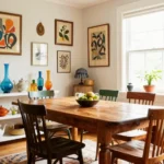
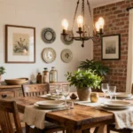
Emerald green paint delivers natural opulence and a connection to the outdoors. This verdant jewel tone brings life to spaces like living rooms and bathrooms, creating an atmosphere of abundance and renewal. Many designers recommend Behr’s “Vine Leaf” or Farrow & Ball’s “Emerald Green” for capturing this perfect balance of richness and vitality. Gold hardware, white trim, and natural wood elements complement emerald walls beautifully, improving the color’s inherent luxury.
3. Ruby Red
Ruby red paint transforms ordinary walls into bold statements of passion and energy. This vibrant hue commands attention and works surprisingly well in dining rooms, powder rooms, or any space where you want to create memorable impact. Sherwin-Williams’ “Red Bay” and Benjamin Moore’s “Caliente” capture this jewel tone’s intensity while maintaining sophistication. Ruby pairs wonderfully with charcoal gray or deep navy blue accents for a balanced color scheme.
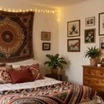
4. Amethyst Purple
Amethyst purple paint offers spiritual depth and creative inspiration to your interior spaces. This mystical jewel tone ranges from soft lavender-tinged purples to deep, regal violets that add instant character. PPG’s “Purple Basil” and Valspar’s “Royal Garnet” exemplify this enchanting hue that works beautifully in bedrooms, creative spaces, or meditation rooms. Amethyst walls complement cream, silver, or light wood furnishings for a balanced yet dramatic effect.
5. Topaz Yellow
Topaz yellow paint infuses spaces with warmth, optimism, and energetic vibrancy. This golden jewel tone brightens rooms while maintaining sophistication unlike typical bright yellows. Sherwin-Williams’ “Nugget” and Benjamin Moore’s “Golden Bounty” capture the perfect topaz glow that works wonderfully in kitchens, sunrooms, or spaces lacking natural light. The rich amber undertones pair exceptionally well with navy blue, charcoal gray, or crisp white accents.
6. Garnet Red-Brown
Garnet red-brown paint grounds spaces with its earthy yet luxurious presence. This multidimensional jewel tone combines deep red with brown undertones, creating cozy sophistication perfect for libraries, dens, or transitional spaces. Behr’s “Spice Trade” and Farrow & Ball’s “Incarnadine” represent this complex color beautifully. Garnet walls create a perfect backdrop for leather furniture, brass lighting fixtures, and natural stone elements, improving the color’s inherent warmth.
7. Turquoise Teal
Turquoise teal paint blends the calming qualities of blue with green’s natural vibrancy. This refreshing jewel tone works wonders in bathrooms, bedrooms, or any space where you want to create a relaxing yet invigorating atmosphere. Benjamin Moore’s “Teal Ocean” and Sherwin-Williams’ “Mariner” capture this perfect balance of blue-green brilliance. White trim, coral accents, and natural wood furniture enhance turquoise walls, creating a balanced and sophisticated palette that feels simultaneously timeless and contemporary.
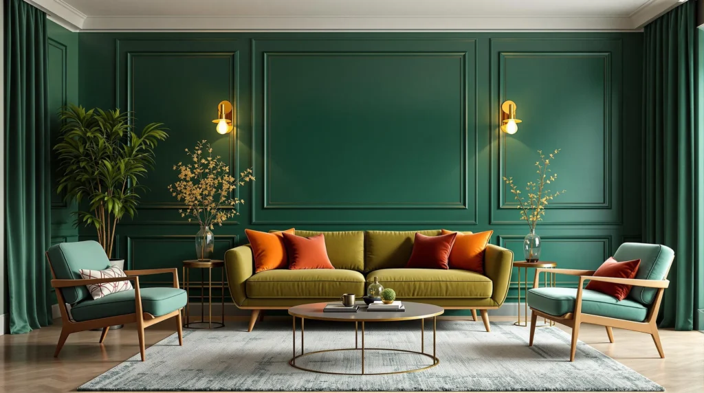
Regal Emerald Green: The Crown Jewel of Wall Colors

Emerald green stands as the quintessential jewel tone, characterized by its deep saturation and luxurious undertones that instantly elevate any space. This majestic color draws inspiration from historical palettes and creates a perfect backdrop for both modern and traditional decor elements.
Top Emerald Green Paint Selections
While exact emerald green shades aren’t explicitly listed in recent color collections, several premium paint brands offer comparable jewel-inspired greens worth considering:
- Sherwin-Williams Ripe Olive presents a sophisticated green-gray depth that creates a more subdued emerald effect perfect for traditional spaces.
- Sherwin-Williams Really Teal offers a stunning blue-green hybrid that captures emerald’s richness with a unique oceanic twist.
- Benjamin Moore Buffett Green CW-535 from their historical Williamsburg® collection delivers a mid-tone green that’s ideal for vintage-inspired interiors seeking authentic period charm.
These options provide the perfect starting point for incorporating emerald’s regal presence without overwhelming your space.
Perfect Rooms for Emerald Green Walls
Living Rooms benefit tremendously from emerald green walls, creating bold focal points that shine brilliantly when paired with gold accents or neutral furnishings for balance.
Dining Rooms gain an intimate, sophisticated atmosphere with emerald tones, which pair exceptionally well with jewel-toned tableware or natural wood finishes for a cohesive look.
Bedrooms transform with emerald green – choose muted versions for tranquility or deeper tones for dramatic luxury that feels both cozy and upscale.
Accent Walls in entryways or studies introduce emerald’s sophistication without dominating the entire space, making a statement that welcomes guests with immediate visual impact.
For optimal results, we recommend placing emerald green in well-lit areas where natural light can highlight its depth and complexity. Pairing emerald with metallic accents, particularly gold or brass, enhances its jewel-like qualities and creates a truly regal environment.
Luxurious Sapphire Blue: Depth and Tranquility Combined

Sapphire blue paint colors deliver a rich, regal presence that transforms ordinary spaces into sophisticated sanctuaries. This mesmerizing jewel tone combines depth and tranquility, making it an excellent choice for creating dramatic yet serene environments.
Best Sapphire Blue Paint Options
Finding the perfect sapphire blue for your space requires exploring options from premium paint brands. Benjamin Moore offers several blue variations that capture the essence of sapphire’s luxurious depth, though you might need to request custom matching for the exact jewel-like quality you desire. Sherwin-Williams stands out with their vibrant jewel tone collections, particularly their Global Spice series that includes rich blues with sapphire-like intensity.
Deep Sea Dive by Sherwin-Williams delivers the quintessential sapphire experience with its rich, saturated blue that immediately elevates any room’s elegance factor. Washington Blue from Benjamin Moore’s historical Williamsburg collection provides a more vintage-inspired take on sapphire, offering depth with a subtle hint of history. These premium options ensure your walls reflect the same luminous quality found in the precious gemstone itself.
How to Style a Sapphire Blue Room
Balancing sapphire blue’s boldness requires thoughtful design choices that complement rather than compete with this commanding hue. Use contrasting neutrals like off-white or light beige to create breathing space within your sapphire-dominated room, preventing the color from overwhelming the space. These lighter elements provide visual relief while highlighting the blue’s rich tonality.
Warm lighting transforms sapphire blue spaces, softening the naturally cool undertones and creating an inviting atmosphere even in the evening hours. Table lamps, sconces, and strategically placed floor lamps with warm-toned bulbs will enhance the room’s coziness while maintaining the color’s sophisticated edge.
Incorporating earthy elements brings necessary grounding to sapphire blue rooms. Natural wood furniture, woven baskets, and living plants add organic texture and warmth that balances the cool, jewel-toned walls. This combination of sapphire’s tranquility with nature’s warmth creates spaces that feel both luxurious and livable, striking the perfect balance between dramatic impact and everyday comfort.
Rich Ruby Red: Bold and Passionate Color Statements

Ruby red jewel tones deliver dramatic luxury to any space, drawing direct inspiration from the precious gemstone itself. These deeply saturated hues incorporate subtle black undertones that create impressive depth, making them perfect focal points for living rooms, dining areas, or statement accent walls.
Leading Ruby Red Paint Choices
Finding the perfect ruby red paint requires selecting shades with the right balance of depth and vibrancy. Benjamin Moore’s Dark Burgundy stands out as a trending jewel tone option that offers rich, red-leaning elegance for sophisticated spaces. Sherwin-Williams provides excellent alternatives with Juneberry (SW 6573), a versatile red-purple hybrid that captures ruby’s multifaceted character. Another standout option is Sherwin-Williams’ Mature Grape (SW 6286), which delivers a bold purple-red statement that adapts beautifully to various lighting conditions. When seeking that classic ruby look, we recommend combining these recommendations with jewel-adjacent mid-tones to achieve comparable saturation while maintaining the gemstone-inspired richness that defines true jewel tones.
Creating Balance with Ruby Red Walls
Ruby red’s intensity requires thoughtful balancing elements throughout your space. Neutral pairings work exceptionally well, particularly off-whites like Benjamin Moore’s Amethyst Cream 2071-50 or warm grays that prevent the red from becoming visually overwhelming. Limiting ruby red to a single accent wall offers maximum impact without domination, while choosing matte finishes enhances sophistication and reduces potential glare. Soft furnishings in beige or cream maintain visual equilibrium and provide necessary breathing space around this powerful color. Historical design approaches benefit from pairing ruby red with complementary jewel tones like earthy greens or navy blues, effectively emulating traditional rich color palettes found in heritage interiors. These strategic pairings allow ruby red to shine as the statement-making jewel tone it truly is.
Deep Amethyst Purple: Mystical and Sophisticated Spaces

Amethyst-inspired hues transform ordinary rooms into mystical and sophisticated sanctuaries. These rich purple tones create depth and intrigue while maintaining an elegant atmosphere that works in various home settings.
Stunning Amethyst Purple Paint Recommendations
Finding the perfect amethyst purple for your space involves selecting shades that balance richness with livability. Benjamin Moore’s Amethyst Cream 2071-50 offers a lighter interpretation of this jewel tone, making it accessible for those new to bold color choices. Carter Plum CW-355 from Benjamin Moore’s Williamsburg collection delivers a more plum-leaning option that still captures the essence of this regal hue. For those seeking deeper saturation, Dark Burgundy by Benjamin Moore provides a rich jewel-toned alternative that complements the amethyst family beautifully. Custom paint mixing remains an excellent option for homeowners wanting to achieve a exact purple depth that perfectly matches their vision.
Complementary Décor for Purple Jewel Tones
Balancing amethyst purple walls requires thoughtful décor choices that enhance rather than compete with this dominant hue. Off-white and neutral furnishings create breathing space and highlight the richness of purple walls without overwhelming the senses. Earthy elements like natural wood furniture or jute rugs ground the ethereal quality of amethyst, creating a harmonious balance between mystical and grounded. Metallic accents in gold or copper introduce warmth and luxury, reflecting light and adding dimension to purple-dominated spaces. Natural textures such as linen drapery, wool throws, or rattan accessories soften the intensity of amethyst walls while adding tactile interest. Soft, strategic lighting proves essential for purple rooms, as proper illumination brings out the depth and subtle undertones that make amethyst truly captivating.
Opulent Topaz Yellow: Warmth with Dramatic Flair

Topaz yellow brings the luxurious warmth of autumn sunlight and golden treasures to your interior palette. This vibrant jewel tone strikes the perfect balance between boldness and sophistication, infusing spaces with energy while maintaining an air of elegance.
Premier Topaz Yellow Paint Selections
Finding the perfect topaz yellow can transform an ordinary room into a statement space. Sherwin-Williams’ Copper Mountain stands out as an exceptional choice, offering bright warmth with its rich metallic undertones. Benjamin Moore also provides stunning options that capture the depth and brilliance of genuine topaz gemstones. These premium paints deliver superior coverage and color retention, ensuring your walls maintain their golden luxury for years to come. Professional designers often recommend pairing these yellow jewel tones with contrasting off-white trim to enhance their opulent effect and create a refined color story throughout your space.
Rooms That Shine with Topaz Yellow
Kitchens benefit tremendously from topaz yellow, creating an inviting atmosphere that energizes the heart of your home. Sunrooms transform into magical retreats when bathed in this golden hue, especially when natural light plays across the walls throughout the day. Home offices gain productive warmth without feeling overwhelming when painted in measured doses of topaz. Dining rooms dressed in this color create memorable entertaining spaces that feel both sophisticated and welcoming. Living areas can incorporate topaz yellow as an accent wall to add drama without dominating the space. Consider using different finishes—high gloss for a statement area or super matte for subtle elegance—to further customize the effect of this versatile jewel tone. Navy and white accents pair beautifully with topaz yellow, creating a balanced and timeless color scheme that works in both traditional and contemporary settings.
Timeless Garnet: The Versatile Burgundy Jewel Tone

Garnet paint colors bring a sophisticated, luxurious depth to any interior space with their rich burgundy undertones that evoke the beauty of the precious gemstone. This versatile jewel tone works beautifully as both a statement color and a complementary accent in various home designs.
Top-Rated Garnet Paint Colors
Dark Burgundy by Benjamin Moore stands as the quintessential garnet shade, offering a deep, sophisticated tone that captures the essence of this precious gemstone. This premium color creates an instant air of luxury in dining rooms, libraries, and master bedrooms.
Racoon Fur by Farrow & Ball delivers a sumptuous burgundy depth with subtle undertones that shift beautifully throughout the day. Its complex character makes it perfect for spaces where you want to create an intimate, cozy atmosphere.
Bordeaux Red by Behr provides a vibrant, garnet-inspired hue that brings warmth and drama to any space. This accessible paint option offers excellent coverage while maintaining the rich saturation that defines true jewel tones.
Timeless Garnet lives up to its name as a versatile burgundy shade that works across various design styles. From traditional spaces to contemporary settings, this color adds depth without overwhelming the room’s other design elements.
Styling Tips for Garnet Accent Walls
Use Neutrals to balance the intensity of garnet walls. White, beige, or light gray furnishings create striking contrast that highlights the richness of the burgundy tone while preventing the space from feeling too dark or heavy.
Add Metallic Accents in gold or brass finishes to enhance the luxurious quality of garnet. Light fixtures, picture frames, and decorative objects with metallic elements reflect light beautifully against the deep background, creating a truly opulent effect.
Balance with Lighter Shades on adjacent walls to prevent the space from feeling closed in. Painting connecting walls in complementary neutral tones allows the garnet accent wall to serve as a dramatic focal point without dominating the entire space.
Incorporate Natural Textures like wood, leather, and wool to add dimension and warmth. These organic elements help ground the rich color and create a welcoming environment that feels both sophisticated and comfortable.
Layer Lighting Strategically to highlight the depth and nuance of garnet tones. Table lamps, wall sconces, and ambient lighting bring out the color’s multifaceted quality, ensuring it appears vibrant rather than flat or muddy.
How to Incorporate Multiple Jewel Tones in Your Color Scheme
Jewel tones offer endless possibilities for creating truly distinctive spaces in your home. From the regal presence of emerald green to the passionate energy of ruby red these colors can transform ordinary rooms into showcases of personality and style.
We’ve seen how each jewel tone brings its own unique character while maintaining that luxurious quality that defines this color family. The key to success with these rich hues is balance – whether through complementary neutrals carefully selected lighting or thoughtful accent pieces.
Remember that jewel tones work beautifully together when properly coordinated. Don’t be afraid to experiment with combining sapphire with emerald or amethyst with garnet for a truly customized look that reflects your bold design vision.
Ready to embrace the drama and sophistication of jewel tones? Your perfect color awaits!
Frequently Asked Questions
What makes jewel tone paint colors so appealing for home interiors?
Jewel tone paint colors add richness and elegance to interiors through their deep, saturated hues. Colors like sapphire blue and emerald green transform ordinary spaces into extraordinary ones with their luxurious quality. These colors create focal points and add personality to rooms while offering versatility across different design styles, from traditional to contemporary settings.
Which jewel tone color works best for a living room?
Emerald green is ideal for living rooms, offering natural opulence that creates both bold statements and intimate atmospheres. Sapphire blue also works exceptionally well, providing sophisticated elegance. For a warmer approach, garnet red-brown grounds the space beautifully. The best choice depends on your lighting conditions, existing furnishings, and the mood you want to create.
Do jewel tones work in small spaces or only large rooms?
Jewel tones can work beautifully in spaces of any size. In smaller rooms, consider using jewel tones on a single accent wall or in well-chosen accessories to prevent overwhelming the space. In larger rooms, these rich colors can help create coziness and definition. The key is balancing them with neutral elements and ensuring adequate lighting to showcase their depth.
How can I balance jewel tone walls without making my room feel too dark?
Balance jewel tone walls by incorporating neutral furnishings in cream, white, or beige. Use strategic lighting with warm-toned bulbs to enhance the color’s richness. Add metallic accents like gold or silver to reflect light. Consider limiting the jewel tone to one accent wall, balancing with lighter shades on other walls. Mirrors and glass elements also help bounce light around the room.
Which metallic accents pair best with jewel tone colors?
Gold accents pair beautifully with emerald green, sapphire blue, and ruby red, enhancing their luxurious appeal. Silver and chrome complement amethyst purple and turquoise teal, creating a cool, contemporary look. Brass works wonderfully with garnet red-brown and topaz yellow, adding warmth. Copper provides a unique complement to teal and emerald. Choose metals that enhance rather than compete with your chosen jewel tone.
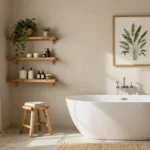
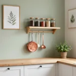
Are jewel tones suitable for kitchens and bathrooms?
Absolutely! Topaz yellow brings warmth and energy to kitchens, while emerald green and turquoise teal work beautifully in bathrooms. In kitchens, jewel tones can enliven cabinets or create striking accent walls. In bathrooms, these colors create spa-like atmospheres or dramatic powder rooms. Consider using moisture-resistant paint formulations in these high-humidity environments to maintain color integrity and finish quality.
How do I choose the right jewel tone paint for my specific room?
Consider the room’s natural light first—north-facing rooms benefit from warmer jewel tones like topaz or ruby, while south-facing rooms can handle cooler hues like sapphire or emerald. Think about the room’s function: restful spaces like bedrooms work well with amethyst or turquoise, while social spaces can handle bolder tones. Test paint samples in your actual space, viewing them in different lighting throughout the day.