Struggling to find that perfect wall color to complement your warm, rich cherry cabinets? You’re not alone. The distinctive reddish-brown tones of cherry wood create a unique design challenge that many homeowners face when refreshing their kitchen or bathroom spaces.
We’ve explored countless color combinations and consulted with top interior designers to bring you the definitive guide to paint colors that harmonize beautifully with cherry cabinetry. From calming neutrals that let your cabinets take center stage to bold contrasting hues that create dramatic impact, we’ll help you discover the perfect palette to transform your space while improving the natural beauty of your cherry woodwork.
Understanding Cherry Cabinet Characteristics and Color Theory
When selecting paint colors to complement cherry cabinets, it’s essential to understand the unique properties of this distinctive wood and how color theory applies. Knowledge of cherry wood’s inherent characteristics will guide you to make informed decisions that enhance rather than clash with your cabinetry.
The Natural Warmth of Cherry Wood
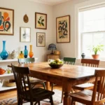
Cherry wood cabinets naturally display rich, reddish-brown tones that emanate warmth and sophistication throughout any space. The wood features subtle grain patterns with varying intensity, ranging from light pinkish-amber to deep burgundy hues. Most cherry cabinets exhibit pronounced undertones of red and orange that create their signature warmth. These distinctive color characteristics make cherry a highly sought-after material for kitchen and bathroom cabinetry. Fine furniture makers have prized cherry wood for centuries due to its exceptional beauty and natural luster. The distinctive coloration comes from the heartwood of the black cherry tree (Prunus serotina), which grows primarily in eastern North America. Understanding these inherent warm tones is crucial when selecting complementary wall colors that will create a harmonious design scheme.
How Cherry Wood Ages and Darkens Over Time
Cherry wood undergoes a remarkable transformation as it ages, developing a deeper, richer patina that enhances its beauty. Fresh cherry cabinets typically display lighter, more vibrant reddish tones when first installed. Exposure to light causes cherry to darken significantly within the first six months, continuing to deepen over several years. This natural oxidation process gradually shifts the wood from lighter amber-red to deeper mahogany-like tones. UV rays accelerate this aging process, with cabinets near windows often darkening more rapidly than those in shadier locations. Paint colors that work initially might need reconsideration as your cabinets mature and deepen in color. Professional designers often recommend selecting wall colors that will complement both the initial and matured states of cherry wood. This natural darkening process represents one of cherry’s most prized attributes, creating cabinets that become increasingly distinguished and valuable over time. Consider this inevitable color evolution when planning your overall color scheme to ensure lasting harmony between your walls and cabinetry.
10 Best Wall Paint Colors to Complement Cherry Cabinets

Classic Neutrals: Beige and Cream Tones
Classic neutral tones create a timeless backdrop for cherry cabinets while neutralizing their red undertones. Benjamin Moore Pale Oak delivers a warm beige-gray that perfectly balances cherry’s richness without competing for attention. Sherwin Williams Alpaca offers an elegant greige option that complements both light and dark cherry finishes. For a softer approach, Benjamin Moore Classic Gray provides a muted backdrop that lets your cabinetry take center stage while maintaining visual harmony throughout the space.
Sophisticated Grays: From Light to Charcoal
Gray paint colors offer sophisticated contrast that enhances cherry’s natural warmth. Sherwin Williams Heron Plume delivers an ethereal greige that softens cherry’s intensity while adding contemporary elegance. Benjamin Moore Balboa Mist features subtle violet-greige undertones that complement cherry’s reddish tones rather than fighting against them. These refined gray options create a balanced palette that feels both current and timeless, allowing your cherry cabinets to shine while providing visual interest.
Soft Blues: Creating Tranquil Kitchen Spaces
Soft blue wall colors establish a serene atmosphere that counterbalances cherry’s warm presence. Sherwin Williams Rainwashed introduces a gentle, watery blue that creates tranquility without clashing with cherry’s red undertones. Muted teal variations offer slightly more color while maintaining harmony with cherry finishes. These cool-toned blues provide visual breathing room in spaces dominated by warm wood elements, resulting in kitchens that feel balanced, fresh, and inviting.
Green Hues: Balancing the Warmth of Cherry
Green paint colors create natural balance with cherry cabinets by providing complementary contrast. Sage green variations particularly excel at offsetting cherry’s warmth while introducing an earthy, organic quality to kitchens and bathrooms. The green-red relationship follows classic color theory principles, resulting in spaces that feel intentionally designed rather than randomly assembled. This pairing brings the outside in, creating a connection to nature that enhances cherry wood’s natural beauty.
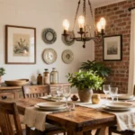
Earth Tones: Terracotta and Clay Colors
Earth-toned walls create a rich, cohesive palette when paired with cherry cabinetry. Terracotta and clay shades harmonize beautifully with cherry’s reddish-brown base, creating a warm, inviting atmosphere throughout the space. These natural pigments enhance cherry’s inherent warmth rather than competing with it. The result is a kitchen that feels grounded, organic, and timeless—perfect for homeowners seeking a cozy yet sophisticated aesthetic that will endure changing design trends.
Rich Burgundy: Bold Color Coordination
Deep burgundy paint creates a bold, monochromatic statement alongside cherry cabinets. Sherwin Williams Blackberry delivers dramatic depth while maintaining color harmony with cherry’s red undertones. This pairing creates luxurious, enveloping spaces that feel both classic and unexpected. While not for the color-shy homeowner, this rich combination makes a sophisticated design statement that works particularly well in formal kitchens, butler’s pantries, or dining rooms featuring cherry cabinetry or millwork.
Crisp Whites: Brightening Dark Cherry Cabinets
White walls provide maximum contrast that showcases cherry cabinets’ natural beauty. Sherwin Williams Incredible White features taupe-violet undertones that complement cherry wood while avoiding stark, clinical contrast. This brightness creates an airy feeling that balances cherry’s visual weight, particularly with darker finishes. The white-cherry combination works exceptionally well in smaller spaces or kitchens with limited natural light, where maximizing brightness enhances functionality and spatial perception.
Soft Yellow: Adding Warmth to Light Cherry
Soft yellow paint enhances lighter cherry finishes by amplifying their natural warmth. Selecting yellows with subtle beige undertones prevents the combination from becoming overwhelming or dated. This sunny pairing creates kitchens that feel welcoming and cheerful without sacrificing sophistication. Yellow walls particularly complement cherry cabinets in breakfast nooks, casual dining areas, or kitchens that receive morning light, creating spaces that feel naturally uplifting.
Muted Sage: A Timeless Pairing
Muted sage green delivers a timeless aesthetic that complements cherry cabinets beautifully. This soft green-gray blend creates seamless visual flow while providing subtle contrast to cherry’s warm tones. The earthy quality of sage enhances cherry’s natural character without overwhelming it. This versatile pairing adapts well to various design styles from traditional to transitional, making it an excellent choice for homeowners seeking longevity in their color selections.
Navy Blue: Creating Dramatic Contrast
Navy blue walls establish dramatic contrast that highlights cherry cabinets’ rich color and grain. Sherwin Williams Naval provides a sophisticated backdrop that makes cherry wood pop visually while maintaining design cohesion. This bold pairing feels both classic and contemporary, working particularly well in kitchens with ample natural light. Navy’s depth creates a sense of architectural importance that elevates cherry cabinetry from merely functional to truly spectacular.
Considering Kitchen Lighting When Selecting Paint Colors

Natural and artificial lighting play crucial roles in how paint colors interact with the warm red or reddish-brown undertones of cherry cabinets. Understanding these lighting dynamics ensures your color choice looks fantastic throughout the day and evening.
How Natural Light Affects Cherry Cabinet Appearance
North-facing kitchens receive cool, blue-toned light that often emphasizes the warmth of cherry wood. For these spaces, soft greiges like Benjamin Moore Balboa Mist or warm whites such as Sherwin Williams Alabaster help balance the cool light while complementing your cabinets beautifully. South-facing rooms get warm, yellow-toned light that can intensify the red undertones in cherry wood, making muted blues or greens like Benjamin Moore Palladian Blue ideal for providing contrast without creating visual conflict. Kitchens with minimal natural light benefit tremendously from light-reflective paints in warm neutral tones like Sherwin Williams Accessible Beige, which brighten the space while subtly downplaying cherry’s rich depth.
Artificial Lighting Considerations for Color Selection
Incandescent bulbs cast a warm yellow light that amplifies the red tones in cherry cabinets. Cooler neutrals such as Benjamin Moore Classic Gray or Sherwin Williams Repose Gray work effectively to neutralize this warmth and create balance. LED or daylight bulbs produce cool white light that may create harsh contrasts with cherry wood, making soft, warm whites like Benjamin Moore White Dove an excellent choice to prevent cabinets from appearing overly orange. Dimmable fixtures offer valuable flexibility for your kitchen lighting plan. Testing paint swatches under both daytime and evening lighting conditions ensures color consistency throughout different times of day. We recommend avoiding stark whites or overly cool grays, as these can clash dramatically with cherry’s natural warmth and create an unintended disconnected look in your kitchen design.
Color Selection Based on Cherry Cabinet Finish

The exact finish and tone of your cherry cabinets play a crucial role in determining the most flattering paint colors for your space. Cherry wood varies significantly in appearance, from vibrant red tones to darker chocolate hues or lighter natural finishes.
Paint Colors for Traditional Red Cherry Cabinets
Traditional red cherry cabinets demand thoughtful color selection to balance their distinctive warmth. Benjamin Moore Pale Oak offers an excellent choice as this warm beige-gray neutral complements the red undertones without competing with them. Sherwin Williams Alpaca creates a gentle contrast with its perfect greige balance, helping to modernize spaces with classic cherry cabinetry. Benjamin Moore Classic Gray works beautifully as a soft off-white greige that effectively mutes the intense red tones while maintaining a cohesive look throughout your space.
Complementary Colors for Darker Cherry Stains
Darker cherry stains benefit from colors that enhance their rich depth without creating a gloomy atmosphere. Green tones like Sherwin Williams Rosemary introduce a bold green-gray element that creates a dramatic yet balanced look against deep cherry finishes. Gray or beige options with subtle purple undertones accentuate the natural beauty of darker cherry without overwhelming the space. These sophisticated neutrals highlight the cabinet’s richness while maintaining visual harmony throughout the room.
Paint Options for Natural or Lighter Cherry Finishes
Natural or lighter cherry finishes call for colors that enhance their inherent brightness without washing them out. Versatile greige provides a neutral background that allows the light cherry cabinets to stand as the focal point in your kitchen or bathroom. Off-whites with pink undertones create a soft complementary effect that enhances the natural warmth of lighter cherry wood. Soft cream colors add warmth to the overall space while keeping the atmosphere light and airy, allowing the natural beauty of lighter cherry finishes to shine through.
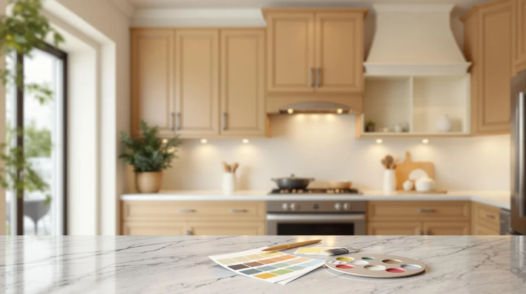
Techniques for Testing Paint Colors With Cherry Cabinets

Selecting the perfect paint color for your cherry cabinets requires thorough testing before committing to painting your entire space. These practical techniques will help you make the right color choice that complements the warm, reddish tones of your cherry woodwork.
Using Sample Boards and Test Patches
Testing paint colors on sample boards offers an effective way to visualize how colors will look with your cherry cabinets before making a final decision. Purchase small sample sizes of your top color contenders, such as Benjamin Moore Classic Gray or Sherwin Williams Alpaca, and apply them to foam boards or poster boards. Position these boards vertically against your cabinets to simulate the actual wall surface. For a more accurate assessment, create test patches directly on your walls, placing them in different areas of the room near the cabinetry. Apply at least two coats of each sample color to ensure you’re seeing the true hue. This approach allows you to compare multiple options simultaneously and observe how each color interacts with your exact cherry finish under various lighting conditions.
Evaluating Colors Throughout the Day
Light dramatically transforms how paint colors appear alongside cherry cabinets, making it crucial to assess potential colors at different times throughout the day. Morning light tends to cast a cooler blue tone, while afternoon and evening light often creates warmer yellow or orange casts that can intensify the reddish tones in cherry wood. Observe your test patches or sample boards during sunrise, midday, sunset, and under artificial lighting to see how the colors shift. Pay particular attention to how shades like Benjamin Moore Balboa Mist or Sherwin Williams Heron Plume interact with your cabinets when natural light is minimal. Take photos of your samples during these different lighting conditions to compare them side by side. This thorough evaluation process helps prevent disappointment after painting and ensures your chosen color complements your cherry cabinets consistently throughout all hours of the day.
Popular Kitchen Color Schemes Featuring Cherry Cabinets

Creating a cohesive color scheme around your cherry cabinets can transform your kitchen into a designer showcase. We’ve organized the most effective approaches into three distinct color strategies that highlight the natural beauty of cherry wood.
Monochromatic Designs
Monochromatic color schemes use varying shades of the same color family to create depth while maintaining harmony. These designs work exceptionally well with cherry cabinets because they respect the wood’s inherent warmth without competing with it. Warm grays serve as perfect companions to cherry wood, complementing the natural warmth while softening the pronounced red undertones. These versatile neutrals create a sophisticated backdrop that lets your cabinetry shine as the focal point.
Taupe and beige tones represent another excellent monochromatic option, as these earthy neutrals align perfectly with cherry’s natural warmth. Colors like Sherwin Williams Accessible Beige provide a subtle canvas that enhances the richness of cherry without overwhelming the space. These neutral foundations allow for flexibility with accessories and accents throughout your kitchen.
Complementary Color Pairings
Complementary color schemes use shades from opposite sides of the color wheel to create visual interest and drama. Since cherry cabinets feature prominent red undertones, colors on the opposite spectrum can create stunning contrasts. Blue-green shades stand directly opposite red on the color wheel, making them ideal candidates for walls that will transform cherry cabinets into dramatic focal points. These cool-toned paints balance the warmth of cherry while creating a visually striking kitchen.
Deep pinks also work surprisingly well with cherry cabinetry, though they aren’t traditional complementary colors. These hues enhance the richness of cherry wood by playing up the underlying red tones, creating a luxurious and cohesive look. This pairing works particularly well in spaces where you want to embrace rather than downplay the distinctive character of cherry.
Analogous Color Schemes
Analogous color schemes employ colors that sit adjacent to each other on the color wheel, creating harmonious transitions and natural flow. Soft browns work beautifully with cherry cabinets as they occupy neighboring positions to red on the color wheel. This proximity creates a seamless visual transition that emphasizes the natural quality of wood throughout your kitchen space.
Warm off-whites like Benjamin Moore White Dove offer another analogous approach that maintains cherry’s inherent warmth while providing soft contrast. These subtle whites contain just enough warmth to complement rather than clash with cherry’s undertones. Their light reflective qualities brighten spaces without creating harsh contrasts that can make cherry cabinets appear overly dark or intense.
How to Incorporate Accent Colors With Cherry Cabinets

Cherry cabinets bring natural warmth and richness to your kitchen, but the right accent colors can truly elevate their beauty. Strategic color choices throughout your kitchen create a cohesive design that enhances rather than competes with your cabinetry.
Best Backsplash Colors to Complement Cherry
Backsplash selection provides an excellent opportunity to create visual interest while maintaining harmony with cherry cabinets. Moody neutrals like charcoal and deep gray add dramatic flair while balancing the warmth of cherry wood. Subway tiles in off-white or beige create a clean, transitional look that doesn’t overwhelm the natural beauty of the wood grain. Stone-look porcelain tiles in taupe or warm gray blend naturally with cherry’s distinctive grain patterns and reddish undertones. For a more subtle approach, consider backsplash materials that incorporate warm metallics or earthy terracotta tones to complement the cabinetry. We recommend avoiding stark white backsplashes, as they can exaggerate cherry’s red tones and create too harsh a contrast.
Island and Trim Color Considerations
Kitchen islands present perfect opportunities for creating appealing contrast with cherry cabinets. Deep navy like Benjamin Moore’s Hale Navy or rich black such as Sherwin Williams Iron Ore can add modern flair while anchoring the space. For trim elements, matching colors to your wall selection creates a seamless look, while warm whites like Benjamin Moore White Dove provide subtle definition without jarring contrast. Cabinet hardware in brushed gold or bronze finishes complements cherry’s warm undertones beautifully. Painting interior-facing cabinet surfaces in a complementary accent color can create unexpected visual interest when cabinets are opened. Pure white trim should be avoided as it typically clashes with cherry’s natural warmth and can make the wood appear overly red.
Countertop and Flooring Color Coordination
Countertop materials significantly impact how cherry cabinets are perceived in your kitchen. Quartzite or marble with taupe veining effectively neutralizes red undertones while adding sophisticated texture. Medium-toned hardwoods like oak or hickory create balanced flooring options that don’t compete with darker cherry cabinetry. Tile floors featuring warm beige or gray stone patterns maintain design harmony while offering practical durability. Natural stone countertops with warm undertones enhance cherry’s rich color without creating overwhelming redness. Cool gray countertops should be approached with caution as they may accentuate pink or red tones in the wood. Flooring in complementary earth tones creates a grounded foundation that showcases your cherry cabinets as the kitchen’s centerpiece.
Trendy Versus Timeless: Making the Right Paint Color Choice

When selecting paint colors for cherry cabinets, you’ll want to consider whether you prefer following current trends or investing in timeless hues that will look beautiful for years to come.
Trendy Options for Cherry Cabinets
Moody colors are making a important impact in today’s kitchen designs. Dark shades like black or deep gray create dramatic contrast against the warm tones of cherry wood, establishing a sophisticated modern aesthetic. These bold choices add depth and character to your kitchen space while highlighting the natural beauty of your cabinets.
Vibrant blues and green-blues have become increasingly popular choices for cherry cabinet kitchens. These lively hues create a striking contrast that makes cherry wood pop, drawing attention to the rich grain patterns and warm undertones of the cabinetry. The juxtaposition of cool blues against warm cherry creates a balanced yet energetic kitchen atmosphere.
Current Color Trends for Cherry Cabinet Kitchens
Neutral tones are dominating today’s cherry cabinet kitchens, with exact shades leading the pack. Benjamin Moore Pale Oak has become a go-to choice for many homeowners seeking to tone down the red hues in their cherry cabinetry. This soft, warm neutral creates a balanced backdrop that complements without competing.
Sherwin Williams Accessible Beige offers another on-trend option that pairs beautifully with cherry wood. Its warm undertones help create a cohesive look while its neutral base prevents the space from feeling too warm or overwhelming. Benjamin Moore Balboa Mist rounds out the current favorites with its light gray-beige blend that softens cherry’s intensity while maintaining a fresh, contemporary feel.
Evergreen Paint Colors That Stand the Test of Time
Taupe shades have proven their staying power when paired with cherry cabinets. These versatile neutrals effectively neutralize the reddish undertones of cherry wood while creating a sophisticated, enduring aesthetic that won’t feel dated in a few years.
Warm grays continue to be reliable choices for cherry cabinet kitchens. These subtle hues balance cherry’s warmth without creating stark contrast, allowing for a harmonious relationship between cabinetry and wall color that remains appealing year after year.
Pink-beige tones offer another timeless option that subtly enhances cherry’s natural warmth. These gentle neutrals create a soft, welcoming environment that highlights the beauty of cherry wood without overwhelming the space.
Soft whites with slight warmth, such as Sherwin Williams Alabaster or Benjamin Moore White Dove, remain classic choices for trim in cherry cabinet kitchens. These versatile whites provide definition without the harsh contrast that pure whites can create, ensuring a balanced, timeless look throughout your space.
Professional Tips for Seamless Cherry Cabinet and Wall Color Integration

Designer Insights on Cherry Cabinet Color Pairings
Professional designers consistently recommend working with cherry cabinets’ natural warmth rather than fighting against it. Greige and cream tones create an ideal neutral backdrop that effectively tones down the red undertones in cherry wood. Benjamin Moore Classic Gray and Sherwin Williams Alpaca are particularly favored by designers for creating balance without overwhelming the space. Green and blue hues offer a harmonious contrast that enhances cherry wood’s richness and depth – with Benjamin Moore Wythe Blue providing a tranquil atmosphere and Palace Green adding sophisticated contrast. Designers often suggest using these complementary colors strategically to create visual interest while maintaining cohesion throughout the kitchen space.
Avoiding Common Color Mistakes With Cherry Woodwork
Many homeowners make the mistake of selecting colors on the same side of the color wheel as cherry wood. Reds, oranges, and purples tend to clash with cherry’s natural undertones, creating a space that feels overwhelming and unbalanced. Instead, use complementary colors such as yellows, greens, and blues to create a harmonious palette that highlights the beauty of your cherry cabinets. Sherwin Williams Venetian Yellow and Reseda Green are excellent choices that create balance through contrast. Testing paint samples in your actual space under different lighting conditions is essential before committing to a color. Wall colors should balance rather than overpower your cherry cabinets, allowing their natural beauty to remain a focal point in your kitchen design.
Making Your Final Decision: Practical Steps to Choose the Perfect Paint Color
Choosing the right paint color for your cherry cabinets doesn’t have to be overwhelming. We recommend bringing home multiple paint samples to test on your walls alongside your cabinetry. Observe these colors at different times of day to see how lighting affects their appearance.
Remember that cherry wood darkens over time so select colors that will complement both current and future tones. Consider your overall design goals – whether you want your cabinets to stand out as a focal point or blend harmoniously with surrounding elements.
Trust your instincts about what feels right in your space. The perfect paint color should enhance your cherry cabinets’ natural beauty while creating the atmosphere you desire. With thoughtful consideration of undertones harmonious pairings and lighting conditions you’ll create a kitchen that showcases the timeless elegance of cherry wood.
Frequently Asked Questions
What are the best neutral paint colors for cherry cabinets?
Beige, cream, and soft gray tones work exceptionally well with cherry cabinets. These neutrals highlight the natural warmth of cherry wood without competing with its rich reddish tones. Benjamin Moore Pale Oak and Sherwin Williams Accessible Beige are particularly popular choices as they help tone down cherry’s red undertones while creating a timeless backdrop that allows the cabinetry to remain the focal point.
How does lighting affect paint color selection with cherry cabinets?
Lighting dramatically impacts how paint colors appear alongside cherry cabinets. Natural daylight reveals true colors, while artificial lighting can alter perception—warm lights enhance reds and yellows, while cool lights bring out blues and greens. Always test paint swatches in your actual kitchen under different lighting conditions (morning, afternoon, evening) to ensure the color remains pleasing throughout the day.
What colors should I avoid with cherry cabinets?
Avoid colors on the same side of the color wheel as cherry wood, particularly oranges and bright reds, as they can create an overwhelming, clash-heavy effect. Pure white can sometimes create too stark a contrast with cherry’s warmth. Also, extremely dark colors might compete with the visual weight of cherry cabinets in smaller spaces, making the room feel closed-in.
Do cherry cabinets work better with warm or cool wall colors?
Both can work beautifully, depending on your desired effect. Warm colors (cream, beige, terracotta) create a cozy, harmonious look that enhances cherry’s natural warmth. Cool colors (blues, greens, grays) provide refreshing contrast that helps neutralize cherry’s red undertones. Cool-toned neutrals like greige often strike an ideal balance that complements cherry without competing with it.
How can I test paint colors effectively with my cherry cabinets?
Paint large sample boards (at least 2′ x 2′) rather than small swatches and place them against your cabinets. Move them around the kitchen at different times of day to observe how lighting affects them. Consider the existing elements in your kitchen (countertops, flooring, appliances) when evaluating samples. Leave samples up for several days before making a final decision.
What backsplash colors work best with cherry cabinets?
Moody neutrals, off-whites, and warm earthy tones complement cherry cabinets beautifully. Consider materials like travertine, cream-colored subway tiles, or glass tiles in soft blues or greens. Avoid stark white backsplashes, which can create too harsh a contrast. Natural stone with beige or gray undertones provides texture while harmonizing with cherry’s warm qualities.
How should I coordinate countertops with cherry cabinets and wall color?
Choose countertops that neutralize cherry’s red undertones. Light to medium gray granite, white quartz with subtle veining, or soapstone create beautiful contrast. For a harmonious look, select countertops with warm undertones that echo elements in your wall color. Avoid countertops with competing red or orange tones that could clash with cherry’s natural hue.
Do cherry cabinets work in modern kitchen designs?
Absolutely. While cherry cabinets have traditional associations, they can shine in modern designs when paired with contemporary elements. Consider pairing cherry with moody wall colors like deep gray or black for a sophisticated modern look. Clean-lined cabinet styles, minimalist hardware, and contrasting countertops in white or gray can update cherry cabinets for today’s aesthetic preferences.
Will my cherry cabinets darken over time, and how should this affect my color choices?
Yes, cherry wood naturally darkens over time, shifting from lighter amber tones to deeper mahogany-like hues, especially with sun exposure. Choose wall colors that will complement both the initial and matured states of your cabinetry. Timeless neutrals like greige, taupe, and soft whites generally maintain their harmonious relationship with cherry throughout its aging process.
What are the most timeless paint colors for kitchens with cherry cabinets?
Soft whites, warm grays, and taupe shades create enduring looks with cherry cabinets. Benjamin Moore Classic Gray and Sherwin Williams Alpaca offer balance without following fleeting trends. Muted green-blues like Benjamin Moore Wythe Blue provide subtle contrast that remains appealing over time. These timeless options create a harmonious backdrop that allows cherry’s natural beauty to shine for years.