Color drenching isn’t just another design trend—it’s a revolutionary approach that transforms any space into a stunning visual masterpiece. We’ve witnessed how this bold technique creates dramatic impact by enveloping entire rooms in single, saturated hues that flow seamlessly from walls to ceilings and trim.
Gone are the days of playing it safe with neutral palettes. Today’s most captivating interiors embrace the power of monochromatic saturation to create depth and sophistication that traditional color schemes simply can’t match. Whether you’re drawn to moody blues that evoke tranquility or energizing terracotta that radiates warmth, color drenching offers endless possibilities for personal expression.
We’ll explore proven strategies that turn ordinary rooms into extraordinary sanctuaries. From selecting the perfect shade to mastering the art of tonal variation, these groundbreaking ideas will help you create spaces that reflect your unique style while maximizing visual impact.
What Is Color Drenching and Why It’s the Hottest Interior Design Trend
Bold color choices are taking center stage as homeowners embrace this dramatic design approach. Color drenching has emerged as the defining interior trend of 2024, replacing the minimalist neutral palettes that dominated previous years.
Understanding the Color Drenching Technique
Color drenching involves painting walls, ceilings, trim, and sometimes furniture in the same saturated hue to create an immersive monochromatic environment. This technique transforms ordinary rooms into bold, cohesive spaces that feel intentional and sophisticated.
We apply this method by selecting one dominant color and using it throughout the entire room, including architectural elements like baseboards, window frames, and door casings. The approach creates visual continuity that makes spaces appear larger and more harmonious than traditional color blocking methods.
Different tonal variations of the chosen hue add depth without breaking the monochromatic scheme. Designers achieve this by using lighter and darker shades of the same color family, creating subtle contrast through texture and finish rather than contrasting colors.
Professional interior designers recommend starting with high-quality paint that offers rich pigmentation for optimal color saturation. The technique works best when we commit fully to the concept rather than leaving some elements in neutral tones.
Benefits of Monochromatic Design Schemes
Monochromatic design schemes create immediate visual impact that transforms any space into a statement room. This approach eliminates the guesswork involved in coordinating multiple colors and ensures a polished, designer-approved aesthetic.
Rooms appear more spacious when we use color drenching techniques because the eye doesn’t stop at contrasting elements like white trim or differently colored ceilings. The continuous color flow tricks the brain into perceiving expanded dimensions and creates an enveloping, cocoon-like atmosphere.
Color psychology benefits become amplified when we surround ourselves with a single hue throughout an entire space. Deep blues promote relaxation and focus, while warm terracotta tones create energy and comfort, and sage greens foster tranquility and connection to nature.
Maintenance becomes simpler with monochromatic schemes because touch-ups blend seamlessly into the existing color palette. We can easily refresh scuffed areas without worrying about exact color matching between different paint shades.
Design flexibility increases because furniture and decor in various materials and textures all complement the unified color backdrop. This allows us to experiment with different styles and accessories without clashing with the room’s color scheme.
Bold Blue Color Drenching Ideas for a Calming Atmosphere

Blue’s versatility makes it perfect for color drenching projects that prioritize tranquility and relaxation. We’ll explore three distinct blue approaches that transform different spaces while maintaining the calming benefits this color family offers.
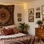
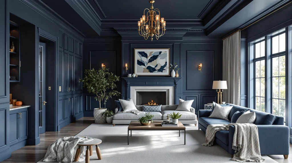
Navy Blue Living Room Transformations
Navy blue creates dramatic yet calming spaces that envelope you in sophistication and serenity. We recommend painting every surface including walls, ceiling, trim, and molding in the same rich navy shade to achieve maximum impact. This bold approach transforms ordinary living rooms into intimate retreats where the deep color absorbs light and creates a cocoon like atmosphere.
Consider pairing your navy drenched walls with cream or white furniture to prevent the space from feeling too heavy. Brass or gold accents work beautifully against navy surfaces, adding warmth and luxury to the monochromatic scheme. Natural textures like jute rugs and linen throws help soften the intensity while maintaining the room’s peaceful energy.
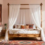
Powder Blue Bedroom Sanctuaries
Powder blue offers a softer alternative that turns bedrooms into peaceful sanctuaries perfect for rest and relaxation. We suggest applying this gentle hue to walls, ceiling, and all trim work to create a soothing ambiance that promotes better sleep. The light reflective quality of powder blue makes bedrooms feel more spacious while maintaining the immersive effect of color drenching.
Layer different textures in similar blue tones to add depth without breaking the monochromatic flow. White linens and natural wood furniture complement powder blue beautifully, creating a fresh and airy feeling. Metallic accents in silver or chrome enhance the cool undertones while keeping the space feeling serene.
Coastal Blue Kitchen Designs
Coastal blue brings the calming essence of ocean waters into kitchen spaces where families gather and connect. We recommend using lighter blue shades that create an airy, open feeling while still achieving the full immersion effect of color drenching. Apply this refreshing hue to all surfaces including cabinets, walls, and ceiling for a cohesive coastal inspired design.
Natural materials like butcher block countertops and woven baskets add warmth and texture against the cool blue backdrop. White or cream colored appliances maintain the bright, beachy atmosphere while allowing the blue tones to remain the focal point. Consider incorporating sea glass or driftwood inspired accessories to reinforce the coastal theme without overwhelming the monochromatic palette.
Warm Earth Tone Color Drenching for Cozy Spaces

Earth tones create an instant sense of warmth and comfort when applied throughout a room using the color drenching technique. We’ve found that these natural hues work exceptionally well for creating intimate, cozy environments that feel both sophisticated and welcoming.
Terracotta and Clay Color Schemes
Terracotta walls transform living rooms and dining areas into warm, inviting spaces that encourage relaxation and conversation. This rich, earthy color creates depth when you paint walls, trim, and ceilings in varying shades of the same terracotta family. We recommend using different paint finishes to add visual interest while maintaining the monochromatic scheme – eggshell for walls, semigloss for trim, and flat for ceilings.
Clay colored environments work beautifully when paired with natural wood furniture and woven textures. The warmth of clay tones makes rooms feel immediately cozier, especially during cooler months. Natural wood elements like oak dining tables or walnut side tables create stunning contrast against clay drenched walls without breaking the cohesive color story.
Textural elements become essential in terracotta spaces to prevent the room from feeling flat. Incorporate linen curtains, jute rugs, and ceramic pottery in similar tones to enhance the earthy atmosphere while adding tactile interest.
Sage Green Room Makeovers
Sage green color drenching creates serene, spa-like atmospheres perfect for bedrooms and meditation spaces. This calming color promotes relaxation while maintaining enough depth to feel sophisticated rather than bland. We’ve seen remarkable transformations when sage green extends from walls to ceiling trim in bedrooms.
Natural plant elements complement sage green beautifully, creating a harmonious connection between indoor and outdoor spaces. Fiddle leaf figs, snake plants, and eucalyptus arrangements enhance the organic feel without competing with the wall color. Wooden headboards in natural or whitewashed finishes provide gentle contrast while maintaining the room’s peaceful energy.
Balanced lighting becomes crucial in sage green spaces to prevent the color from appearing too cool. Warm white LED bulbs and brass fixtures help maintain the cozy atmosphere while highlighting the subtle undertones in sage green paint.
Warm Beige and Cream Environments
Beige color drenching creates spacious, airy feelings while maintaining warmth and comfort throughout the room. These classic neutral tones work exceptionally well in smaller spaces because they reflect light effectively and create seamless visual flow. We recommend using warm beige rather than cool gray beige to maintain the cozy atmosphere.
Cream colored walls paired with matching trim and ceilings create sophisticated, hotel-like environments that feel both luxurious and approachable. The key lies in selecting cream tones with warm undertones rather than stark white bases.
Textured accessories become essential in beige and cream spaces to add visual depth and prevent monotony. Woven baskets, chunky knit throws, and plush area rugs in similar tones create layers of interest while maintaining the monochromatic scheme. Natural fiber elements like jute, sisal, and linen work particularly well in these neutral environments.
Dramatic Dark Color Drenching for Sophisticated Interiors

Dark color drenching transforms ordinary rooms into luxurious retreats that exude drama and sophistication. Deep pigments create an immersive environment that feels both cozy and elegant when executed properly.
Black and Charcoal Statement Rooms
Black and charcoal rooms make bold statements that demand attention while maintaining sophisticated appeal. We recommend distinguishing between finishes by using eggshell on walls and satin on trim to add depth without breaking the monochromatic effect. These dramatic spaces feel modern, mysterious, and sophisticated when you balance them with contrasting elements like light colored floors or furniture.
Testing these deep colors under your actual lighting conditions ensures you’ll achieve the desired dramatic effect. Natural and artificial light create beautiful interplay with dark surfaces, highlighting architectural features while maintaining the room’s vibrancy. Texture becomes especially important in all black spaces, so we suggest incorporating varied materials like velvet upholstery, matte ceramics, and glossy metals.
Strategic lighting placement prevents these dark rooms from feeling too enclosed or oppressive. Consider adding statement light fixtures, table lamps, or wall sconces to create focal points and enhance the room’s luxurious atmosphere.
Deep Forest Green Transformations
Deep forest green creates a powerful connection to nature while delivering sophisticated drama throughout your space. This rich shade envelops rooms in a cocooning effect that makes spaces feel intimate and inviting when applied to all surfaces. We’ve found that forest green works exceptionally well in spaces with ample natural light, where the color can showcase its depth and complexity.
Natural wood tones complement forest green beautifully, creating warmth that prevents the space from feeling too serious. Metallic accents in brass, gold, or copper add luxurious touches that enhance the room’s sophisticated appeal. Consider incorporating live plants to reinforce the natural connection while adding textural contrast.
Varying the sheen levels across different surfaces helps create visual interest within the monochromatic scheme. We suggest using matte finishes on walls and semi gloss on trim to define architectural elements while maintaining color consistency.
Rich Burgundy and Wine Color Palettes
Rich burgundy and wine shades deliver unmatched drama and elegance that transforms any room into an opulent retreat. These colors work particularly well in living rooms, dining areas, and bedrooms where you want to create a moody, luxurious atmosphere. Layering different sheens and adding contrasting textiles or artwork prevents these bold spaces from feeling overwhelming.
Deep wine colors create instant sophistication that feels both timeless and contemporary. We recommend balancing these intense hues with lighter furniture pieces or metallic accents to create visual breathing room. Velvet fabrics, rich leather, and silk textiles enhance the luxurious feeling these colors naturally create.
Lighting becomes crucial with burgundy and wine palettes, as these colors can absorb light and make spaces feel smaller. Warm white lighting enhances the red undertones while maintaining the color’s richness and depth throughout different times of day.
Energizing Bright Color Drenching Ideas

Bright, vibrant hues bring instant energy and positivity to any space through color drenching techniques. These bold choices create ever-changing environments that uplift mood and inspire creativity throughout your home.
Sunny Yellow Room Designs
Painting every surface in sunny yellow transforms spaces into cheerful, uplifting retreats. This energizing approach works exceptionally well in kitchens, living rooms, and home offices where we want to promote positivity and productivity.
Using varying paint sheens adds essential depth to yellow color drenching. We recommend applying eggshell finish on walls, satin on trim, and flat paint on ceilings to prevent the space from appearing monotonous. These finish variations create subtle texture differences that enhance the overall visual interest.
Balancing yellow’s intensity requires careful consideration of lighting and accents. Natural light amplifies yellow’s warmth, while artificial lighting should be warm toned to complement the hue. We suggest incorporating white or natural wood furniture to ground the bold color and maintain visual balance.
Vibrant Orange Accent Spaces
Orange color drenching brings warmth and excitement to smaller, transitional areas. Entryways, powder rooms, and sunrooms benefit most from this bold approach because the intense hue creates memorable first impressions without overwhelming larger living spaces.
Pairing orange drenched walls with neutral flooring creates perfect balance. Natural wood floors or stone tiles provide grounding elements that prevent the vibrant color from becoming too stimulating. This combination maintains the room’s inviting atmosphere while showcasing orange’s energetic qualities.
Strategic placement maximizes orange’s impact in accent spaces. We find that using orange in areas with good natural light enhances its warmth, while darker spaces may require additional lighting to prevent the color from appearing muddy or overwhelming.
Bold Pink and Coral Transformations
Bold pink and coral color drenching infuses youthful, lively energy into bedrooms, playrooms, and creative studios. These hues range from soft blush to vivid magenta, offering flexibility to create either playful or sophisticated environments depending on your design goals.
Contrasting finishes add visual interest to pink drenched spaces. High gloss trim paired with matte walls creates ever-changing texture variation that prevents the monochromatic scheme from feeling flat. We recommend this technique particularly in children’s rooms where durability and easy cleaning are priorities.
Accent elements in complementary tones anchor bold pink choices. Neutral furniture pieces, metallic accents, or natural textures help balance pink’s intensity while maintaining the room’s cohesive color story. These grounding elements ensure the space feels intentional rather than overwhelming.
Neutral Color Drenching for Timeless Elegance

Neutral color drenching offers the perfect balance between bold design impact and lasting appeal. We’ve found this approach particularly effective for creating sophisticated spaces that won’t feel dated in years to come.
All-White Minimalist Spaces
All-white color drenching transforms rooms into serene, airy retreats by painting every surface in pristine white. We recommend this technique for small rooms or spaces with ample natural light, where the uniform white application creates a clean and spacious feeling. Ceilings, walls, trim, and doors all receive the same white treatment to eliminate visual boundaries and enhance the room’s perceived size.
Different white paint finishes add subtle texture variation without disrupting the monochromatic flow. We suggest using satin finish on walls paired with semi-gloss on trim to create gentle contrast through sheen rather than color. This approach works exceptionally well in bathrooms, powder rooms, and compact bedrooms where maximizing light reflection is crucial.
Natural materials like wood flooring or woven textures provide necessary warmth against the crisp white backdrop. We’ve observed that all-white spaces benefit from varied lighting sources, including ambient, task, and accent lighting to prevent the room from feeling sterile or cold.
Greige Color Scheme Applications
Greige combines the coolness of gray with the warmth of beige, making it our top choice for versatile neutral drenching. We apply this sophisticated blend throughout living rooms, bedrooms, and kitchens to create soothing yet inviting atmospheres. The color works equally well in modern and traditional settings, adapting to various design styles without losing its calming effect.
Kitchen applications of greige drenching include painting cabinets, walls, and even ceiling beams in matching tones. We recommend using different saturation levels of greige to define various elements while maintaining the monochromatic scheme. Lighter greige on upper cabinets paired with deeper tones on lower cabinets creates visual weight distribution.
Bedroom greige drenching promotes restful sleep while providing a neutral canvas for colorful bedding and artwork. We’ve found that greige adapts beautifully to changing natural light throughout the day, appearing warmer in morning sun and cooler in evening shadows.
Soft Gray Monochromatic Designs
Soft gray delivers unmatched serenity when applied as a complete room treatment across all surfaces. We use this gentle hue to create sophisticated backdrops that highlight furniture and decor without competing for attention. The color’s inherent versatility allows for seamless integration with both minimalist and elaborate design approaches.
High-gloss soft gray finishes on trim and doors contrast beautifully with matte or eggshell wall treatments. We recommend this technique in larger spaces where the uniform soft gray enhances feelings of cohesion and tranquility. The monochromatic approach eliminates visual distractions while allowing architectural features to shine through subtle tonal variations.
Textural elements become essential in soft gray spaces to prevent monotony. We incorporate varied fabrics, natural wood tones, and metallic accents to add depth and visual interest. Soft gray serves as an ideal foundation for seasonal decor changes, easily accommodating warm autumn tones or cool summer accessories without requiring paint updates.
Essential Tips for Successfully Implementing Color Drenching

Successfully executing color drenching requires attention to exact technical details that prevent monochromatic spaces from appearing flat or overwhelming. We’ll guide you through the crucial elements that transform a simple single-color concept into a sophisticated design statement.
Choosing the Right Paint Finishes
Paint finish selection creates dimension and visual interest even when using identical colors throughout your space. We recommend applying eggshell or satin finishes on walls to achieve subtle sheen while maintaining washability for everyday living.
Semi-gloss or satin works best on trim, molding, and built-ins because these finishes provide crisp definition and contrast against wall surfaces. Ceilings benefit from flat or matte finishes that soften light reflections and prevent glare from overhead lighting.
Dark hues require special consideration for ceiling applications. We suggest reducing paint opacity by approximately 25% on ceilings when using deep colors to enhance light reflection and prevent oppressive feelings in the room.
High-gloss options can be strategically applied to exact elements like trim or built-ins to create dramatic focal points while emphasizing architectural details throughout your drenched space.
Incorporating Texture and Pattern
Texture prevents monochromatic rooms from feeling flat while maintaining the cohesive color theme that defines successful drenching. We incorporate varied textures through fabric upholstery, textured wallpaper, and layered rugs in matching hues to create visual depth.
Textured paint finishes add another dimension to walls without breaking the color continuity that makes drenching so effective. Subtle patterns work beautifully when kept tone-on-tone, allowing you to introduce visual interest without disrupting the immersive atmosphere.
Fabric choices like velvet cushions, woven throws, and textured curtains in your chosen hue create layers that catch light differently throughout the day. Natural materials such as jute rugs or wooden accents in matching stains complement the drenched color while adding organic texture.
Balancing Light and Dark Elements
Lighting becomes crucial in color-drenched rooms, especially when working with deeper shades that absorb more natural light. We ensure abundant natural light reaches dark color-drenched spaces through large windows and strategic mirror placement to reflect available light.
Artificial lighting requires careful planning in monochromatic rooms to prevent corners from appearing blackened or overly shadowed. Multiple light sources at different heights create even illumination that showcases your chosen color rather than hiding it in darkness.
Contrasting elements like warm hardwood floors or bright accent pieces balance the overall atmosphere without compromising the drenched effect. Light-colored furniture or metallic fixtures provide visual relief while maintaining the sophisticated unity that makes color drenching so impactful.
Strategic placement of lighter elements prevents dark-drenched rooms from feeling closed in or overwhelming, ensuring your bold color choice enhances rather than diminishes the space’s functionality and comfort.
Common Color Drenching Mistakes to Avoid

Even the most stunning color drenching transformations can fall flat when common pitfalls aren’t addressed. We’ve identified the key mistakes that can turn your bold design vision into an overwhelming disaster.
Overwhelming Small Spaces
Small rooms require careful consideration when implementing single-color schemes. Applying strong, saturated hues throughout compact spaces can create a claustrophobic atmosphere that makes the area feel even smaller than it actually is. We recommend favoring lighter shades in tiny rooms or strategically breaking up the color with contrasting accents to maintain visual breathing room.
Testing your chosen color in the exact room size helps determine whether the intensity works with your space’s dimensions. Darker colors tend to absorb light and visually shrink rooms, while lighter variations of the same hue can maintain the monochromatic effect without overwhelming the space. Consider using your bold color on a single accent wall while keeping other surfaces in lighter tonal variations.
Ignoring Natural Light Considerations
Natural and artificial lighting dramatically affects how colors appear throughout the day. Dark colors can turn black or oppressive in rooms without sufficient light sources, completely undermining the sophisticated atmosphere you’re trying to create. We always test paint colors in both daylight and evening lighting conditions to ensure the chosen hue looks vibrant rather than dull or harsh.
Rooms with limited natural light require careful color selection and enhanced artificial lighting to prevent the space from feeling cave-like. Consider installing multiple light sources, including ambient, task, and accent lighting, when working with deeper hues. Southern-facing rooms can handle richer, darker colors, while northern exposures benefit from warmer tones that won’t appear muddy or gray.
Forgetting About Accent Colors
Monochromatic doesn’t mean monotonous, yet many people neglect the importance of thoughtful accent colors. Relying solely on one color without introducing contrasting elements can make spaces feel flat and lacking in personality. We recommend incorporating 10-20% of contrasting colors through furniture, textiles, artwork, or decorative accessories to create visual interest and depth.
Strategic accent placement prevents color-drenched rooms from feeling overwhelming while maintaining the bold, cohesive aesthetic. Consider introducing metallic finishes, natural wood tones, or complementary colors that enhance rather than compete with your primary hue. These carefully chosen accents serve as visual rest points that allow the eye to appreciate the dramatic color choice without feeling overstimulated.
Budget-Friendly Color Drenching Ideas for Every Room

Creating a stunning color-drenched space doesn’t require a massive budget or professional help. We can achieve the same dramatic transformation using smart strategies that maximize impact while minimizing costs.
DIY Painting Techniques
Prep thoroughly before applying any paint to ensure professional-looking results that last years without peeling or uneven coverage. Sand rough surfaces, clean all walls with mild detergent, and apply primer to create the perfect foundation for your chosen color.
Use multiple sheens strategically to add subtle dimension without breaking the uniform color scheme. Apply eggshell finish on walls for durability and easy cleaning, while using satin on trim and flat paint on ceilings to create visual interest through varying light reflection.
Combine rollers and brushes for optimal coverage and precision across different surfaces. Roll large wall areas quickly and efficiently, then switch to high-quality brushes for detailed work around moldings, door frames, and corners where precision matters most.
Tape edges carefully using painter’s tape to achieve crisp, professional lines around trim and architectural details. Press tape edges firmly to prevent paint bleeding, and remove tape while the paint is still slightly wet for the cleanest results.
Work in sections to maintain a wet edge and avoid visible lap marks that can ruin the seamless color-drenched effect. Complete one wall entirely before moving to the next, ensuring consistent coverage throughout the space.
Affordable Decor Accessories
Incorporate textured throw pillows in complementary tones to add visual interest without disrupting the monochromatic scheme. Choose fabrics like linen, velvet, or faux fur in similar hues to create depth while maintaining the color-drenched aesthetic.
Layer area rugs strategically to define spaces and add warmth without overwhelming the uniform color palette. Select rugs with subtle patterns or textures in the same color family to enhance the drenching effect while providing comfort underfoot.
Install colorful light fixtures with warm bulbs or colored shades to subtly enhance the drenching effect during evening hours. Paper lanterns, colored lampshades, or LED strips can reinforce your chosen hue without expensive electrical work.
Mix metallic accents sparingly through picture frames, hardware, or small decorative objects to create contrast without overpowering the monochromatic design. Gold, brass, or copper elements add sophistication while keeping costs minimal.
Display plants in coordinating containers to introduce natural texture and subtle color variation. Greenery provides fresh contrast against any drenched color while improving air quality and creating a more livable environment.
Thrift Store Finds and Upcycling
Hunt for furniture pieces at estate sales and thrift stores that can be easily painted in your drench color to blend seamlessly with the transformed space. Look for solid wood pieces with good bones that just need surface refinishing.
Upcycle old frames by painting them in your chosen monochromatic hue to create a cohesive gallery wall that reinforces the color drenching theme. Mismatched vintage frames become unified design elements when painted the same color.
Transform vintage shelving with a fresh coat of paint to create functional storage that disappears into the color-drenched background. Floating shelves painted to match walls create clean lines while providing necessary storage space.
Repurpose decorative objects like vases, candle holders, and small sculptures by spray painting them in your signature color. These coordinated accessories cost pennies compared to new items while maintaining the immersive color experience.
Combine vintage finds with modern elements to create an eclectic yet cohesive look that feels intentional rather than matchy. Balance painted vintage pieces with contemporary accessories in coordinating neutral tones for visual sophistication.
Conclusion
Color drenching offers an exciting opportunity to create truly personalized spaces that reflect your unique style and personality. Whether you’re drawn to calming blues serene neutrals or bold dramatic hues this groundbreaking technique can elevate any room from ordinary to extraordinary.
We’ve shown you that successful color drenching isn’t about having an unlimited budget—it’s about understanding the fundamentals of color theory lighting and texture. With careful planning and attention to detail you can achieve professional-looking results that rival high-end designer spaces.
The key is starting small testing your chosen colors in different lighting conditions and building confidence as you go. Remember that color drenching is more than just painting walls—it’s about creating an immersive experience that makes you feel truly at home in your space.
Frequently Asked Questions
What is color drenching in interior design?
Color drenching is an innovative design technique that involves painting all elements of a room—including walls, ceilings, trim, and sometimes furniture—in the same dominant hue. This monochromatic approach creates an immersive, cohesive environment that enhances visual continuity and makes spaces appear larger and more harmonious while adding depth and sophistication to interiors.
Why is color drenching trending in 2024?
Color drenching has emerged as the defining interior trend of 2024, representing a shift away from neutral palettes and minimalist styles of previous years. This technique offers immediate visual impact, creates bold statements with saturated hues, and provides design flexibility while simplifying maintenance. It allows homeowners to embrace personality and creativity in their spaces.
What are the main benefits of monochromatic design schemes?
Monochromatic design schemes create immediate visual impact, simplify maintenance, and increase design flexibility. They enhance visual continuity, making spaces appear larger and more harmonious. Color psychology benefits include promoting specific atmospheres—relaxation, energy, or tranquility—depending on the chosen hue. The technique also eliminates the guesswork of coordinating multiple colors throughout a space.
Which colors work best for color drenching?
Popular choices include calming blues (navy, powder, coastal), warm earth tones (terracotta, clay), serene sage green, neutral tones (beige, cream, greige), dramatic darks (black, charcoal, forest green), rich burgundy, and energizing brights (sunny yellow, orange, bold pink). The best color depends on the room’s purpose, natural light, and desired atmosphere.
How do you add depth to a monochromatic room?
Add depth by using different tonal variations of your chosen color, incorporating various paint finishes (eggshell for walls, semi-gloss for trim), and introducing texture through varied materials like textured throw pillows, layered rugs, and patterned fabrics. Strategic lighting and contrasting accent pieces in complementary colors (10-20% of the overall scheme) also enhance visual interest.
What lighting considerations are important for color drenching?
Lighting is crucial, especially with darker shades that absorb light. Maximize natural light and use multiple artificial light sources for even illumination. Test colors in different lighting conditions before committing. Layer lighting with ambient, task, and accent fixtures to prevent spaces from appearing flat or overwhelming, particularly in dramatically dark color-drenched rooms.
Can color drenching work in small spaces?
Yes, but approach carefully. Lighter shades work better in compact areas to avoid overwhelming the space. Use different tonal variations and varied finishes to create dimension. Consider powder blue, sage green, or warm beige for smaller rooms. Avoid very dark or intensely saturated colors in tiny spaces, as they can make rooms feel cramped.
What are common color drenching mistakes to avoid?
Common mistakes include overwhelming small spaces with strong hues, ignoring natural light considerations, and neglecting accent colors entirely. Avoid using flat paint everywhere, skipping texture and pattern, and choosing colors without testing them in different lighting. Always incorporate 10-20% contrasting colors through furniture and accessories to prevent monotony and maintain visual interest.
How can I achieve color drenching on a budget?
Use DIY painting techniques with thorough preparation, multiple paint sheens for dimension, and careful edge taping. Incorporate affordable accessories like textured throw pillows, layered rugs, and plants. Upcycle thrift store finds and mix vintage pieces with modern elements. Focus on one accent wall first, then gradually expand the color throughout the space.
What paint finishes should I use for color drenching?
Use different finishes to create dimension: eggshell or satin for walls, semi-gloss for trim and ceilings. Matte finishes can make colors appear flat, while varying sheens add visual interest and depth. In high-traffic areas, choose more durable finishes. The key is using multiple finishes of the same color to prevent the space from looking one-dimensional.