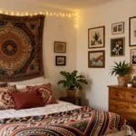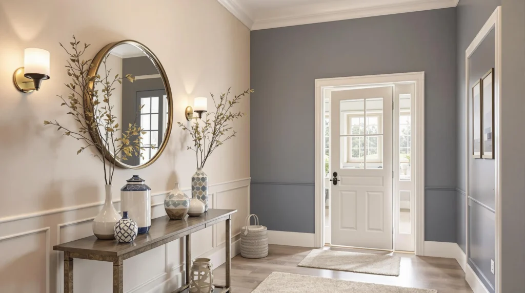
Walking into a home, the foyer creates that crucial first impression. It’s the space that welcomes both you and your guests, setting the tone for the entire house. That’s why choosing the perfect paint color for this area isn’t just decorating—it’s strategic home design.
We’ve gathered the most stunning foyer paint color ideas to transform your entryway from forgettable to fantastic. Whether you’re looking for something bold and dramatic or subtle and sophisticated, the right shade can enhance your foyer’s architectural features and complement your overall home aesthetic. From timeless neutrals to unexpected statement colors, we’ll help you find the perfect hue to make your entrance area truly shine.
10 Timeless Neutral Foyer Paint Color Ideas for a Welcoming Entrance
1. Crisp White
Bright white paint creates an airy, spacious feel in your foyer regardless of its actual size. Benjamin Moore’s “Simply White” offers a clean canvas that maximizes natural light and serves as a perfect backdrop for artwork and decor. This versatile shade works wonderfully in both traditional and modern homes, allowing architectural details like wainscoting or crown molding to stand out beautifully.
2. Warm Greige
Greige combines the warmth of beige with the sophistication of gray for a balanced neutral that feels both cozy and contemporary. Sherwin-Williams “Agreeable Gray” delivers a welcoming vibe that transitions smoothly to adjacent rooms. Many designers recommend this shade for its ability to complement virtually any decor style from farmhouse to transitional.
3. Soft Taupe
Taupe provides subtle warmth without overwhelming your entrance space. Behr’s “Perfect Taupe” creates a gentle, inviting atmosphere that pairs beautifully with natural wood elements and metallic accents. This elegant neutral adapts to changing light throughout the day, appearing slightly warmer during golden hour and cooler during midday.
4. Classic Ivory
Ivory paint colors add a touch of warmth while maintaining a light, airy feel in your foyer. Farrow & Ball’s “Pointing” offers a creamy undertone that feels sophisticated without the starkness of pure white. This timeless shade works particularly well in homes with traditional architecture or those seeking a slightly antique aesthetic.
5. Light Gray
Light gray creates a refined, contemporary entrance that still feels warm and inviting. Benjamin Moore’s “Gray Owl” provides a perfect balance of cool and warm undertones that complement most flooring types. This versatile neutral adapts beautifully to various lighting conditions and creates a serene first impression for guests entering your home.
6. Pale Beige
Beige foyers exude warmth and create an immediately welcoming atmosphere. Sherwin-Williams “Accessible Beige” offers depth without feeling too dark or yellow-toned. This approachable neutral coordinates effortlessly with wood tones, stone elements, and virtually any accent color you might incorporate through rugs or artwork.
7. Soft Pewter
Pewter paint brings subtle sophistication to entrance spaces with its blend of gray and brown undertones. Benjamin Moore’s “Revere Pewter” has remained consistently popular for its chameleon-like ability to shift between warm and cool depending on lighting. This dimensional neutral creates a grounded feeling perfect for transitional foyers.
8. Mushroom
Mushroom tones deliver depth and earthy elegance to entrance spaces. Farrow & Ball’s “Elephant’s Breath” offers a complex neutral that appears slightly different throughout the day as light changes. This sophisticated shade creates a subtle backdrop that allows architectural details and statement lighting to stand out beautifully.
9. Warm Off-White
Off-white paints provide subtle warmth without committing to a definite color direction. Sherwin-Williams “Alabaster” creates a soft, luminous glow that feels both fresh and timeless. This versatile neutral works especially well in foyers with limited natural light, helping brighten the space without feeling stark or clinical.
10. Pale Linen
Linen-inspired paint colors bring a natural, organic quality to entrance spaces. Benjamin Moore’s “White Dove” offers a subtle warmth that feels simultaneously fresh and cozy. This versatile neutral provides the perfect backdrop for seasonal decor changes and complements both cool and warm accent colors throughout your home.
8 Bold Foyer Paint Colors That Make a Statement

Ready to make an unforgettable first impression? These bold foyer paint colors will transform your entrance from forgettable to remarkable, setting the tone for your entire home.
- Atmospheric Deep Blue – Create a sophisticated, moody ambiance with deep blue tones like Encore. This rich hue works wonderfully in high-contrast entries, especially when paired with light trim or furnishings.
- Neon Pink – Add instant vibrancy to lackluster hallways with a bold pink like Benjamin Moore’s Peony. This unexpected choice brings personality and energy to your entryway.
- Forest Green – Choose this timeless, grounding color to establish a natural connection. Forest green pairs beautifully with wooden accents, creating an elegant yet welcoming atmosphere.
- Deep Navy – Offer classic drama with this sophisticated shade. Deep navy looks stunning when balanced with crisp white trim, creating a defined, architectural look.
- Jade Green – Energize your foyer without overwhelming the space with this balanced mid-tone green. Jade provides vibrancy while maintaining sophistication.
- Salmon Pink – Bring warmth to transitional spaces with soft yet bold salmon. This versatile hue bridges the gap between neutral and statement colors.
- Barbie Pink – Make a truly unconventional choice with playful, high-energy Barbie pink. This standout color creates a memorable entrance that reflects bold personality.
- Rich Terracotta – Harmonize earthy appeal with bold character through terracotta. This warm, organic tone works beautifully with natural textures and materials.
Dramatic Dark Hues for Sophisticated Spaces
Dark colors can transform your foyer into a sophisticated, intimate space that makes a powerful first impression. Benjamin Moore Revere Pewter HC-172 offers a muted gray with substantial depth, perfectly balancing vibrant adjoining rooms. For understated elegance that enhances architectural details, Farrow & Ball Wevet provides a light gray alternative that creates a subtle backdrop for statement pieces. Charcoal black delivers modern minimalism when paired with metallic fixtures, creating dramatic contrast that elevates your entrance. These darker hues work particularly well in spaces with ample natural light or thoughtful artificial lighting to prevent the area from feeling cramped.
Vibrant Accent Colors That Energize Your Entrance
Inject personality and energy into your foyer with vibrant accent colors that create an immediate impact. Benjamin Moore Peony brings hot pink excitement to compact foyers, instantly establishing a home’s playful character. Pastel blue brightens narrow hallways, making them feel more spacious while providing a refreshing welcome. Sage green offers a more subtle earthy approach that complements natural light beautifully, creating a serene transition into your home. We recommend testing these vibrant hues in your exact lighting conditions before committing, as entryway illumination can significantly affect how these energetic colors appear throughout the day. For maximum versatility, consider using neutrals like Benjamin Moore Classic Gray OC-23 on supporting walls to provide flexibility for rotating artwork while deep accent tones add dimensionality and focus.
7 Light and Airy Foyer Paint Colors to Create a Spacious Feel

1. Soft Whites and Creams for Classic Appeal
Benjamin Moore’s classic whites offer timeless elegance while maximizing light reflection in your foyer. These neutral shades create an immediate sense of spaciousness that welcomes guests into your home. Warm cream variations provide slightly more depth than pure whites without sacrificing brightness, making small entryways feel more open and inviting. Pairing these neutrals with white trim creates a seamless visual flow that enhances architectural features while maintaining that coveted airy aesthetic.
2. Pale Blues for a Serene Entrance
Benjamin Moore’s Palladian Blue transforms foyers into tranquil, welcoming spaces that instantly calm visitors upon entry. This soft blue-green hybrid works exceptionally well in entryways with large windows, maximizing natural light while adding subtle color. Lighter sky-inspired hues provide a perfect balance—adding personality without overwhelming the space or compromising brightness. These shades particularly shine in foyers that receive minimal natural light, as they amplify what little brightness is available.
3. Muted Greens for Natural Harmony
Sherwin-Williams’ lighter green variations bring the outdoors in, creating a nature-inspired tranquility perfect for transitional spaces. Soft sage tones maintain an airy feel while adding subtle depth that pure neutrals simply can’t achieve. These gentle green hues work beautifully with natural wood elements and brass fixtures commonly found in foyer spaces. Their versatility allows them to bridge different design aesthetics throughout your home while keeping the entrance feeling open and inviting.
4. Warm Beige Neutrals for Subtle Sophistication
Nearly Brown SW 9093 by Sherwin-Williams demonstrates how lighter taupe-beige hybrids can add warmth without visual heaviness. Its yellow undertones enhance natural light perception, making even north-facing foyers feel sunnier and more welcoming. These sophisticated neutrals create an excellent backdrop for statement lighting fixtures or artwork in your entrance area. Their timeless quality ensures your foyer will maintain its spacious feel regardless of changing design trends.
5. Pale Gray-Blues for Transitional Elegance
Benjamin Moore’s horizon gray variations bridge cool and warm palettes, making them ideal for foyers that connect differently styled rooms. These transitional shades create subtle depth while maintaining brightness essential for welcoming spaces. Gray-blues reflect light beautifully, especially in satin finishes that enhance their light-amplifying properties. Their versatility pairs seamlessly with both modern and traditional architectural elements commonly found in entrance areas.
6. Creamy Off-Whites for Gentle Warmth
Benjamin Moore’s ivory tones provide slight warmth compared to pure whites, preventing starkness while preserving excellent light-reflective qualities. These creamy variations feel softer and more inviting than stark whites without compromising spaciousness. Buttercream shades work particularly well in foyers with northern exposure, counteracting cool light with their subtle warmth. Their universal appeal ensures your entrance coordinates beautifully with adjacent spaces regardless of their color schemes.
7. Whisper-Light Lavender for Unexpected Softness
Ultra-pale lilac-gray blends provide subtle color variation without overwhelming small entrance spaces. These delicate hues add unexpected sophistication while maintaining an open, airy quality essential for foyers. They work exceptionally well with metallic accents, particularly pewter fixtures that complement their cool undertones. Pairing these whisper-light lavenders with matching trim enhances the perception of height and space through monochromatic harmony.
6 Two-Tone Foyer Paint Color Combinations for Added Dimension

Using two complementary paint colors in your foyer creates depth and visual interest that single-color walls simply can’t achieve. These strategic color combinations can transform an ordinary entrance into a sophisticated, multi-dimensional space.
Complementary Color Pairings for Visual Interest
- Warm Earthy and Creamy White: Combining a rich Rustic Oak with Halogen (creamy white) establishes a modern yet inviting atmosphere. This pairing works wonderfully in foyers with natural wood elements, creating seamless transitions between indoor and outdoor spaces.
- Deep Gray and Light Beige: The contrast between Deep Silver or Thundercloud Gray with Carrington Beige adds sophisticated depth while maintaining warmth. These combinations excel in larger foyers where the interplay of light and shadow can be fully appreciated.
- Soft Pastel and Neutral White: Gentle pastel tones paired with crisp neutral whites create a welcoming, airy entrance. This combination offers subtle dimension without overwhelming visitors upon entry.
- Rich Navy Blue and Soft Gray: Ocean-inspired sophistication emerges when dark navy meets warm gray tones. This pairing brings dramatic contrast while remaining timeless and elegant, especially in foyers with substantial natural light.
- Green and Earthy Brown: Mossy green tones alongside earthy browns establish a natural, cozy ambiance. These nature-inspired combinations help connect your indoor space with outdoor elements for a grounded, welcoming entrance.
- Vibrant Yellow and Soft Cream: Energetic yellow paired with soft cream creates a cheerful, sunlit welcome regardless of your foyer’s actual light conditions. This combination instantly lifts the mood while maintaining visual balance.
Color-Blocking Techniques for Modern Foyers
Horizontal Color Blocking: Dividing your foyer walls horizontally creates balance and visual interest. Paint the lower portion with a deeper tone and the upper section with a lighter complementary color to ground the space while maintaining openness above.
Vertical Color Blocking: Creating vertical sections with different paint colors adds perceived height and draws the eye upward. This technique works especially well in foyers with architectural features like columns or alcoves that naturally define different wall sections.
Accent Wall Technique: Designating just one wall for your bolder color choice creates a natural focal point and prevents the space from feeling overwhelming. This approach works particularly well when highlighting architectural features like a staircase wall or an entrance wall with minimal interruptions.
When implementing these two-tone techniques, consider your foyer’s lighting conditions, as natural and artificial light will significantly impact how these color combinations interact throughout the day. Sample your chosen combinations on small areas first to ensure they create the desired effect in your exact space.
9 Trending Foyer Paint Colors for 2023

Nature-Inspired Tones for Organic Ambiance
- Sage Green brings tranquility to any entrance with its muted, earthy undertones. Designers widely endorse this versatile shade for both small and spacious foyers, creating a calming transition from the outside industry.
- Jade Green offers a richer, more saturated option that adds depth while maintaining organic warmth. This vibrant hue works beautifully for creating statement walls that immediately capture attention when guests enter your home.
- Forest Green has risen in popularity for accent walls and trim details in foyers. The darker earth tone delivers a natural, calming effect that grounds the space and creates a sophisticated welcome.
- Burnt Orange/Terracotta shades are replacing cooler tones in modern foyers. These warm, earthy red-orange hues invigorate entryways with their rich, sunbaked quality that pairs beautifully with natural wood elements.
- Olive Green features muted tones with gray undertones that align perfectly with the current shift toward earthy palettes. This versatile color complements wooden accents and creates a subtle but impactful first impression.
Contemporary Neutrals with Character
- Warm Neutrals like beige and cream with yellow or pink undertones have displaced stark whites in foyer design. These cozy options foster a welcoming atmosphere while maintaining a clean, timeless look that doesn’t overwhelm the senses.
- Cool-Toned Gray in soft shades like “pebble” or “slate” provides modern elegance for contemporary homes. These sophisticated neutrals create a serene entrance without feeling cold or sterile.
- Dark Brown in rich chocolate or coffee hues adds instant sophistication to foyer spaces. These deep tones pair exceptionally well with natural materials like wood and stone, creating a grounding effect in your entrance.
- Pastel Blue offers light, airy freshness while maintaining neutrality in the color palette. This subtle shade provides a breath of fresh air in entrance spaces, creating a calm transition between outdoors and indoors.
5 Foyer Paint Colors That Coordinate With Popular Flooring Types

Selecting the perfect paint color for your foyer requires thoughtful consideration of your existing flooring. The right color pairing creates a harmonious entrance that flows beautifully into the rest of your home.
Perfect Pairings for Hardwood Entrances
Hardwood floors bring natural warmth and character to your foyer, making them a popular choice for many homeowners. The undertones in your hardwood should guide your paint color selection for the most cohesive look.
- For Red-Toned Hardwood:
SW 6204 Sea Salt offers a soft, calming presence that beautifully complements the rich red undertones in cherry or mahogany floors. This gentle green-blue hue creates a refreshing contrast without competing with your statement floors.
SW 6161 Nonchalant White provides a gentle white backdrop that balances bold floor colors while maintaining an airy feel. This versatile neutral allows your rich red-toned hardwood to remain the focal point.
- For Brown-Toned Hardwood:
SW 9632 Serenely delivers a soothing atmosphere that harmonizes perfectly with chocolate, walnut, or espresso brown floors. This balanced neutral creates depth without overwhelming the space.
SW 6000 Snowfall features just enough warmth to complement brown hardwood while keeping your foyer bright and welcoming. The subtle creamy undertones prevent the space from feeling stark or clinical.
- For Golden or Orange-Toned Hardwood:
SW 9636 Windchill presents a cool, crisp contrast that beautifully balances the warmth of oak or pine floors. This refreshing white creates a modern, clean aesthetic in your entrance.
SW 9180 Aged White delivers a classic, timeless look that enhances the natural beauty of golden floors. The subtle depth in this white paint provides sophistication while maintaining brightness.
Complementary Colors for Tile and Stone Foyers
Tile and stone flooring creates distinctive patterns and textures that influence your paint color selection. We recommend these versatile options to enhance your foyer’s natural stone or tile features:
- Soft Neutrals: Beige or cream paint colors blend seamlessly with most tile patterns, creating a cohesive look that feels intentional rather than busy. These warm neutrals particularly complement travertine, limestone, or ceramic tile with earthy undertones.
- Cool Whites: Bright, airy whites work exceptionally well with marble or slate tile, improving the natural veining or patterns while creating a spacious feel. These clean backgrounds allow intricate floor designs to take center stage.
- Subtle Grays: Sophisticated gray tones complement darker stone like granite or basalt, adding depth and refinement to your entrance. The cooler undertones create balance with the natural variation in stone flooring.
Always test your chosen paint samples in your exact lighting conditions before committing. The unique natural and artificial light in your foyer can significantly affect how the color appears throughout the day.
4 Small Foyer Paint Color Ideas to Maximize Your Space

1. Warm Neutrals (Beige/Greige)
Warm neutral tones create an illusion of spaciousness in compact foyers while maintaining a timeless appeal. These versatile hues align perfectly with current “quiet luxury” design trends, offering subtle sophistication without overwhelming the limited square footage. Beige and greige variations adapt beautifully to different lighting conditions throughout the day, making them ideal for entryways that might not receive consistent natural light. We’ve found that these colors pair seamlessly with most furniture styles and décor elements, allowing for easy updates to your foyer accessories without needing to repaint.
2. Earthy Pinks & Terracottas
Pale plaster pinks and subtle terracotta shades function as unexpected near-neutrals that add dimension to small entrance areas. These warm-toned options infuse your compact foyer with a welcoming glow while maintaining an open, airy feeling that’s essential in limited spaces. Earthy pink tones harmonize particularly well with natural light, creating a soft, flattering ambiance for everyone who enters your home. Many designers are embracing these hues for their ability to transition smoothly between adjoining rooms, making them perfect for open-concept layouts where the foyer flows directly into other living spaces.
3. Bold Dark Tones (Deep Teal/Burgundy)
Contrary to conventional wisdom, deep, saturated colors can actually expand the perceived depth of small foyers rather than making them feel cramped. Colors like deep teal, rich burgundy, and charcoal gray create a dramatic envelope that blurs spatial boundaries and adds sophisticated impact to your entrance. These bold choices establish a distinct transition between outdoor and indoor environments, making even the smallest foyer feel intentional and well-designed. Bold colors work exceptionally well when paired with strategically placed mirrors and thoughtful lighting to enhance their depth-creating properties.
4. Soft Greens & Blues
Light green tones evoke natural tranquility while making compact entryways feel connected to the outdoors. Muted blues introduce a serene, moody aesthetic that can make small foyers feel more expansive and considered. Both color families enhance and reflect natural light, creating a brightening effect that’s crucial in limited spaces. These gentle hues pair beautifully with wood accents and metallic finishes, allowing you to incorporate stylish details that elevate your small foyer without creating visual clutter. Always test paint swatches under your foyer’s exact lighting conditions to ensure the undertones complement your existing décor and flooring materials.
7 Paint Color Solutions for Foyers With Limited Natural Light

Lacking natural light in your foyer doesn’t mean you’re stuck with a dark, uninviting entrance. We’ve compiled expert-recommended paint colors specifically designed to brighten and enhance foyers with minimal natural light.
1. Bright White
Benjamin Moore’s Simply White maximizes the reflection of any available light in your dim foyer. This crisp, clean shade creates an instantly brighter and more welcoming entrance space without feeling sterile. Simply White works brilliantly in foyers with limited windows or those facing north, helping to amplify what little natural light filters through.
2. Soft Gray
Revere Pewter from Benjamin Moore provides an excellent neutral backdrop that performs exceptionally well in low-light conditions. This versatile gray maintains its character throughout the day while creating a sophisticated atmosphere. Soft gray tones add depth without absorbing too much light, making your foyer feel more spacious and inviting even though lighting challenges.
3. Yellow-Based Whites
Colors like New White and White Tie from Farrow & Ball effectively bounce what little light is available in your dim foyer. These subtle yellow undertones create a warmer, brighter atmosphere compared to stark whites. Yellow-based whites offer noticeable brightness without appearing too clinical or institutional, perfect for creating a gentle transition from outdoors.
4. Extra White and Pure White
Sherwin-Williams options such as Extra White and Pure White offer refined alternatives for crisp trims and ceilings. These versatile whites help foyer spaces feel lighter without appearing flat or one-dimensional. Pure White delivers a hint of warmth that prevents the space from feeling cold while still maximizing light reflection throughout your entrance area.
5. Warm Neutrals
Colors like Joa’s White create a cozy and inviting environment by adding warmth without darkening your light-challenged foyer. These warm neutral tones establish an intimate atmosphere that welcomes guests while maintaining brightness. Warm neutrals work particularly well in foyers with vintage or traditional architectural elements that benefit from a softer approach.
6. Soft Cream
Soft cream enhances the warm ambiance of your foyer without relying heavily on natural light sources. This timeless option creates an inviting atmosphere while maintaining sufficient brightness to prevent the space from feeling cramped or gloomy. Cream tones complement various design styles from farmhouse to traditional, making them versatile choices for different home aesthetics.
7. Deep Rich Colors
Deep colors create a dramatic yet cozy atmosphere that strategically compensates for the lack of natural light. Rather than fighting the darkness, these rich tones embrace it by creating an intentionally intimate entrance experience. Dark blues, forest greens, or burgundies paired with strategic lighting fixtures and reflective accessories can transform a dim foyer into a sophisticated, jewel-box entrance.
How to Choose the Perfect Foyer Paint Color for Your Home’s Style
Selecting the perfect foyer paint color doesn’t have to be overwhelming. We’ve shared many options from timeless neutrals to bold statements that can transform your entrance into a memorable space.
Remember to consider your home’s natural lighting flooring materials and overall aesthetic when making your choice. Test paint samples directly in your foyer and observe how they appear at different times of day.
Whether you opt for airy pastels dramatic darks or trendy nature-inspired hues your foyer color should feel like an intentional welcome to your home. The perfect shade will not only create that crucial first impression but also set the tone for your entire living space.
Now it’s time to grab those paint swatches and create an entrance that truly reflects your style and personality!
Frequently Asked Questions
What makes the foyer so important in a home?
The foyer creates the first impression of your home for both residents and guests. It sets the tone for the entire house and serves as a transitional space between the outside world and your interior living areas. A well-designed foyer with the right paint color can make your home feel more welcoming, establish your personal style, and enhance the overall flow of your home.
What are the best neutral paint colors for a foyer?
The best neutral paint colors for a foyer include Crisp White (maximizes light), Warm Greige (sophisticated and versatile), Soft Taupe (subtle warmth), Classic Ivory (airy yet warm), Light Gray (refined), Pale Beige (coordinates well), Soft Pewter (adaptable undertones), Mushroom (earthy elegance), Warm Off-White (bright without starkness), and Pale Linen (complements seasonal decor).
Can I use bold colors in my foyer?
Absolutely! Bold colors can make a striking statement in your foyer. Options like Deep Blue, Forest Green, Deep Navy, Jade Green, Salmon Pink, Barbie Pink, and Rich Terracotta can add personality and create a memorable entrance. Bold colors work particularly well when you want to establish a distinct atmosphere or highlight architectural features in your foyer.
How can I make my small foyer appear larger?
To make a small foyer appear larger, opt for warm neutrals like beige or greige, light earthy pinks or terracottas, soft greens or blues, or even bold dark tones like deep teal or burgundy. Use adequate lighting, incorporate mirrors to reflect light, and maintain visual consistency with adjoining spaces. Light and airy colors generally maximize the perception of space.
What paint colors work best for foyers with limited natural light?
For foyers with limited natural light, consider Bright White (maximizes reflection), Soft Gray (adds sophistication), Yellow-Based Whites (warmer alternatives), Extra White or Pure White (crisp and inviting), Warm Neutrals (creates intimacy), Soft Cream (enhances warmth), or even Deep Rich Colors (for dramatic effect). Proper artificial lighting will complement these color choices.
How do I coordinate foyer paint with my existing flooring?
For hardwood floors, pair red-toned wood with Sea Salt (SW 6204), brown-toned wood with Serenely (SW 9632), and golden/orange-toned wood with Windchill (SW 9636) or Aged White (SW 9180). For tile and stone, soft neutrals, cool whites, and subtle grays enhance natural features. Always test paint samples in your foyer’s specific lighting conditions.
What are the trending foyer paint colors for 2023?
Trending foyer paint colors for 2023 include nature-inspired tones like Sage Green, Jade Green, Forest Green, Burnt Orange/Terracotta, and Olive Green. Contemporary neutrals such as Warm Neutrals, Cool-Toned Gray, Dark Brown, and Pastel Blue are also popular choices that create a fresh, updated look for modern homes.
What is color-blocking and how can I use it in my foyer?
Color-blocking is a technique that uses two or more distinct colors to create visual interest and dimension. In a foyer, you can implement it through horizontal divisions (different colors above and below a chair rail), vertical divisions (different colors on adjacent walls), or an accent wall. This technique adds architectural interest and can highlight specific features of your entryway.
How should I test paint colors before committing?
Test paint colors by applying sample patches (at least 2×2 feet) directly on your foyer walls. Observe these samples at different times of day to see how natural and artificial lighting affects them. Consider viewing the colors alongside your flooring, trim, and any furniture or decor that will remain in the space. This approach ensures the colors work harmoniously in your specific environment.
Can dark colors work in a foyer?
Yes, dark colors like muted gray, charcoal black, deep teal, or burgundy can create a sophisticated, intimate atmosphere in a foyer. They add drama and can actually make a space feel larger by blurring visual boundaries. For success with dark colors, ensure adequate lighting, consider the size of your space, and balance with lighter elements through trim, decor, or adjoining rooms.