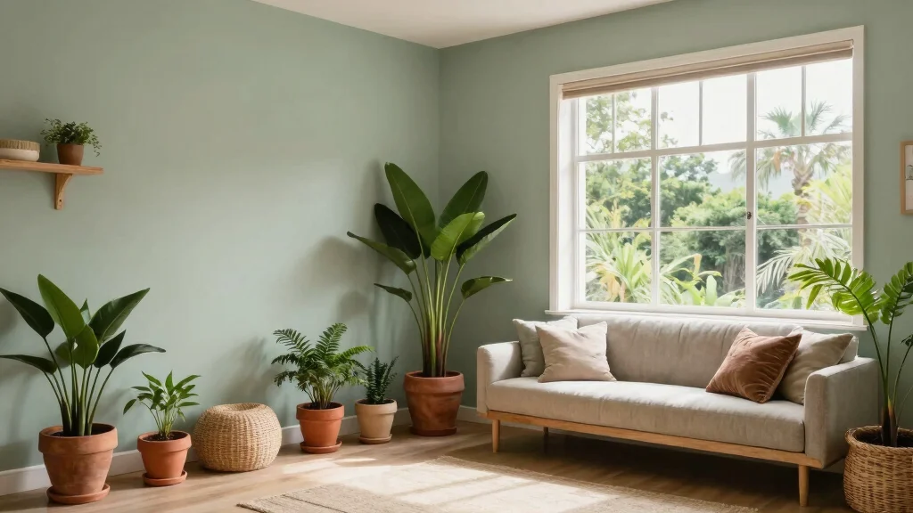
If you’ve been daydreaming about transforming your home into a tranquil sanctuary, you’re not alone. The quest for calmness and a connection to nature often leads decor aficionados to explore serene color palettes. This post focuses on light gray green paint colors, which harmoniously blend the coolness of gray with the earthiness of green. These shades evoke a sense of calm and natural beauty, making them perfect for any room in your home.
If you’re someone who loves creating peaceful and inviting spaces, this guide is tailored just for you. Whether you’re a DIY enthusiast or simply looking for inspiration, you’ll find a treasure trove of ideas here. I’ve curated a list of 12 light gray green paint colors that are soothing, versatile, and perfect for crafting a serene atmosphere in your living space.
Get ready to discover calming paint colors that not only beautify your home but also foster a relaxing environment. From soft sage to frosted pine, each color has a unique character and charm, ready to bring a touch of nature indoors. By the end of this post, you’ll be equipped with all the insights needed to select the perfect shade for your home decor project.
Key Takeaways
– Light gray green paint colors create a serene atmosphere, enhancing relaxation in your home.
– These shades are perfect for various rooms, offering versatility and a natural touch.
– Each color on the list has unique attributes that cater to different interior styles.
– Using calming paint colors can help improve mood and promote well-being.
– Embracing eco-friendly options in your decor journey is a sustainable choice for your home.
How To Choose The Right Light Gray Green Paint Color
1. Consider Your Space: Evaluate the room size and natural light. Lighter shades can make smaller spaces feel airy, while deeper tones add coziness to larger areas.
2. Test Samples: Always paint swatches on your walls before making a final decision. Colors can look different under varying light conditions, so observe them at different times of the day.
3. Match with Existing Decor: Think about your current furniture and decor. Choose a gray green shade that complements your existing color palette rather than clashes with it.
4. Think About Mood: Different shades evoke different feelings. Softer greens tend to feel more calming, while deeper hues can bring warmth and intimacy to a space.
5. Eco-Friendly Options: Look for low-VOC or zero-VOC paints to maintain indoor air quality. Sustainable choices not only help the environment but also ensure a healthier living space for you and your family.
Pro Tip: Once you narrow down your options, buy sample pots to paint small sections of your wall. This way, you can see how the colors interact with your furnishings and lighting before committing.
How To Use Light Gray Green Paint Colors in Your Home
Transforming your home with light gray green colors can be easy and fun. Here’s how to make the most of these soothing hues:
Tools You’ll Need:
– Paintbrushes and rollers
– Painter’s tape
– Drop cloths
– Paint tray
– Ladder (for high areas)
Step 1: Prepare Your Space
Clear out any furniture or cover it with drop cloths. Make sure to tape off edges where the walls meet ceilings or trim to ensure clean lines.
Step 2: Prime If Necessary
If you’re transitioning from a darker color or if your walls have stains, a primer will help the new color appear more vibrant and even.
Step 3: Apply the Paint
Start by cutting in around edges with a brush, then use a roller for larger areas. Make sure to apply at least two coats for the best coverage.
Step 4: Assess Lighting
Check how the color looks under different lighting conditions. It might look more vibrant in natural daylight and softer in artificial light.
Step 5: Allow to Dry
Let the paint dry thoroughly before moving furniture back in. This will help avoid smudges and ensure a smooth finish.
Step 6: Decorate
Once the paint is dry, bring your furniture and decor back in. Add accents that complement your new wall color, such as throw pillows, artwork, or rugs.
Estimated Time: ⏱ About 4-6 hours for painting, plus drying time.
Tip: Consider using lighter shades in smaller rooms to create an illusion of space and airiness, and deeper tones in larger rooms for warmth.
Buying Guide: How To Choose The Best Light Gray Green Paint
When selecting the perfect light gray green paint, there are several factors to consider. This guide will help you navigate your options effectively.
Types of Light Gray Green Paint:
– Matte: Offers a smooth finish and is ideal for low-traffic areas.
– Eggshell: Slightly glossy, making it easier to clean, perfect for living rooms and bedrooms.
– Satin: Provides a soft sheen, suitable for areas like hallways and kitchens.
Key Features to Check:
– Durability: Look for paints that are washable and resistant to stains, especially for high-traffic areas.
– Color Accuracy: Some paint brands offer more color variations, so check swatches carefully.
– Eco-Friendliness: Opt for paints with low or no harmful chemicals to protect air quality.
Material Comparison:
| Type | Finish | Cleanability | Best Use |
|———–|———-|————–|———————|
| Matte | Flat | Low | Ceilings, Bedrooms |
| Eggshell | Soft | Moderate | Living Rooms |
| Satin | Soft Shine | High | Kitchens, Bathrooms |
Extra Considerations:
– Local Availability: Check local stores or online retailers for the best options and prices.
– Price Range: Affordable options are available, but investing in quality paint can save you money in the long run.
Top Recommendations:
– 🏆 Best Overall: Soft Sage – a perfect balance of gray and green.
– 🥈 Best Budget: Misty Meadow – offers great color at an affordable price.
– 🥉 Best for Small Spaces: Frosted Pine – adds a cozy touch without feeling overwhelming.
Final Tip: Always buy a little extra paint for touch-ups. This way, you’ll have the same batch for future repairs, ensuring a consistent finish.
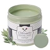
1. Soft Sage

Soft sage is a charming light gray green that captures the essence of nature’s tranquility and renewal. This color excels in creating peaceful spaces, seamlessly blending with organic materials like wood and stone for a harmonious look. Imagine soft sage walls paired with creamy furniture and earthy throw pillows, crafting a cozy haven in your living room. In bedrooms, this hue promotes restful sleep, effortlessly highlighting architectural features or serving as a soothing accent wall.
To make the most of soft sage, consider these practical tips:
– Pair it with warm, natural textiles for a balanced look.
– Use it in spaces with ample natural light to enhance its subtle beauty.
– Consider combining it with muted blush or soft peach for a fresh, harmonious palette.
With soft sage, you’re not just painting; you’re crafting a serene retreat that reflects the tranquility of nature.


Last update on 2026-02-27 / Affiliate links / Images from Amazon Product Advertising API
2. Misty Meadow

Misty meadow is a delicate hue that embodies the soft charm of a foggy landscape. This light gray green is perfect for creating serene environments, reminiscent of peaceful mornings spent outdoors. It pairs beautifully with crisp white trim and natural wood finishes, infusing a room with a calming aura. Whether used in a dining area for relaxed meals or a home office to inspire creativity, misty meadow complements various design styles effortlessly.
To effectively incorporate misty meadow into your home, try these ideas:
– Use it in combination with natural textures like linen and jute.
– Pair with lighter wood furniture to maintain a bright, airy feel.
– Accessorize with pastel accents like soft pinks or yellows for a touch of warmth.
Choosing misty meadow can transform any space into a tranquil haven, inviting comfort and calmness.


Last update on 2026-02-27 / Affiliate links / Images from Amazon Product Advertising API
3. Tranquil Fern

Tranquil fern is a vibrant light gray green that brings the refreshing essence of a forest into your home. This lively shade energizes spaces while still offering a soothing atmosphere. Picture this color adorning the walls of a cozy reading nook or a creative office, where inspiration flows freely. It beautifully complements natural wood tones and pairs well with deep blues or warm metallics for added sophistication.
For using tranquil fern effectively, consider these suggestions:
– Incorporate it into spaces that receive plenty of sunlight to highlight its vibrancy.
– Pair with soft, plush textures to create a cozy atmosphere.
– Use as an accent color in home decor items like cushions or artwork.
By choosing tranquil fern, you’ll cultivate a lively yet peaceful retreat that inspires relaxation and creativity.


Last update on 2026-02-27 / Affiliate links / Images from Amazon Product Advertising API
4. Pebble Path

Pebble path is a gentle gray green that mimics the subtle hues found in nature’s stones. This color has a grounding quality, making it ideal for creating calm and stable environments. Perfect for entryways or hallways, pebble path welcomes you with a soothing and sophisticated feel. Pair it with light wood accents to accentuate its earthy tones, or juxtapose it with darker furniture for a striking contrast.
To incorporate pebble path into your decor, consider these options:
– Use with minimalistic decor elements to highlight the color’s elegance.
– Accessorize with plants in terracotta pots to add warmth.
– Incorporate textured fabrics for an inviting touch.
Choosing pebble path whispers subtle elegance throughout your home, connecting you to the tranquility of nature.

Last update on 2026-02-27 / Affiliate links / Images from Amazon Product Advertising API
5. Seafoam Breeze

Seafoam breeze captures the refreshing essence of calm ocean waves in a vibrant yet soothing shade. This light gray green is perfect for bathrooms or coastal-themed spaces, infusing an invigorating vibe that feels both relaxing and uplifting. Imagine stepping into a bathroom adorned with seafoam breeze walls, where the color calms your senses while evoking serene coastal memories. Pair it with whites and soft grays for a crisp, clean aesthetic.
For using seafoam breeze effectively, try these ideas:
– Combine with light whites for a fresh, airy atmosphere.
– Use in combination with natural elements like driftwood or seashells.
– Enhance with soft textiles, like fluffy towels or woven baskets.
Choosing seafoam breeze transforms your home into a serene seaside retreat without ever stepping outside.
Seafoam Breeze makes even small bathrooms feel like a coastal retreat. With light gray green paint colors, you get calm, cleaner air for your day-to-day routine—and it pairs beautifully with whites for a fresh, eco-friendly vibe.


Last update on 2026-02-27 / Affiliate links / Images from Amazon Product Advertising API
6. Olive Mist

Olive mist embodies deeper gray green tones that bring a touch of warmth and earthiness to your decor. This inviting shade is perfect for creating spaces that embrace connection and relaxation. Consider using olive mist in living rooms or dining areas where family and friends gather, as it beautifully complements warm wood tones and invites a sense of togetherness.
To effectively incorporate olive mist, follow these tips:
– Pair it with natural wood furniture for a harmonious look.
– Use it as an accent to highlight architectural features like moldings or beams.
– Complement it with textiles in warm colors or soft neutrals.
Opting for olive mist can deepen the warmth in your space, turning your home into a cozy retreat perfect for gatherings.


Last update on 2026-02-27 / Affiliate links / Images from Amazon Product Advertising API
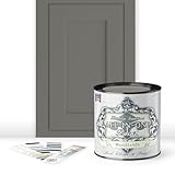
7. Woodland Gray

Woodland gray is a beautiful blend of gray and green that evokes the gentle shadows found beneath a forest canopy. This color conveys peace and tranquility, making it an ideal choice for those seeking to create a sanctuary at home. It pairs wonderfully with natural wood and stone elements, enhancing the beauty of rustic designs. Use woodland gray in bedrooms or lounges to cultivate a relaxing atmosphere.
Consider these ideas for using woodland gray:
– Pair with white or cream linens to create a cozy bedroom environment.
– Accessorize with natural elements such as rocks or driftwood.
– Incorporate artwork featuring landscapes or nature scenes.
Choosing woodland gray creates a calming ambiance throughout your home, encouraging a deep sense of peace.
Woodland gray isn’t just a color—it’s a mood. A few coats of light gray green paint colors in your bedroom or lounge can transform a space into a calm, forest-inspired sanctuary, especially when you pair it with natural wood and stone.


Last update on 2026-02-27 / Affiliate links / Images from Amazon Product Advertising API
8. Cool Moss

Cool moss is a refreshing light gray green that radiates vibrant energy while maintaining a grounded feel. This shade can enhance any room, making it an excellent choice for kitchens or offices where creativity thrives. Pair it with crisp white cabinetry for a modern touch, and don’t hesitate to include plants to amplify the lush vibe.
To utilize cool moss effectively, consider these options:
– Combine with sleek silver or chrome fixtures for a contemporary look.
– Use it alongside warm, earthy tones for a balanced palette.
– Accessorize with colorful, patterned textiles for added interest.
Opting for cool moss can transform any space into a lively haven that embraces creativity and freshness.


Last update on 2026-02-27 / Affiliate links / Images from Amazon Product Advertising API
9. Pebble River

Pebble river is a soft, muted light gray green that brings calm and serenity to any space. This color evokes the tranquility of flowing water, creating a peaceful retreat in your home. It’s especially lovely in bedrooms or bathrooms, where relaxation is key. Pair pebble river with soft whites or light wood finishes to maintain an airy feel.
Suggestions for using pebble river include:
– Use it as a backdrop for botanical prints or art.
– Combine with light textiles for a layered look.
– Accessorize with natural fibers like jute or linen.
Choosing pebble river transforms your space into a soothing sanctuary reminiscent of nature’s calm waterways.
Pebble River proves that calm is a color you can live in daily. For light gray green paint colors, this shade pairs perfectly with soft whites and light wood, turning bedrooms into a peaceful retreat.

Last update on 2026-02-27 / Affiliate links / Images from Amazon Product Advertising API
10. Dusty Spruce

Dusty spruce is a sophisticated light gray green that infuses spaces with elegance and depth. This color is perfect for crafting a rich yet tranquil atmosphere that feels both refined and welcoming. Ideal for dining rooms or elegant living spaces, dusty spruce pairs beautifully with metallics and rich textiles.
For using dusty spruce, keep these tips in mind:
– Combine with gold or brass accents for a luxurious touch.
– Use alongside rich textiles like velvet or silk for added texture.
– Accessorize with art pieces that echo the nature theme.
By choosing dusty spruce, you’ll cultivate a sophisticated yet serene atmosphere, making your home a true reflection of your style.
Last update on 2026-02-27 / Affiliate links / Images from Amazon Product Advertising API
11. Silver Sage

Silver sage is a stunning light gray green that feels both contemporary and timeless. This color captures the beauty of nature with a hint of sophistication, making it perfect for modern homes. Its subtle sheen creates a serene backdrop in living rooms or bedrooms, effortlessly pairing with various styles—from boho to industrial.
Here are some ways to style silver sage:
– Combine with brass or gold accents for a chic finish.
– Use alongside soft textile patterns for added depth.
– Pair with bold colors to create a beautiful contrast.
Opting for silver sage allows you to cultivate a fresh yet timeless space that feels effortlessly inviting.
12. Frosted Pine

Frosted pine is a calming gray green that evokes the peaceful essence of a winter forest. This hue is ideal for those looking to create a cozy environment while maintaining tranquility in their home. Use frosted pine in your living room or study to foster a nurturing atmosphere. It pairs wonderfully with soft neutrals and warm woods, creating a harmonious balance that feels inviting.
For using frosted pine effectively, consider these ideas:
– Combine with textures like wool or knitted throws for added warmth.
– Use alongside warm wood furniture for an inviting look.
– Add accents in soft white or cream to brighten the space.
Choosing frosted pine helps establish a calming retreat, making every corner of your home feel serene and welcoming.
Conclusion

Light gray green paint colors offer a unique opportunity to transform your home into a tranquil and natural sanctuary. From soft sage to frosted pine, each hue inspires calmness and connection to the earth, enhancing your sustainable home decor journey.
Consider incorporating these shades to create spaces filled with serenity and beauty. With the right light gray green paint color, you can craft your own oasis of peace and comfort that reflects your personal style.
Note: We aim to provide accurate product links, but some may occasionally expire or become unavailable. If this happens, please search directly on Amazon for the product or a suitable alternative.
This post contains Amazon affiliate links, meaning we may earn a small commission if you purchase through our links, at no extra cost to you.
Frequently Asked Questions
What are the best light gray green paint colors for a calm, natural look?
For a calm, natural vibe, start with light gray green paint colors that lean warm gray and pale sage. Test several samples on your wall at different times of day to see how they shift with natural light. Choose eco-friendly options (low-VOC, sustainable pigments) to keep your space aligned with sustainable home decor. Pair with natural decor like wood tones, linen, and plants to cultivate a serene color palette. When you’re unsure, opt for a shade with a soft undertone and a good amount of white to keep the space airy.
How can I choose sustainable, eco-friendly light gray green paint colors for a serene color palette?
Start by filtering for eco-friendly labels—low-VOC or zero-VOC, plant-based binders, and recycled packaging. Compare gray-green shades by looking at their undertones in natural daylight, not store lighting. Preview large swatches on a full wall to see how the color interacts with furniture and plants. Choose brands with transparent ingredient lists and low-emission manufacturing to support sustainable home decor. Once you’ve picked a candidate, test with a two-week sample patch to ensure it harmonizes with your serene color palette.
What interior paint ideas help gray-green shades feel calming in small spaces?
Use light gray green shades as an accent wall or on all walls in a small room with plenty of natural light to maximize the calming effect. Pair with natural materials like wood, jute, and linen to anchor the look and avoid clutter that can feel busy. Select a soft finish—matte or eggshell—to reduce glare and keep the space serene. Extend the color story into textiles, artwork, and greenery to reinforce the calming paint colors across the room. Add warm lighting to prevent a cool cast that can make the space feel clinical.
Which gray green shades work well with natural home decor and sustainable furnishings?
Warmer gray greens with beige undertones often pair best with natural home decor and sustainable furnishings like FSC wood and organic textiles. Cooler gray greens can read more modern, so balance them with warm neutrals to maintain a serene color palette. Evaluate how the shade reads in daylight and under LED lighting—some can shift more blue or yellow. Accessorize with greenery, linen drapes, and rattan furniture to strengthen the eco-friendly vibe.
How do I test and apply light gray green paint colors to ensure they stay true under different lighting?
Start with large swatches on an interior wall and observe across morning, afternoon, and evening light to see how the color shifts. Choose a finish that fits your space—eggshell or satin for durability with a soft sheen that still feels calm. Use a reliable primer to seal the wall and prevent color bleed, especially with sustainable pigments. Look for interior paint ideas that emphasize low-VOC formulas and proper ventilation during and after painting. Once applied, clean walls with a gentle solution to maintain the hue without fading.
Related Topics
home decor
light gray green paint
calming colors
natural decor
gray green shades
eco-friendly paint
serene palette
interior paint ideas
sustainable living
minimalist design
color trends
beginner friendly