Ever walked into a room and instantly felt uplifted? That’s the power of color psychology at work. The paint colors surrounding us can dramatically influence our mood, energy levels, and overall sense of happiness without us even realizing it.
We’ve researched the science behind color psychology and consulted with interior design experts to bring you the definitive guide to mood-boosting paint colors. Whether you’re planning a complete home makeover or just refreshing a single room, choosing the right hues can transform your living space into a sanctuary of positive energy and joy.
How Color Psychology Affects Your Mood at Home
Color psychology isn’t just a design trend—it’s a science that explains how different hues impact our emotions and behaviors. The colors surrounding us in our homes can significantly influence our daily mood, productivity, and overall well-being. Research from the Journal of Environmental Psychology shows that people respond emotionally to colors based on both personal experiences and cultural associations.
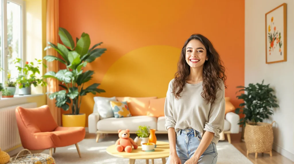
Warm colors like red, orange, and yellow tend to energize a space and promote social interaction. Red stimulates excitement and passion but can increase stress levels when overused. Yellow brings optimism and creativity but might cause visual fatigue in large doses. Orange combines the energy of red with the cheerfulness of yellow, creating a welcoming atmosphere perfect for gathering spaces.
Cool colors such as blue, green, and purple generally create calm, relaxing environments. Blue lowers blood pressure and heart rate, making it ideal for bedrooms and bathrooms. Green connects us to nature and reduces anxiety, working wonderfully in any room where balance is desired. Purple, historically associated with luxury, can add a sense of sophistication while promoting introspection and mindfulness.
Neutral tones provide versatility and serve as excellent foundations for any color scheme. White creates a sense of spaciousness and cleanliness but can feel sterile without accent colors. Gray offers sophistication and pairs well with almost any accent color. Beige and tan bring warmth and stability while allowing other elements in your decor to stand out.
Color intensity and brightness also play crucial roles in mood regulation. Brighter colors stimulate activity and alertness, making them suitable for home offices and kitchens. Softer, muted tones promote relaxation and are better suited for bedrooms and reading nooks. The finish of your paint (matte, eggshell, or gloss) further influences how light reflects and how the color is perceived throughout the day.
Room function should guide your color choices for maximum psychological benefit. Kitchens benefit from appetizing colors like yellow or warm neutrals. Living rooms work well with community-building hues like green or light blue. Bedrooms require restful colors such as lavender, soft blue, or gentle sage green. Home offices function best with focus-improving colors like blue-green or subtle yellows.
10 Paint Colors That Will Boost Your Happiness

Sunny Yellow: The Ultimate Mood Lifter
Sunny yellow consistently ranks as one of the most effective colors for boosting happiness, with research linking it to high-arousal positive emotions. This vibrant hue naturally evokes energy and cheerfulness, making it perfect for spaces where you need an instant mood lift. Consider incorporating sunny yellow in kitchens or home offices to promote productivity and positive thinking.
Sky Blue: Creating Calm and Contentment
Sky blue promotes a sense of calm and contentment, making it an excellent choice for creating relaxing environments. Studies have connected this shade to low-arousal positive emotions such as relaxation and tranquility. This versatile color works wonderfully in bedrooms and bathrooms where stress reduction is a priority.
Soft Green: Nature’s Tranquility Indoors
Soft green mimics the natural industry, fostering feelings of tranquility and comfort in any room. This nature-inspired hue brings the restorative power of the outdoors inside, creating spaces that feel both refreshing and peaceful. Paint living areas or meditation rooms in soft green to create a sanctuary that promotes wellbeing.
Coral: The Energizing Hue
Coral energizes spaces with its perfect balance of warmth and vibrancy, making rooms feel immediately more lively. This sophisticated color combines the energy of red with the cheerfulness of orange, creating a universally flattering tone. Use coral in social areas or creative spaces to stimulate conversation and inspiration.
Lavender: Soothing Serenity
Lavender provides a soothing serenity that reduces stress through its gentle calming effects. This delicate purple hue has been shown to lower anxiety and promote relaxation. Apply lavender in bedrooms or reading nooks to create a peaceful retreat that supports emotional wellbeing.
Warm Terracotta: Grounding and Comforting
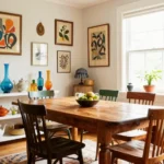
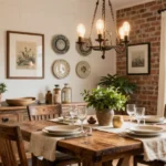
Warm terracotta enhances comfort and stability through its rich, earthy tones. This grounding color connects occupants to the earth, creating spaces that feel secure and nurturing. Incorporate terracotta in living rooms or dining areas to foster feelings of warmth and belonging among family and friends.
Pale Pink: Gentle Optimism
Pale pink infuses spaces with gentle optimism, linking to feelings of relaxation and hope. This subtle hue creates an uplifting atmosphere without overwhelming the senses. Try pale pink in dressing rooms or creative studios to inspire positive thinking and self-confidence.
Mint Green: Fresh and Invigorating
Mint green invigorates spaces with its refreshing quality, associated with low-arousal positive moods that boost wellbeing. This crisp color adds a sense of cleanliness and renewal to any room. Apply mint green in home offices or breakfast nooks to start your day with clarity and freshness.
Powder Blue: Peaceful and Expansive
Powder blue creates peaceful and expansive environments that support mental clarity and calm thinking. This lighter blue shade makes spaces feel larger and more open, reducing feelings of confinement. Use powder blue in smaller rooms or areas where you need mental focus without stimulation.
Buttery Cream: Subtle Warmth and Joy
Buttery cream encourages joy through its subtle warmth without overwhelming the senses with too much stimulation. This versatile neutral has the cheerfulness of yellow in a more sophisticated, accessible form. Paint living areas or transitional spaces in buttery cream to create an inviting atmosphere that uplifts without dominating.
How to Choose the Right Happy Color for Different Rooms

Color psychology reveals that exact paint colors can significantly impact our emotional well-being in different spaces throughout our homes. The right color choices can transform each room into an environment that supports its unique purpose and enhances our happiness.
Living Room Colors for Social Happiness
Living rooms benefit tremendously from warm tones that naturally promote social interaction and cheerfulness. Yellow stimulates optimism and enhances communication, making it perfect for spaces where family and friends gather. Warm neutrals like beige and soft gray provide an excellent foundation, while teal or coral accents add energy without overwhelming the space. Research shows these balanced color combinations encourage relaxed social interaction while maintaining a vibrant atmosphere. Avoid using overly bright reds in living spaces, as studies indicate they may elevate tension rather than promote the calm sociability most people desire in their main gathering area.
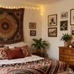
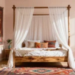
Bedroom Colors for Restful Joy
Bedrooms require colors that promote both rest and happiness for optimal well-being. Soft blues, such as sky-blue and powder blue varieties, demonstrably reduce stress levels and improve sleep quality according to psychological research. Muted purples like lavender create a restorative environment that balances tranquility with subtle joy. Sage green brings nature’s calming influence indoors, making it an excellent choice for creating peaceful bedroom retreats. White with warm undertones adds a sense of airiness and space without the cold sterility that pure white might introduce. These gentle hues work together to create sanctuaries that support both emotional balance and proper sleep habits.
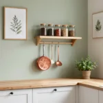
Kitchen Colors That Stimulate Positive Energy
Kitchens thrive with colors that energize and invigorate without overwhelming the senses. Sunny yellows enhance happiness and mental clarity, making meal preparation more enjoyable and social. Peach or terracotta tones evoke warmth and comfort, creating welcoming environments for family gatherings around food. Mint green offers a refreshing balance of energy and calm that works particularly well in food preparation spaces. Data suggests avoiding dull grays in kitchens, as these colors may suppress appetite and diminish the natural enjoyment of cooking and eating. Opt instead for colors that stimulate positive engagement with both food and family.
Home Office Colors for Productivity and Satisfaction
Home offices require colors that balance focus with emotional well-being for optimal productivity. Soft green shades like sage and seafoam improve concentration while reducing eye strain during long work sessions. Light blue fosters calm efficiency, helping maintain steady work output without creating stress. Gray with warm undertones adds sophistication to workspace design without introducing the coldness that can make work environments feel unwelcoming. These color choices support both cognitive function and emotional stability, creating spaces where work feels satisfying rather than draining. Studies confirm that thoughtfully colored work environments can significantly improve both productivity and job satisfaction.
Easy Ways to Incorporate Mood-Boosting Colors Without Repainting Everything

Not everyone has the time, budget, or inclination to repaint an entire room. Fortunately, we’ve discovered several effective ways to introduce happiness-inducing colors into your living spaces without committing to a full paint job. These simple strategies can transform your mood and environment with minimal effort.
Add an Accent Wall
Creating an accent wall delivers maximum impact with minimal effort. You’ll only need to paint one wall instead of an entire room, yet the psychological benefits remain important. Choose a vibrant yellow to inject optimism and creativity into a home office, or select a calming green to establish balance in a busy living area. This focused approach allows you to experiment with mood-boosting colors without overwhelming your space.
Incorporate Colorful Furniture and Decor
Furniture pieces and decorative items offer excellent opportunities to introduce mood-improving colors. We recommend adding orange cushions, throws, or even a statement chair to bring joy and success energy into your living spaces. Green planters, vases, or side tables can introduce harmony and serenity without touching a paintbrush. These portable elements also give you the flexibility to move color therapy from room to room as needed.
Display Vibrant Artwork and Prints
Artwork featuring yellow, orange, or green tones creates focal points that elevate your mood whenever you see them. Wall art serves as an instant color infusion that can be changed seasonally or whenever you need a different emotional boost. Framed prints, canvas paintings, or even tapestries in these uplifting hues provide the psychological benefits of color without permanent commitment.
Update Your Accessories
Small accessories make a big difference in your color environment. Swap neutral throw pillows for yellow ones to brighten your outlook, or add orange curtains to frame your windows with success energy. Green blankets, lampshades, or decorative bowls bring nature’s balancing influence indoors without repainting. These affordable updates allow you to experience the mood-lifting effects of color psychology with minimal investment and maximum flexibility.
The Science Behind Why Certain Paint Colors Make You Happier

Color psychology research reveals that exact paint colors can significantly influence our emotions and overall happiness. Scientists have discovered that certain hues trigger distinct psychological and physiological responses that directly affect our mood. Let’s explore the scientific evidence behind how exact colors can transform your living space into a happier environment.
Yellow: The Ultimate Mood Lifter
Yellow stands out as the scientifically recognized “happiest” color in the spectrum. This vibrant hue mimics sunlight, naturally elevating mood and improving outlook. Research shows that yellow’s distinctive position in the color spectrum helps it activate positive memories, creating an instant boost in happiness. Many interior designers recommend yellow for spaces where you want to foster creativity and optimism.
Orange: The Brain Booster
Orange combines the energizing qualities of red with the cheerfulness of yellow to create a powerful mood enhancer. Studies indicate that orange improves critical thinking and memory function, which explains its popularity in educational environments. This warm color promotes joy similar to yellow while adding a dimension of mental stimulation that can increase overall satisfaction and happiness in your living space.
Green: The Natural Tranquilizer
Green connects us to nature and triggers feelings of abundance and health. Scientific research confirms that green environments create a calming effect conducive to happiness and wellbeing. The color’s natural association with growth and renewal makes it particularly effective at reducing stress while promoting a sense of contentment. Green rooms often feel more spacious and peaceful, contributing to long-term happiness.
Pink: The Stress Reducer
Pink has been scientifically proven to lower heart rate and create a calming effect on the nervous system. This physiological response helps reduce stress levels, which directly contributes to increased happiness. Subtle pink tones can transform a room into a sanctuary of calm and love, making it an excellent choice for spaces where relaxation is a priority.
| Color | Primary Emotional Impact | Scientific Benefit |
|---|---|---|
| Yellow | Joy, Happiness | Activates positive memories, mimics sunlight effects |
| Orange | Joy, Enhanced Thinking | Improves critical thinking and memory function |
| Green | Contentment, Relaxation | Creates calming environment, reduces stress |
| Pink | Calmness, Love | Lowers heart rate, reduces anxiety |
While these colors have universal qualities that impact mood and behavior, personal experiences and cultural backgrounds may influence individual responses to exact hues. The science of color psychology provides valuable insights for anyone looking to create a happier home environment through thoughtful paint color selection.
Conclusion: Transforming Your Space and Mood With the Perfect Paint Color
The power of color to transform not just our living spaces but our emotional wellbeing is undeniable. By making thoughtful paint color choices we can create environments that support happiness relaxation and energy exactly where we need them most.
Whether you opt for sunny yellows in social spaces calming blues in bedrooms or productivity-improving greens in work areas the right color can significantly impact how you feel day to day. And remember you don’t need to commit to a full repaint to experience these benefits.
Eventually the perfect color is one that resonates with you personally while supporting the function of your space. Trust your instincts experiment with smaller changes and watch how the right colors can help cultivate a happier more balanced home environment.
Frequently Asked Questions
How does color psychology affect our mood?
Color psychology is a science that explains how different hues influence our emotions and behaviors. Research shows that colors in our environment can significantly impact our mood, energy levels, and overall happiness. Warm colors (red, orange, yellow) tend to energize us, while cool colors (blue, green, purple) create calm feelings. Our emotional responses to colors are shaped by both personal experiences and cultural associations, making color psychology a powerful tool for enhancing wellbeing in our living spaces.
Which colors are considered the most mood-boosting?
Yellow is widely recognized as the “happiest” color, mimicking sunlight and triggering positive memories. Sky blue promotes calmness and serenity. Soft green brings nature’s tranquility indoors. Coral energizes social spaces. Other mood-enhancing colors include lavender for relaxation, warm terracotta for comfort, pale pink for gentle optimism, mint green for freshness, powder blue for peaceful expansiveness, and buttery cream for subtle warmth and joy.
How should I choose colors for different rooms in my home?
Select colors based on room function for maximum psychological benefit. For living rooms, use warm tones like yellow and coral to promote social happiness. In bedrooms, soft blues and muted purples encourage restful joy. Kitchens benefit from sunny yellows and peach tones to stimulate positive energy. Home offices work best with soft greens and light blues to balance productivity and satisfaction. Always consider how you want to feel in each space.
Can I incorporate mood-boosting colors without repainting?
Absolutely! Create an accent wall for maximum impact with minimal effort. Introduce colorful furniture pieces like a vibrant sofa or chair. Display artwork with uplifting hues to elevate your mood. Update small accessories such as pillows, throws, and vases to enhance your color environment. These strategies offer flexible, affordable approaches to experiencing the psychological benefits of color without committing to a full room repaint.
Does everyone respond to colors in the same way?
No, color responses vary between individuals. While certain colors have universal emotional impacts (yellow is generally uplifting, blue is calming), personal experiences and cultural backgrounds significantly influence how we react to different hues. What feels energizing to one person might feel overwhelming to another. Consider your own emotional responses when selecting colors for your space rather than following trends blindly. Test samples in your home before making final decisions.
How important is color intensity for mood regulation?
Color intensity and brightness play crucial roles in mood regulation. Brighter, more saturated colors tend to stimulate activity and energy, making them ideal for spaces where you want to feel alert and engaged. Softer, less intense tones promote relaxation and calm, perfect for areas designated for rest. Finding the right balance of intensity is key—too bright can feel overwhelming, while too muted might lack the mood-boosting effect you’re seeking.
What role do neutral colors play in mood-enhancing spaces?
Neutral tones (white, beige, gray) provide versatility and serve as excellent foundations for color schemes. They create breathing space for the eye and prevent color overload, which can cause stress. Neutrals can be paired with mood-boosting accent colors to create balance while still harnessing color psychology benefits. They also allow you to more easily change accent colors as seasons or preferences shift, making your color strategy more adaptable.
Which colors are best for reducing stress and anxiety?
Blues and greens are most effective for reducing stress and anxiety. Blue lowers blood pressure and heart rate, creating a sense of calm. Green connects us to nature, promoting balance and harmony. Soft pinks have been shown to reduce stress hormones. Lavender encourages relaxation and improved sleep quality. For maximum stress reduction, choose softer, less saturated versions of these colors rather than bright, intense variations.