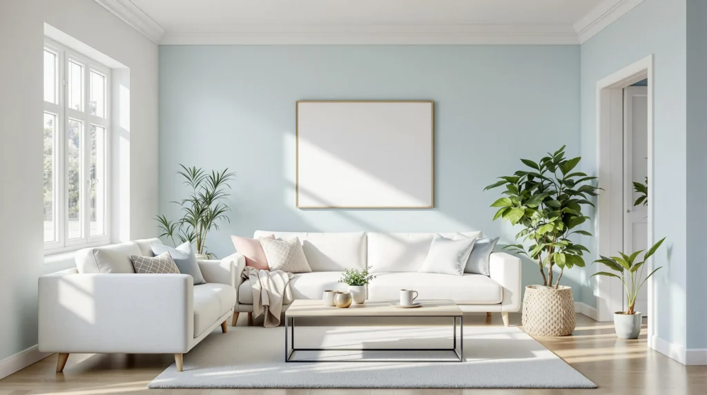
Transforming a compact space into one that feels open and airy doesn’t always require knocking down walls. We’ve discovered that the right paint color can work wonders in creating the illusion of a more spacious room. It’s amazing how something as simple as your color choice can dramatically impact your perception of space.
In our experience working with countless homeowners, we’ve identified exact paint colors that consistently make rooms look bigger and more inviting. These space-improving hues can completely transform your small bedroom, narrow hallway, or cozy living room without the need for costly renovations. Let’s explore these optical illusion paint colors that will help you maximize your space and create the airy, open feeling you’ve been dreaming of.
How Paint Colors Can Transform Your Small Space Into a Larger-Looking Room
Paint color isn’t just about aesthetics—it’s a powerful tool that can visually alter your room’s dimensions. Understanding how colors work in small spaces can help you create an optical illusion of openness and airiness. Light reflects differently off various paint colors, which directly impacts how we perceive spatial boundaries.
When selecting paint for compact areas, consider these key principles:
- Light colors reflect more natural light than dark ones, instantly making rooms feel more expansive and open. Rooms painted in lighter shades bounce light around the space rather than absorbing it.
- Monochromatic color schemes create a seamless visual flow, eliminating the harsh transitions that can make a room feel choppy and smaller. Using variations of the same color family helps walls recede visually.
- Cool tones like soft blues, greens, and purples naturally recede, making walls appear farther away than they actually are. These colors create a sense of depth that warm colors typically don’t provide.
- Strategic accent walls can extend your line of sight and draw the eye through the space, making rooms feel longer or wider depending on which wall you highlight. This technique works especially well when you want to emphasize a room’s best feature.
- Ceiling color choices dramatically affect perceived height. Painting ceilings in lighter shades than your walls lifts the eye upward and creates the illusion of higher ceilings and more volume.
- Trim and molding painted in lighter colors than walls can make boundaries appear to extend outward, while matching them to wall colors creates a seamless, space-expanding effect by eliminating visual breaks.
- Sheen selection matters almost as much as color. Eggshell and satin finishes reflect just enough light to create depth without showing every imperfection that might draw unwanted attention to wall limitations.
By applying these principles thoughtfully, you’ll transform your compact spaces from cramped to comfortable without moving a single wall. The right paint color can make even the smallest rooms feel welcoming, spacious, and perfectly proportioned.
10 Best White Paint Colors That Create an Illusion of Space

Lighter paint colors naturally reflect more light, visually expanding your room’s dimensions without moving a single wall. We’ve compiled the most effective white and off-white shades that professional designers recommend for creating an airy, spacious feel.
Pure White: The Ultimate Space Expander
Benjamin Moore’s Chantilly Lace delivers a crisp, clean white that maximizes light reflection throughout your space. This pure white works wonders in rooms with limited natural light, bouncing what little illumination exists across all surfaces. Rooms painted in this shade often appear significantly larger as the walls visually recede, creating an expansive atmosphere that feels open and breathable. Many designers choose this shade specifically for its ability to transform cramped spaces into seemingly larger environments without adding unnecessary undertones.
Off-White: Subtle Warmth Without Closing In
White Dove by Benjamin Moore offers the perfect balance of warmth without the dark undertones that can make a space feel confined. This versatile off-white maintains an airy feel while adding just enough depth to prevent a sterile appearance. Rooms painted in White Dove benefit from a soft, inviting ambiance that still maximizes perceived spatial dimensions. Homeowners particularly appreciate how this shade creates warmth without sacrificing the spacious quality that lighter colors provide, making it ideal for living rooms and bedrooms where both comfort and openness matter equally.
Shaded White: Depth Without Restriction
Farrow & Ball’s Shaded White incorporates subtle gray undertones that add sophisticated depth while keeping walls visually expansive. This nuanced white creates interest without overwhelming small spaces or drawing attention to their limitations. Rooms painted in this shade maintain their perceived size while gaining architectural character. The gray undertones work particularly well in spaces with northern exposure, where they counterbalance cooler light without diminishing the room’s apparent dimensions.
Polished Cotton: Cool Brightness
ECOS Paints 0629 Polished Cotton brightens walls instantly with its cool undertones, creating a refreshing sense of openness. This shade pairs exceptionally well with lighter ceilings to enhance vertical space perception. Spaces painted in Polished Cotton appear cleaner, brighter, and notably more expansive than when painted with warmer whites. The cool characteristics of this paint help walls visually recede, making narrow rooms in particular feel substantially wider.
Calm Breeze: Muted Expansion
ECOS Paints 0461 Calm Breeze offers a pale, muted white that complements darker furniture or decor accents without shrinking your space. This understated shade creates a neutral backdrop that allows furniture to stand out while maintaining an open feel. Rooms benefit from this color’s ability to fade into the background, allowing architectural features to shine without imposing visual limitations. The subtle nature of Calm Breeze works especially well in multipurpose spaces where both spaciousness and versatility matter.
Lavender Secret: Subtle Contrast
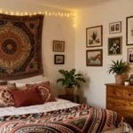
Benjamin Moore’s Lavender Secret introduces a pale lavender-gray off-white that provides subtle wall definition without flat monotony. This unique shade adds dimensional interest that prevents the boring uniformity sometimes associated with white spaces. Rooms gain character and depth without sacrificing the spacious quality light colors deliver. The lavender undertones create a soothing atmosphere that feels both expansive and distinctive, particularly effective in bedrooms and sitting areas.
Alabaster: Balanced Openness
Sherwin-Williams Alabaster creates the perfect balance between cozy warmth and visual spaciousness. This popular white avoids the clinical feeling of starker whites while still reflecting ample light throughout your room. Spaces painted in Alabaster maintain an inviting quality without closing in, making them feel both comfortable and expansive. The warm undertones prevent starkness without adding heaviness that could diminish the room’s perceived size.
Decorator’s White: Airy Enhancement
Benjamin Moore’s Decorator’s White features slight cool undertones that emphasize airiness and spatial freedom. This versatile shade resists yellowing and maintains its clean appearance throughout changing light conditions. Rooms benefit from this color’s ability to make ceilings appear higher and walls more distant. Professional designers frequently select this shade for smaller spaces specifically because it reliably creates a sense of expanded dimensions without appearing cold or uninviting.
Simply White: Natural Light Mimicry
Simply White by Benjamin Moore offers bright, reflective qualities that effectively mimic natural light even in darker spaces. This luminous shade creates an immediate sense of openness that transforms confined areas. Rooms painted with Simply White often appear as though they receive more window light than they actually do, improving their apparent size. The clean yet soft characteristics make this shade particularly valuable in basement rooms, windowless bathrooms, or any space lacking natural illumination.
Greek Villa: Warm Spaciousness
Sherwin-Williams Greek Villa provides soft warmth that prevents sterility while simultaneously enlarging your space visually. This balanced white avoids the yellowing tendency of some warmer whites that can make rooms feel smaller. Spaces painted in Greek Villa maintain visual expansiveness while adding just enough warmth to feel inviting rather than institutional. The subtle undertones create depth without overwhelming or constricting the visual field, making this shade especially effective in rooms that need to feel both spacious and welcoming.
7 Light Blue and Green Hues That Make Rooms Feel More Spacious

Blue and green tones naturally create an expansive feeling in interior spaces by mimicking the openness of the sky and outdoors. These cool-toned colors visually recede, making walls appear farther away and ceilings higher.
Soft Sky Blues: Creating a Receding Ceiling Effect
Soft sky blues like ECOS Paints’ 0607 Brush Blue can dramatically transform your space by mimicking the infinite expanse of the sky. These cool-toned blues create an optical illusion where walls and ceilings appear to recede, instantly making any room feel more open and airy. When applied to ceilings, sky blues produce a particularly effective expanding effect, drawing the eye upward and creating the sensation of height and openness. The subtle reflective quality of these hues also enhances natural light distribution throughout the space, eliminating shadows that can make rooms feel cramped or confined.
Pale Sage Greens: Bringing the Outdoors In
Pale sage greens like ECOS Paints’ 0461 Calm Breeze create an immediate connection to nature, invoking the expansiveness of outdoor environments. These earthy green tones promote a sense of tranquility while visually pushing walls outward to make spaces appear larger than their actual dimensions. The versatility of sage green works beautifully in various lighting conditions, maintaining its space-improving properties even in rooms with limited natural light. For maximum spatial impact, we recommend pairing pale sage with white trim or ceiling treatments, creating a clean contrast that further emphasizes the room’s perceived size and openness.
Dusty Teal: Balancing Blue and Green Undertones
Dusty teal offers a sophisticated balance between blue and green undertones, adding dimension to walls without overwhelming smaller spaces. This multifaceted hue creates depth through its complex pigmentation, allowing light to interact with the color in ways that enhance spatial perception. The slight gray influence in dusty teal prevents it from feeling too saturated, maintaining the expanded feeling while adding visual interest to the room. Many designers favor this shade for narrow hallways or smaller bedrooms where both spaciousness and character are essential.
Powder Blue: Brightness with Warmth
Powder blue with gray undertones brightens walls while maintaining a welcoming warmth that pure whites often lack. This washed-out blue variant reflects light beautifully, creating the illusion of more square footage without the clinical feel of starker colors. The subtle gray undertones add sophistication and prevent the color from appearing childish or dated in contemporary spaces. Powder blue works exceptionally well in north-facing rooms that typically receive cooler natural light, counterbalancing potential darkness while maximizing perceived space.
Seafoam Green: Coastal Light Expansion
Seafoam green mimics the light-reflective qualities of coastal environments, creating a breezy aesthetic that visually expands walls. This pale green-blue hybrid channels the expansiveness of ocean horizons, making it particularly effective in bathrooms and bedrooms where a sense of airiness enhances comfort. The inherent brightness of seafoam green helps illuminate darker corners of rooms, eliminating shadows that can make spaces feel confined. Pairing this shade with natural materials like light woods or rattan further enhances its space-expanding properties.
Muted Aqua: Creating Depth in Small Rooms
Muted aqua creates remarkable depth in small rooms through its balanced intensity and light-reflective properties. These softened aquatic tones establish a visual perception of distance between walls, effectively pushing boundaries outward without overwhelming the senses. The versatility of muted aqua allows it to adapt to changing light conditions throughout the day, maintaining its space-improving effect from morning to evening. Designer portfolios frequently showcase this shade in compact urban apartments where maximizing perceived space represents a primary consideration.
Pale Celadon: The Subtle Gray-Green Blend
Pale celadon, a subtle gray-green blend, expands walls through its understated elegance and light-reflecting capacity. This historically important color brings a timeless quality to interiors while performing the practical function of making rooms appear larger. The gentle gray influence in celadon prevents it from competing with other design elements, allowing architectural features to shine while walls visually recede. For optimal space-improving results, we recommend using pale celadon in a monochromatic scheme where walls, trim, and ceiling share the same color family but vary slightly in intensity.
5 Neutral Paint Colors That Visually Expand Your Room

Neutral paint colors are powerful tools for creating the illusion of space in compact rooms. When strategically selected, these versatile hues can transform even the smallest areas into airy, open environments without any structural changes.
1. Light Grays: The Modern Space Enhancer
Light grays offer a contemporary approach to visually expanding your space. These modern neutrals provide a clean backdrop that efficiently reflects light throughout the room, instantly making it feel larger and more open. Professional designers often recommend options like Farrow and Ball’s Shaded White for its exceptional ability to reflect natural light while creating a calming atmosphere. The subtle undertones in light gray paints add depth without closing in walls, making them perfect for smaller bedrooms and living areas where maximizing perceived space is essential.
2. Beige and Taupe: Subtle Expansion With Warmth
Beige and taupe shades expertly balance visual spaciousness with comforting warmth. These warm neutrals gently expand your room’s dimensions while maintaining an inviting atmosphere that cooler tones sometimes lack. Sun-filled spaces particularly benefit from these hues, as natural light enhances their space-expanding properties. The understated elegance of beige and taupe creates a seamless visual flow from one area to another, eliminating harsh transitions that can make spaces feel choppy and smaller. Their versatility allows them to complement virtually any design style while consistently contributing to a more spacious feel.
3. Off-White: The Classic Space Maximizer
Off-whites remain the timeless choice for creating the illusion of expansiveness in tight quarters. These nearly-white neutrals provide a clean, minimalist backdrop that optimizes brightness and openness without the stark clinical feel of pure white. Designers consistently turn to off-whites when the primary goal is maximizing perceived space while maintaining design flexibility. The subtle warmth in these shades prevents rooms from feeling cold or sterile while still delivering exceptional light reflection properties that visually push walls outward and upward.
4. Pastels: Soft Hues With Spatial Impact
Soft pastels deliver unexpected spatial benefits while adding subtle personality to your space. Pale lavender shades like Benjamin Moore’s Lavender Secret gently brighten rooms while providing dimensional depth that flat neutrals sometimes lack. These whisper-soft colors reflect light beautifully while adding just enough visual interest to keep spaces from feeling bland. Pastels work particularly well in bedrooms and reading nooks where both spaciousness and tranquility are desired outcomes, creating environments that feel both open and emotionally comforting.
5. Polished Cotton: The Reflective Neutral
ECOS Paints’ 0629 Polished Cotton exemplifies how specialized neutrals can dramatically affect spatial perception. This clean, reflective shade maximizes light distribution throughout the room, effectively pushing walls outward to create a more expansive feel. The slight coolness in this particular neutral counteracts closed-in sensations that plague many smaller spaces. Its exceptional reflective properties make it ideal for rooms with limited natural light, where creating a sense of openness presents the greatest challenge. Designers frequently pair this shade with matching ceiling paint to eliminate visual boundaries between walls and ceiling, further improving the space-expanding effect.
Understanding Color Psychology: Cool vs. Warm Tones for Small Spaces

Color psychology plays a crucial role in transforming the perceived dimensions of your living spaces. We’ve found that understanding the fundamental differences between cool and warm tones can dramatically impact how spacious a room feels.
Cool Tones: Creating Depth and Openness
Cool tones naturally recede visually, making walls appear to fade into the background. Off-whites and pale pastels enhance brightness significantly and create an immediate sense of openness that can make even the smallest rooms feel airy. Ocean blues and soft lavender shades, while less conventional than neutrals, add a calming effect that visually expands your space.
These colors work particularly well because they:
- Reflect more natural light throughout the room
- Minimize shadows that can make spaces feel cramped
- Create the illusion of walls receding, similar to how the sky appears endless
Warm Tones: Adding Dimension Without Confinement
Warm tones don’t necessarily make rooms feel smaller when selected carefully. Light neutrals such as Airy Taupe provide a warm, rich look without overwhelming the space, creating a balanced feel that enhances roominess. Farrow and Ball’s Shaded White offers a soothing, light appearance while maintaining warmth that doesn’t compress the room’s dimensions.
The right warm colors succeed because they:
- Add dimension and character without closing in the space
- Create a cozy atmosphere that still feels expansive
- Balance intimacy with openness for a livable environment
Strategic Considerations for Small Spaces
White remains a classic choice for making rooms look bigger by maximizing light reflection and creating an illusion of expanded space. Surprisingly, soft black can create depth that actually distracts from a room’s small size, giving it a grand feel even though limited square footage.
The effectiveness of any color eventually depends on two key principles:
- Reflectivity: Lighter colors typically reflect more light, improving the illusion of space
- Depth Perception: Strategic use of darker tones can create depth that masks a room’s compact dimensions
By thoughtfully applying these color psychology principles, you can transform the perceived size of your rooms without changing their actual dimensions.
Strategic Painting Techniques to Create Depth and Height

Beyond color selection, strategic painting techniques can transform a room’s perceived dimensions. These methods create optical illusions that enhance spaciousness through clever paint application.
Accent Walls: Where to Place Them for Maximum Space
Accent walls serve as powerful tools for creating depth when positioned correctly. Place darker accent colors on smaller walls to establish depth perception and draw the eye through the space. This technique creates a focal point that makes the room appear longer than it actually is. For maximum effectiveness, keep larger walls in lighter shades to reflect ample light throughout the space. Using contrasting colors between your accent wall and the rest of the room establishes visual interest while preventing the closed-in feeling that comes with painting all walls in darker tones. Remember that strategic accent wall placement works best when the wall you’re highlighting has architectural significance or serves as the natural focal point of the room.
Ceiling Techniques That Lift Your Room Visually
The ceiling represents a fifth wall that’s often overlooked when considering paint strategies. Painting your ceiling a lighter color than the walls creates an immediate illusion of higher ceilings and greater vertical space. This technique draws the eye upward and removes the boxed-in feeling of rooms with standard height ceilings. Vertical striping effects applied to the ceiling can further enhance this lifting effect by creating visual pathways that extend the perceived height of the room. For a subtle approach, consider painting the ceiling a shade lighter than your wall color to create a seamless transition that opens up the space. Avoid dark ceiling colors in small rooms, as they can make the ceiling appear to close in on the space. Even lighting throughout the room complements these ceiling techniques by eliminating shadows that might otherwise create the impression of confined space.
How to Choose the Perfect Finish to Enhance Spaciousness

Beyond selecting the right paint color, the finish you choose plays a crucial role in creating the illusion of more space. The right finish can enhance light reflection and minimize imperfections, making your room feel more open and airy.
Opt for Flat or Matte Finishes in Low-Traffic Areas
Flat or matte finishes absorb light rather than reflect it, helping to hide wall imperfections that might otherwise draw attention and make a space feel smaller. These finishes create a smooth, uniform appearance that allows walls to recede visually. They’re ideal for bedrooms, dining rooms, and other areas that don’t see heavy daily use.
Consider Eggshell or Satin for Versatility
Eggshell and satin finishes offer a perfect balance between flat and glossy options. They provide a subtle sheen that reflects just enough light to create depth without highlighting flaws. These versatile finishes work exceptionally well in living rooms, hallways, and children’s bedrooms where you need some washability without creating glare.
Use Semi-Gloss Strategically
While high-gloss finishes can sometimes make a space feel smaller by creating too much visual interest on walls, strategic use of semi-gloss can enhance spaciousness. Apply semi-gloss to trim, moldings, and doors to create subtle contrast with walls. This technique draws the eye outward and creates definition without overwhelming the space.
Avoid High-Gloss on Large Wall Surfaces
High-gloss paints reflect the most light but also highlight every imperfection on your walls. In small spaces, these imperfections become more noticeable and can make a room feel cluttered and confined. Reserve high-gloss finishes for very smooth surfaces or small accent pieces rather than entire walls.
Create Depth with Varied Finishes
Combining different finishes in the same space creates subtle dimension that can enhance the perception of depth. For instance, using a flat finish on walls with semi-gloss trim creates visual interest and helps define the boundaries of the room. This technique works particularly well in open-concept spaces where you want to create subtle zone distinctions.
Test Samples Under Different Lighting
Always test your chosen finish under various lighting conditions before committing. The way a finish interacts with natural and artificial light throughout the day can dramatically impact how spacious a room feels. Apply sample patches on different walls and observe them at different times to ensure the finish enhances rather than diminishes your space perception.
Common Mistakes to Avoid When Painting Small Rooms

When painting small spaces, seemingly minor decisions can significantly impact how spacious your room appears. Avoiding these common pitfalls will help ensure your paint color enhances rather than diminishes your space.
Using Dark or Bold Colors Throughout
Dark and bold colors absorb light rather than reflect it, making already compact rooms feel even more confined. These intense hues create visual weight that can make walls appear closer than they actually are. Instead of covering entire rooms in dark colors, consider using them as accents on a single wall or in small decorative elements to add depth without overwhelming the space.
Neglecting Proper Lighting Assessment
Failing to test paint colors under different lighting conditions is a critical mistake many homeowners make. Paint colors can appear dramatically different depending on natural and artificial lighting throughout the day. We recommend testing paint samples on multiple walls and observing them at different times of day before making your final decision. This simple step prevents disappointing results that could make your space feel smaller than intended.
Creating Inconsistent Color Schemes
Visual clutter from too many competing colors can make small rooms feel chaotic and cramped. An inconsistent color palette disrupts the eye’s movement across the space, creating visual barriers that emphasize the room’s limited dimensions. Opt for a cohesive color scheme with variations of the same hue to create a seamless visual flow that expands perceived space.
Overlooking Furniture and Decor Context
Even the most space-improving paint colors can’t compensate for oversized furniture and heavy decor in a small room. Large, bulky pieces can counteract the spacious feeling created by your carefully selected paint colors. When planning your paint project, consider how your existing furnishings will interact with your chosen colors, and possibly rethink your furniture arrangement or selection to maximize the spacious effect of your paint color.
Choosing the Wrong Finish
The sheen of your paint can either enhance or diminish the perception of space. Highly reflective finishes like high-gloss can draw attention to wall imperfections and create distracting glare in small spaces. For most walls in small rooms, an eggshell or satin finish provides just enough reflectivity to enhance light without highlighting every bump and flaw that might make the space feel confined.
Pairing Your Space-Enhancing Paint With the Right Decor Elements

Create Contrast With Strategic Trim Colors
When painting to maximize space, we’ve found that creating contrast can dramatically enhance room dimensions. Pairing dark walls with bright white trim introduces depth that makes rooms feel more expansive. Benjamin Moore experts recommend this contrast technique as it defines the edges of your space, drawing the eye outward rather than inward. The stark difference between wall and trim colors creates visual interest while expanding the perceived boundaries of your room.
Mind Your Ceiling Treatment
Ceiling color plays a crucial role in how spacious a room feels. For rooms with dark wall colors, selecting a ceiling shade that’s 20% lighter maintains proper height perception. Cool-toned ceiling colors like Brush Blue or Polished Cotton create an elevated illusion, effectively “raising” your ceiling. Another effective approach involves matching your walls and ceiling in the same hue, which draws the eye upward and eliminates the visual boundary between vertical and horizontal surfaces.
Optimize Furniture Placement
The way furniture interacts with your newly painted walls significantly impacts spatial perception. Avoid pushing furniture directly against walls – leaving even a few inches of space between pieces and walls emphasizes floor area and creates a more open feeling. This simple adjustment allows your carefully chosen paint colors to have maximum impact, as more of the wall surface remains visible and reflective.
Incorporate Mirrors and Strategic Lighting
Mirrors amplify the space-improving effects of your paint choices when positioned thoughtfully. Place mirrors opposite windows or light sources to multiply brightness and create the illusion of extended space. Using sheer window treatments rather than heavy drapes allows more natural light to interact with your paint colors. Targeted lighting fixtures that wash walls with light further enhance color reflectivity, especially with lighter paint shades.
Maintain Visual Continuity
For cohesive spaces that feel larger, we recommend selecting a unified color palette with varying saturations. This approach prevents the cramped feeling that comes with too many competing colors. Testing your chosen paint colors under both natural daylight and artificial evening lighting using sample patches ensures they’ll create the spacious effect you’re seeking throughout the day. Minimalist decor that doesn’t overwhelm your carefully chosen paint colors will complete the spacious, airy feeling you’ve worked to create.
The Bottom Line: Transforming Your Space With the Right Paint Colors
Choosing the right paint color is one of the most powerful and cost-effective ways to transform a cramped room into an airy sanctuary. By applying the principles we’ve shared you can dramatically alter the perception of your space without moving a single wall.
Remember that light reflects off paint colors differently throughout the day so testing samples in your exact lighting conditions is essential. The perfect space-improving color balances your personal style with practical considerations about the room’s purpose and existing elements.
With thoughtful color selection strategic application techniques and complementary decor choices you’ll create rooms that not only look larger but feel more inviting and harmonious. Your small space has unlimited potential waiting to be unlocked with just a few coats of the right paint.
Frequently Asked Questions
What colors make a small room look bigger?
Light colors like whites, off-whites, and pale cool tones (light blues and greens) are best for making small rooms appear larger. These colors reflect more light, creating an airy, expansive feel. Benjamin Moore’s Chantilly Lace and White Dove are excellent white options, while ECOS Paints’ Brush Blue and Calm Breeze are effective cool tones that visually push walls outward.
Should I paint all walls the same color in a small space?
Generally, yes. Using a monochromatic color scheme creates seamless visual flow and prevents the choppy feeling that multiple colors can create. However, a strategic accent wall (preferably on a smaller wall) can add depth while maintaining spaciousness. The key is consistency in undertones across your color choices.
Are dark colors always bad for small rooms?
Dark colors aren’t always bad, but they require strategic application. Use darker shades on smaller walls or as accents to create depth. Pair dark colors with ample lighting and lighter ceilings to prevent a cramped feeling. Reflective finishes on darker colors can also help bounce light around the room.
What paint finish is best for making a room look bigger?
Eggshell and satin finishes are generally best as they provide a subtle sheen that reflects light without highlighting wall imperfections. Flat finishes work well on ceilings, while semi-gloss is ideal for trim to create contrast. Avoid high-gloss finishes on large wall surfaces as they can emphasize flaws and create distracting reflections.
Does ceiling color matter in small spaces?
Absolutely! Painting your ceiling a lighter shade than your walls creates the illusion of height and openness. For maximum spaciousness, choose a ceiling color that’s a lighter version of your wall color or use pure white. Some designers recommend painting ceilings and walls the same light color to eliminate visual boundaries.
How do cool tones versus warm tones affect space perception?
Cool tones (blues, greens, grays) tend to recede visually, making walls appear farther away and rooms more spacious. Warm tones (beiges, creams, pale yellows) can add coziness but may make spaces feel smaller if too intense. For small rooms, choose cool tones or very light warm tones with cool undertones.
What’s the best neutral color for small spaces?
Light grays, off-whites, and beiges with cool undertones are excellent neutrals for small spaces. ECOS Paints’ Polished Cotton is particularly effective due to its exceptional reflective properties. Benjamin Moore’s White Dove and Farrow & Ball’s Shaded White also offer warmth without confinement while maximizing perceived space.
Should I consider lighting when choosing paint for small rooms?
Definitely! Natural and artificial lighting dramatically affects how paint colors appear. Test samples in different lighting conditions before deciding. North-facing rooms benefit from warmer tones to counteract bluish light, while south-facing rooms can handle cooler tones as they receive warm sunlight.
How can I use paint to make a low ceiling appear higher?
Paint your ceiling lighter than your walls to draw the eye upward. Vertical stripes or extending wall color 6-12 inches onto the ceiling can create the illusion of height. Another trick is painting crown molding the same color as the ceiling to visually extend height without interruption.
What decor elements complement space-enhancing paint colors?
Mirrors placed strategically to reflect light, glass or lucite furniture that doesn’t visually block space, and strategic lighting all amplify the spacious effect of paint. Maintain a cohesive color palette with minimal contrast in larger furniture pieces, and use vertical elements like tall bookcases to draw the eye upward.