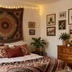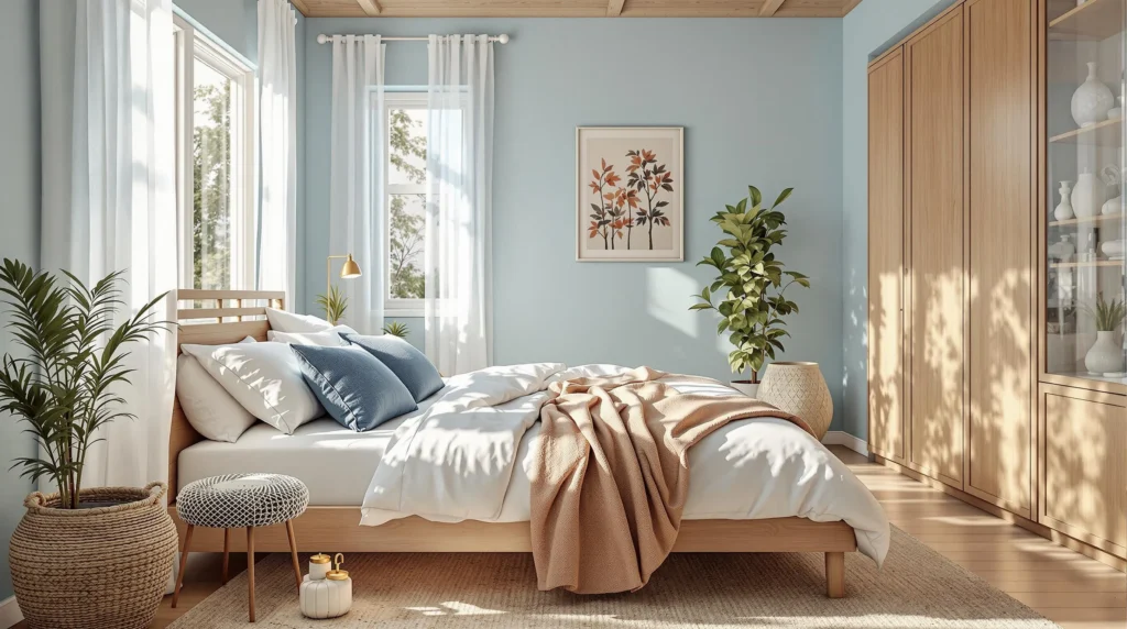
Transforming your bedroom into a tranquil sanctuary has never been more essential in our fast-paced industry. We’ve discovered that serene blue hues offer the perfect foundation for creating that peaceful oasis you’ve been dreaming about. From soft powder blues to deeper navy tones, this versatile color family has the remarkable ability to lower blood pressure, reduce anxiety, and promote better sleep quality.
We’ll guide you through selecting the ideal blue shade for your personal retreat, complementary color pairings, and practical styling tips that elevate your space from ordinary to extraordinary. Whether you’re planning a complete bedroom makeover or simply refreshing your existing decor, incorporating these calming blues will help you create a space where stress melts away and relaxation takes center stage.
The Psychology of Blue: How Color Affects Your Sleep and Mood
Blue isn’t just a beautiful color choice for your bedroom—it’s scientifically proven to impact your mental state and sleep quality. Research from the University of Sussex shows that people who sleep in blue bedrooms get an average of 7.9 hours of sleep per night, compared to just 6.5 hours for those with purple bedrooms. This important difference highlights blue’s powerful psychological effects on our minds and bodies.
Color psychology experts confirm that blue naturally lowers blood pressure and heart rate, creating ideal physiological conditions for restful sleep. The wavelength of blue light stimulates the production of melatonin, our body’s natural sleep hormone, which helps regulate our circadian rhythm. Many sleep therapists recommend blue specifically for insomnia sufferers because of these calming properties.
Different blue tones trigger varying psychological responses in our brains. Light blues (like sky and powder blue) evoke feelings of expansiveness and freedom, making smaller bedrooms feel more spacious. Medium blues (such as periwinkle and cornflower) balance tranquility with subtle energy, perfect for creating a peaceful yet uplifting environment. Deep blues (including navy and indigo) provide a cocooning effect that promotes introspection and profound relaxation, especially beneficial for overthinking minds.
The psychological benefits of blue extend beyond improved sleep quality. Studies from the American Psychological Association have linked blue environments to decreased anxiety levels and improved concentration. Your blue bedroom becomes a stress-reduction zone where cortisol levels naturally drop, allowing your mind to process the day’s events and prepare for restorative sleep.
Matching your exact sleep needs with the right blue shade enhances these psychological benefits. Morning people often benefit from brighter blues with subtle green undertones that energize upon waking. Night owls typically respond better to deeper blues with purple undertones that help the transition to sleep. Understanding these psychological connections helps you select the perfect blue shade that works with your natural sleep patterns rather than against them.
7 Stunning Blue Paint Colors That Transform Bedrooms into Sanctuaries

Dreamy Sky Blue: The Perfect Daytime Calm
Dreamy sky blue captures the essence of clear skies and calm oceans, instantly transforming any bedroom into a relaxing retreat. This light, airy shade promotes a sense of tranquility that’s particularly effective during daylight hours. Research shows that these soft blue tones can significantly lower stress levels while creating an atmosphere that feels both spacious and peaceful. Many designers recommend sky blue for smaller bedrooms where the color’s reflective qualities help amplify natural light.
Tranquil Teal: Where Blue Meets Green
Tranquil teal offers a unique harmony between blue’s serenity and green’s natural vitality, creating a distinctive bedroom atmosphere. This versatile color evokes aquatic environments, instantly connecting us to the calming sensations of water. Teal works beautifully in both contemporary and traditional bedroom settings, providing enough visual interest to stand alone while pairing wonderfully with neutrals like beige or gray. Designers often suggest using teal as an accent wall behind the bed to create a soothing focal point without overwhelming the space.
Navy Depth: Bold Yet Soothing Statements
Navy blue ranks among the most calming colors according to scientific research, making it an exceptional choice for bedroom sanctuaries. This deep, rich hue promotes profound relaxation while adding a touch of sophistication to your sleep space. Navy creates a cozy, enveloping feeling that signals to your brain it’s time to unwind and prepare for rest. Decorators often pair navy with crisp whites or soft golds to balance its intensity while maintaining its calming properties.
Powder Blue: Timeless Serenity
Powder blue delivers classic serenity that never goes out of style, creating bedrooms that feel instantly peaceful. This soft, gentle shade has been used for centuries to promote restful environments conducive to quality sleep. Interior designers favor powder blue for its versatility, as it works beautifully with virtually any decorating style from farmhouse to modern minimalist. The color’s subtle presence allows it to serve as either a primary wall color or a complementary accent through textiles and accessories.
Icy Blue-Gray: The New Neutral
Icy blue-gray has emerged as the new neutral in bedroom design, offering a refreshing alternative to traditional beige and white palettes. This sophisticated blend provides the perfect balance between cool and warm tones, creating a soothing backdrop for various design elements. Designers appreciate how this versatile shade adapts to different lighting conditions, appearing more blue in natural light and more gray in the evening. The color pairs beautifully with natural wood elements, creating harmony between cool walls and warm textures.
Periwinkle: The Perfect Blue-Purple Balance
Periwinkle achieves the ideal balance between blue’s calmness and purple’s warmth, resulting in a uniquely soothing bedroom color. This harmonious shade creates an atmosphere that feels simultaneously tranquil and comforting without leaning too cool or too dramatic. Decorators often recommend periwinkle for north-facing bedrooms that need warmth while still maintaining a serene blue presence. The color works exceptionally well with cream accents, natural linens, and brass or copper fixtures for a bedroom that feels both peaceful and inviting.
Midnight Blue: Dramatic Cocoon Comfort
Midnight blue creates a dramatic cocoon effect that transforms bedrooms into deeply relaxing havens for sleep. This rich, velvety shade envelops the space in comfort while promoting the psychological conditions ideal for peaceful rest. Design experts recommend midnight blue for bedrooms used primarily at night, as the color absorbs light rather than reflects it, signaling to your body it’s time for deep relaxation. The dramatic depth pairs beautifully with crisp white bedding, creating stunning contrast that enhances both colors while maintaining the room’s sanctuary-like qualities.
Creating Contrast: How to Pair Serene Blues With Complementary Colors

The magic of serene blues truly comes alive when paired with complementary colors and textures. Creating the right contrast not only enhances the calming properties of blue but also adds visual interest and depth to your bedroom sanctuary.
Crisp Whites and Blues: The Classic Combination
Combining soft blues with crisp whites creates a timeless and refreshing aesthetic that never goes out of style. This classic pairing enhances the serenity of blue tones while adding brightness and spaciousness to your bedroom. Try incorporating white bedding against blue walls for a striking yet peaceful contrast that draws the eye. Alternatively, blue bedding against white walls creates an equally calming effect while maintaining visual interest. White moldings, window frames, and ceiling details stand out beautifully against blue backgrounds, creating architectural definition that frames your peaceful retreat.
Warm Woods With Cool Blues: Natural Balance
Introducing warm wood elements alongside cool blue tones establishes a perfect temperature balance in your bedroom’s color scheme. Oak, pine, and walnut furniture pieces provide a natural counterpoint that grounds the ethereal quality of blue walls or textiles. This combination works exceptionally well in creating a cozy yet refreshing atmosphere. Consider a reclaimed wood headboard against a serene blue wall or wooden nightstands paired with blue bedding. Floor-to-ceiling wood accents like exposed beams or hardwood flooring complement blue walls by adding warmth and organic texture that prevents the space from feeling too cool or clinical.
Metallic Accents: Elevating Your Blue Haven
Adding metallic elements to a serene blue bedroom instantly increases its sophistication and visual appeal. Gold accents bring warmth and luxury, creating a stunning contrast against cooler blue tones. Silver or chrome details offer a modern, crisp look that enhances the refreshing qualities of blue. Copper and brass elements provide a vintage-inspired warmth that balances blue’s coolness while adding distinctive character. Incorporate these metallics through light fixtures, mirror frames, drawer pulls, or decorative objects for maximum impact. Even small metallic touches like picture frames or vases can transform your blue sanctuary from simply calming to elegantly refined without disturbing its peaceful ambiance.
Layering Blue Tones: Techniques for Dimension and Depth

Create a Calming Base Layer
Light blue serves as an ideal foundation for any serene bedroom design. Research shows this gentle hue promotes relaxation and better sleep quality, making it perfect for your bedroom walls. We recommend selecting a soft powder blue or sky blue as your primary color to establish a tranquil atmosphere. These lighter tones reflect more natural light, creating an airy feeling that makes spaces appear larger and more peaceful.
Add Visual Interest with Accent Walls
Incorporating deeper blue tones through accent walls prevents your space from feeling flat or monotonous. A navy blue feature wall behind your bed creates a striking focal point while maintaining the room’s overall peaceful quality. Strategic placement of these darker blues adds sophistication without disrupting the calming environment you’re cultivating.
Introduce Textured Textiles
Layered bedding in various blue tones creates immediate dimension in your bedroom sanctuary. Consider combining azure sheets with a navy duvet and powder blue throw pillows for a visually rich yet cohesive look. Woven throws and linen curtains introduce tactile elements that enhance the room’s depth while reinforcing your serene blue palette.
Balance with Neutrals
White, beige, or soft gray elements provide essential contrast to blue’s natural coolness. Neutral furniture pieces or trim work create breathing space within your design and prevent the room from feeling overwhelmingly blue. These balanced combinations allow the serene qualities of blue to shine without becoming visually heavy.
Elevate with Metallic Accents
Brass or chrome fixtures add sophisticated highlights that catch light and create visual interest. A gold-toned reading lamp or silver picture frames introduce elegant contrast to the cool blue palette. Metallic elements work particularly well against medium and darker blues, creating a refined and intentional design statement.
Incorporate Subtle Patterns
Patterns prevent monotony while reinforcing the tranquil aesthetic of your blue bedroom. Subtle stripes on bedding or organic motifs on area rugs add visual texture without competing with your serene color scheme. These thoughtful pattern additions create interest points for the eye without disrupting the peaceful quality of the space.
Try Monochromatic Gradients
Blending light and mid-tone blues throughout your bedroom creates natural depth and visual flow. Powder blue walls paired with turquoise decorative elements establish a graduated color story that feels intentional and harmonious. This technique works especially well in smaller bedrooms where dramatic color contrasts might feel overwhelming.
Integrate Natural Materials
Wooden nightstands or jute rugs complement blue’s inherent serenity with organic warmth. Natural materials ground the airy quality of blue tones, creating a balanced and inviting atmosphere. The 2025 trend report emphasizes this combination, highlighting how muted blues paired with natural elements create exceptionally restful spaces.
Optimize Lighting Answers
Maximize natural daylight to enhance blue’s refreshing qualities during daytime hours. For evenings, carry out warm-toned lighting fixtures that counterbalance blue’s coolness and create a cozy ambiance. Thoughtful lighting transforms how your blue tones appear throughout the day, allowing your space to shift from energizing to relaxing as needed.
Blue Bedroom Accessories That Enhance the Peaceful Atmosphere

The right accessories can transform a blue bedroom from simply pretty to genuinely peaceful. Strategic decor choices amplify the calming properties of blue while creating a cohesive sanctuary.
Coastal Elements
Nautical-inspired accessories perfectly complement blue bedrooms by reinforcing the connection to water and sky. Striped throw pillows in navy and white instantly evoke seaside tranquility, creating visual interest without disrupting the peaceful atmosphere. Driftwood accents, whether in the form of picture frames or decorative pieces, add organic texture that grounds the space. Sea-inspired artwork featuring ocean waves or shorelines reinforces the serene coastal vibe while maintaining the room’s relaxing ambiance.
Light Blue Accents
Light blue accessories create harmony and balance in bedrooms through their subtle yet impactful presence. Bedding in soft blue shades establishes a restful focal point while reinforcing the room’s tranquil color story. Decorative pieces like vases, lamps, or trinket dishes in pale blue hues distribute the color throughout the space without overwhelming it. These lighter accents work particularly well when paired with deeper blue walls, creating pleasant visual contrast that maintains the room’s peaceful essence.
Neutral Furniture
Pairing blue walls with neutral-toned furniture establishes a calming, spacious aesthetic that prevents visual crowding. White, cream, or light wood furniture pieces create breathing space within the blue environment, allowing the wall color to shine without competition. Natural wood tones introduce warmth that balances blue’s inherently cool nature while maintaining the room’s peaceful ambiance. This neutral foundation allows accessories to take center stage while ensuring the overall space remains serene and uncluttered.
Textiles That Complete Your Blue Sanctuary
Thoughtfully selected textiles enhance the tactile experience of a blue bedroom while reinforcing its peaceful qualities. Crisp white or light-colored linens create stunning contrast against light blue walls, amplifying the room’s airy, cloud-like feel. The clean brightness of white bedding reflects natural light, making the space feel more expansive and heavenly.
Woven rugs in sandy or neutral tones ground blue bedrooms with natural texture and warmth. These natural fiber floor coverings introduce an organic element that prevents the space from feeling too cool or clinical. The textural contrast between smooth blue walls and nubby rugs creates multidimensional interest while maintaining the room’s overall serenity.
Artwork and Wall Décor for Blue Bedrooms
Wall decorations provide opportunities to enhance blue bedrooms with personality and depth. Subtle patterns on wallpaper or decorative accents add sophisticated dimension without disrupting the room’s peaceful vibe. Geometric patterns create contemporary interest, while delicate florals introduce a soft, natural element that complements blue’s connection to the natural industry.
Nature-inspired artwork amplifies the serene ambiance that blue naturally creates. Landscapes featuring water elements, cloud-filled skies, or botanical subjects reinforce blue’s connection to the natural industry. These artistic choices create visual windows that extend the room’s peaceful feeling beyond its physical boundaries, improving the sanctuary-like quality of the space.
Lighting Choices to Enhance Your Blue Palette
Lighting dramatically impacts how blue tones are perceived and experienced throughout the day. Soft lighting options including table lamps, wall sconces, or string lights maintain the calming atmosphere that makes blue bedrooms so effective for relaxation. Warm-toned bulbs counterbalance blue’s coolness, creating a cozy evening environment that supports transition to sleep.
Natural light maximization through sheer curtains enhances the refreshing qualities of blue spaces during daylight hours. These lightweight window treatments filter sunlight while maintaining privacy, allowing blue walls to show their full range of undertones throughout the day. Morning light brings out blue’s energizing qualities, while evening light enhances its calming properties, creating a bedroom that naturally supports your body’s daily rhythms.
Small Space Solutions: Making Blues Work in Any Size Bedroom

Blue tones can transform even the smallest bedroom into a peaceful sanctuary with the right approach. Many homeowners mistakenly believe dark blues are off-limits for compact spaces, but science and design experts suggest otherwise. Let’s explore how to effectively incorporate serene blues into bedrooms of any size.
Embrace Light Tones for Visual Expansion
Soft blues like sky or powder blue naturally create an illusion of more space in smaller rooms. These gentle hues effectively reflect light rather than absorb it, improving brightness throughout your compact bedroom. Research shows lighter blue tones can make walls appear to recede, giving the impression of a larger, airier space while maintaining the color’s sleep-improving benefits.
Create Focal Points with Accent Walls
Navy blue doesn’t have to overwhelm a small bedroom when used strategically as an accent wall. Applying a deeper blue to just one wall creates a stunning focal point that adds depth without making the room feel confined. We recommend pairing this bold choice with neutral furnishings in whites or beiges to maintain visual balance and keep the space feeling open.
Add Dimension Through Textural Contrast
Combining different finishes within the same color family creates depth that makes small spaces more interesting. Matte blue walls paired with glossy trim or satin accessories create subtle dimension without requiring additional square footage. Lightweight, sheer curtains in complementary blue tones further enhance this effect while maintaining an airy, uncluttered feel.
Amplify Light with Strategic Mirrors and Lighting
Mirrors serve as powerful tools for counteracting any potential heaviness from darker blue tones in compact spaces. Positioning a large mirror opposite a window doubles the natural light and visually expands the room’s boundaries. Layered lighting answers—including overhead fixtures, wall sconces, and task lighting—ensure your blue sanctuary remains bright and inviting regardless of room size.
Try Trending Mapped Blue for Versatility
Current design forecasts for 2025 highlight Mapped Blue—a sophisticated mid-tone with gray undertones—as particularly suitable for smaller bedrooms. This versatile shade offers the calming benefits of blue without the potential cramping effect of darker navy options. Its adaptability makes it perfect for creating a serene retreat in spaces where square footage is limited.
Balance Darker Blues with Ample Light
If you’re drawn to deeper blues even though space constraints, balance is key. Dark blues should be used sparingly in compact bedrooms to avoid a closed-in feeling. Compensate with ample natural light during the day and thoughtful artificial lighting for evenings to maintain the room’s openness while benefiting from the superior sleep quality associated with darker blue environments.
Pair with Warm Neutrals for Cohesion
Creating a cohesive color scheme helps small blue bedrooms feel intentional rather than cramped. Pairing blue walls with warm neutrals like soft beige, cream, or gentle whites maintains a restful ambiance while preventing the space from feeling overwhelming. This balanced approach ensures your compact bedroom benefits from blue’s scientifically proven relaxation effects without sacrificing spaciousness.
Seasonal Adaptations: How to Keep Your Blue Bedroom Fresh Year-Round

Spring and Summer Blues
Light and sky blue reign supreme during warmer months, creating an atmosphere that feels naturally cooling and expansive. We recommend maximizing natural light with sheer curtains or lightweight linen drapes that allow sunshine to filter through while maintaining privacy. Adding floral patterns or fresh greenery brings a seasonal touch that complements the airy quality of lighter blues. Consider introducing coastal-inspired elements like crisp white bedding and sandy-toned rugs to enhance the refreshing summer vibe. These simple adjustments create a bedroom that feels like a breezy retreat from summer heat.
Autumn Transitions
As temperatures cool, transitioning to softer, mistier blue tones creates a cozy yet still serene space. Combine these gentler blues with warm neutrals such as natural wood tones and beige accents to maintain balance while adding warmth. Introducing rich textures through patterned throw blankets, velvet pillows, or woven elements adds necessary depth and tactile comfort. This seasonal shift maintains your blue bedroom’s peaceful qualities while acknowledging the changing season outside your windows.
Winter Warmth
Embrace deeper blues like navy during the coldest months to create a sophisticated and enveloping sanctuary. Warm lighting becomes essential during shorter days – incorporate table lamps, floor lamps, and even string lights to combat winter darkness while highlighting the richness of your blue palette. Add plush throw blankets and soft area rugs in neutral tones to enhance physical warmth and visual coziness. The combination of deep blues with warm lighting elements transforms your bedroom into a comforting haven that feels both luxurious and inviting throughout winter’s chill.
By adapting your blue bedroom throughout the seasons, you’ll create a space that remains fresh, relevant, and perfectly attuned to both the climate outside and your changing needs for comfort and serenity.
Conclusion: Creating Your Personal Blue Oasis
The groundbreaking power of blue in bedroom design can’t be overstated. By selecting the right shade from powder to navy and pairing it with complementary elements you’ll create more than just a beautiful space—you’ll design an environment that actively promotes better sleep and reduced anxiety.
We’ve explored how different blue tones affect psychology seasonal adaptations for year-round freshness and techniques for spaces of all sizes. Remember that your blue sanctuary should reflect your personal definition of tranquility whether that means coastal inspiration layered textiles or strategic lighting.
Take the first step toward your serene retreat today. The perfect blue bedroom awaits offering not just a stylish upgrade but a genuine path to improved wellbeing and restful nights.
Frequently Asked Questions
What are the best blue shades for a bedroom?
The best blue shades for a bedroom include Dreamy Sky Blue, Tranquil Teal, Navy Depth, Powder Blue, Icy Blue-Gray, Periwinkle, and Midnight Blue. Each shade offers different psychological benefits – light blues create spaciousness, medium blues balance tranquility and energy, while deep blues promote introspection and relaxation. Choose based on your room size and the specific mood you want to create.
How does a blue bedroom affect sleep?
Research from the University of Sussex shows people sleeping in blue bedrooms average 7.9 hours of sleep per night compared to just 6.5 hours in purple bedrooms. Blue naturally lowers blood pressure, reduces heart rate, decreases anxiety, and stimulates melatonin production. These physiological effects create optimal conditions for quality sleep and relaxation.
What colors pair well with blue in a bedroom?
Blue pairs beautifully with crisp whites for a timeless look, warm wood tones for natural balance, and metallic accents like gold, silver, copper, or brass for sophistication. Neutral colors create a calming foundation, while strategic color pairings can either enhance tranquility or add energy to the space depending on your preference.
How can I incorporate blue in a small bedroom?
Use light blue tones as they create an illusion of more space. Apply deeper blues strategically as accent walls to add depth without overwhelming the room. Combine different finishes within the same color family, use mirrors to amplify light, and pair with warm neutrals. The trending Mapped Blue shade works well in smaller spaces when balanced with ample lighting.
How can I layer blue tones effectively?
Start with light blue as a calming base layer, add deeper blue accent walls for visual interest, and incorporate textured textiles to enhance the palette. Balance with neutral elements, introduce subtle patterns, and consider monochromatic gradients. Integrate natural materials and optimize lighting to create a harmonious atmosphere that adapts to different moods.
What accessories work best in a blue bedroom?
Coastal elements like nautical-inspired decor and driftwood accents reinforce connections to water. Light blue accents in bedding create harmony, while neutral furniture establishes a calming aesthetic. Add crisp white linens, woven rugs, and nature-inspired artwork for depth. Choose soft lighting options and maximize natural light to enhance blue’s calming qualities throughout day and night.
How can I adapt my blue bedroom for different seasons?
For spring/summer, use light and sky blues with sheer curtains and floral patterns for a cooling effect. In autumn, transition to softer blues paired with warm neutrals and rich textures. Winter calls for deeper blues like navy, complemented by warm lighting and plush textiles. These seasonal adaptations keep your blue sanctuary relevant to climate changes and personal comfort needs.