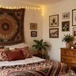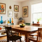
Nothing transforms a living room quite like the perfect warm paint color. We’ve all walked into a space that instantly feels like home – that cozy embrace that makes us want to kick off our shoes and settle in for hours. The secret? It’s often in the walls.
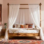
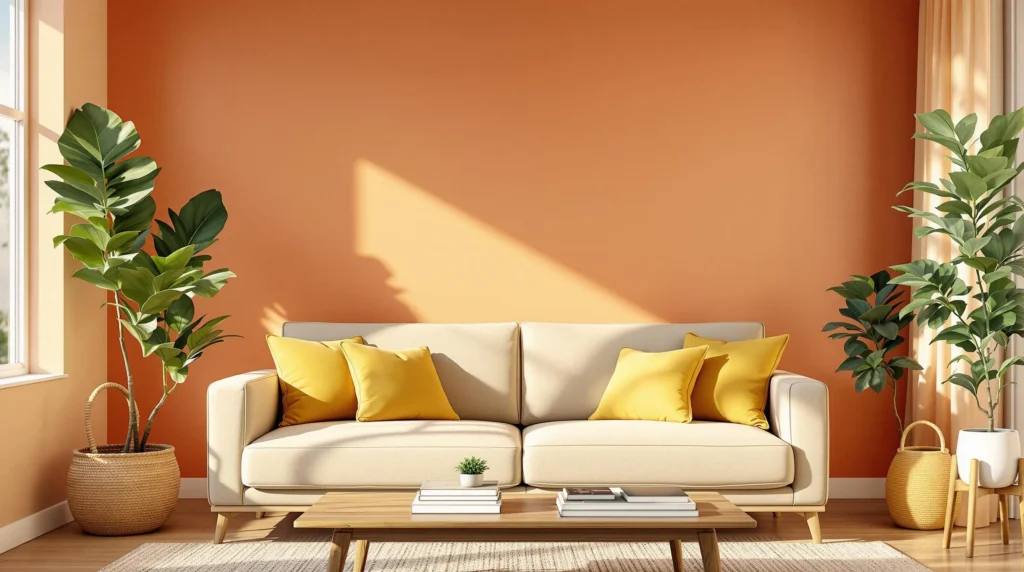
Warm paint colors create an inviting atmosphere that draws family and friends together. From rich terracotta and soft peaches to creamy beiges and golden yellows these hues work magic in any living space. They reflect light beautifully during the day and create intimate ambiance when evening falls.
Choosing the right warm color isn’t just about following trends – it’s about creating a space that reflects your personality while making everyone feel welcome. We’ll guide you through the most stunning warm paint options that’ll transform your living room into the heart of your home.
Understanding Warm Paint Colors and Their Impact on Living Room Design
Warm paint colors fundamentally transform how we experience our living spaces through their unique visual and psychological properties.
What Makes a Paint Color “Warm”
Warm paint colors contain underlying red, orange, or yellow tones that naturally evoke feelings of comfort and energy. These hues exist on one side of the color wheel, ranging from deep burgundies and rich terracottas to soft peaches and creamy yellows. Traditional warm colors include burnt orange, golden yellow, rust red, and warm beige variations.
Temperature perception in paint comes from the color’s undertones rather than its surface appearance. Even colors that appear neutral can lean warm when they contain traces of red or yellow pigments. We often identify warm colors by their ability to advance visually, making spaces feel more intimate and cozy.
How Warm Colors Affect Mood and Atmosphere
Warm living room paint colors create an immediate sense of comfort and security within your space. Research shows these hues stimulate feelings of happiness, energy, and social connection among family members and guests. Red undertones can increase energy levels and encourage conversation, while yellow tones promote optimism and mental clarity.
Psychological responses to warm colors vary based on saturation and lightness levels. Deeper warm tones like burgundy or chocolate brown create sophistication and grounding, while lighter warm shades such as peach or cream foster openness and relaxation. These colors naturally make rooms feel smaller and more intimate, which works particularly well in large living spaces that might otherwise feel cold or impersonal.
Benefits of Choosing Warm Tones for Your Living Space
Warm paint colors enhance natural lighting conditions throughout different times of day in your living room. Morning sunlight appears richer when reflected off warm walls, while evening artificial lighting creates a golden glow that extends the cozy atmosphere into nighttime hours. These colors also complement wood furniture, brass fixtures, and natural textiles more effectively than cool alternatives.
Practical advantages include their ability to hide minor wall imperfections through their advancing visual properties. Warm colors create better color harmony with earth tone accessories like leather furniture, wooden coffee tables, and natural fiber rugs. They also provide excellent backdrop flexibility for seasonal decorating, working equally well with autumn harvest themes or spring botanical elements.
Choosing the Perfect Shade of Red for Your Living Room

Red shades offer powerful warmth that transforms any living room into a passionate, energizing space. We’ll explore three distinct red categories that bring different moods and styling opportunities to your room.
Classic Burgundy and Wine Tones
Burgundy creates sophisticated elegance through its deep, rich undertones of brown and purple. Wine shades establish timeless appeal that works beautifully in traditional and contemporary living rooms alike. These colors add grounded sophistication when paired with warm neutrals like off-whites or creamy browns.
Deep red tones provide excellent versatility for seasonal decorating throughout the year. Furniture pieces in leather or rich fabrics complement these shades naturally. Accent lighting enhances the luxurious depth that burgundy and wine colors bring to your space.
Soft Coral and Salmon Hues
Coral brings gentle warmth without overwhelming smaller living rooms or spaces with limited natural light. Salmon shades offer pink and orange undertones that create fresh, approachable atmospheres perfect for modern casual designs. These lighter reds maintain warmth while keeping the room feeling open and airy.
Muted red tones work exceptionally well in homes with contemporary or transitional styling. They’re ideal for creating subtle focal points through accent walls or large furniture pieces. These shades pair beautifully with crisp whites and natural wood finishes.
Bold Crimson and Cherry Accents
Crimson delivers dramatic energy that creates stunning focal points in larger living rooms. Cherry reds provide bright saturation that stimulates conversation and social connection among guests. These bold shades work best as accent walls or through carefully chosen accessories and artwork.
Bright red accents require thoughtful balance with neutral base colors to prevent visual overwhelm. They’re perfect for creating statement walls behind entertainment centers or seating areas. These energetic shades enhance rooms with abundant natural light and high ceilings.
Exploring Orange Paint Colors That Transform Living Spaces

Orange shades bring distinctive character and energy to living rooms, creating vibrant yet welcoming environments that complement both contemporary and traditional design styles.
Burnt Orange for Rustic Charm
Burnt orange delivers deep, muted warmth that transforms living spaces into cozy retreats. This sophisticated shade evokes rustic elegance while maintaining the energizing qualities we love in warm paint colors. We find burnt orange particularly effective when paired with natural wood furniture and leather accents.
The earthy undertones in burnt orange create grounding effects that balance liveliness with comfort. Neutral textiles enhance this color’s versatility, allowing us to build layered, textured designs. Country and vintage inspired living rooms benefit tremendously from burnt orange accent walls or decorative elements.
Natural materials like exposed beams, stone fireplaces, and woven baskets complement burnt orange beautifully. We recommend using this shade strategically on feature walls to avoid overwhelming smaller spaces while maximizing its rustic charm.
Peach Tones for Subtle Warmth
Peach offers gentle warmth through its delicate blend of pink and orange undertones. This understated color choice creates welcoming atmospheres without the intensity of bolder orange shades. We appreciate peach’s ability to maintain airiness while delivering the cozy qualities essential in living room design.
Light filled spaces showcase peach tones exceptionally well, as natural sunlight enhances their soft, cheerful character. Smaller living rooms benefit from peach’s expansive qualities, which create illusions of greater space. We often recommend peach for those transitioning from cooler color palettes.
Calm yet uplifting environments emerge when we incorporate peach through wall colors, throw pillows, or artwork. This versatile shade pairs seamlessly with whites, creams, and soft grays, creating harmonious color schemes that feel both fresh and inviting.
Terracotta for Earthy Sophistication
Terracotta brings timeless sophistication through its clay inspired appearance and natural connection. This versatile warm color promotes tranquility while grounding living spaces in earthy elegance. We find terracotta particularly effective across various design styles, from bohemian to modern minimalism.
Indoor plants thrive visually against terracotta backgrounds, creating organic partnerships that enhance both elements. Textured fabrics like linen, jute, and wool complement terracotta’s natural qualities beautifully. We recommend incorporating this shade through accent walls, pottery, or upholstered furniture pieces.
| Orange Shade | Best Use | Design Style | Key Benefit |
|---|---|---|---|
| Burnt Orange | Accent walls | Rustic/Country | Deep warmth |
| Peach | Full rooms | Contemporary | Subtle energy |
| Terracotta | Statement pieces | Bohemian/Modern | Natural grounding |
Contemporary and traditional aesthetics both welcome terracotta’s adaptable nature, making it our top choice for homeowners seeking sophisticated warmth with lasting appeal.
Incorporating Yellow Paint Colors for Bright and Cheerful Living Rooms

Yellow hues serve as the perfect bridge from warm oranges to create living spaces that radiate optimism and energy. These colors belong to the warm spectrum that stimulates and energizes the atmosphere while maintaining the cozy foundation we’ve established with our previous warm color choices.
Golden Yellow for Luxurious Appeal
Golden yellow tones elevate living rooms with sophisticated warmth that feels both rich and inviting. This vibrant shade creates an enveloping glow that transforms ordinary spaces into luxurious retreats where elegance meets comfort. We recommend using golden yellow as a primary wall color to establish a sunny character that enhances both natural and artificial lighting throughout the day.
Pairing golden yellow with deep wood furnishings amplifies its luxurious appeal while maintaining the warm foundation. Social gatherings feel more intimate and welcoming when surrounded by these rich, sunny tones that encourage conversation and connection. Golden yellow works exceptionally well in living rooms where we want to create a sophisticated yet approachable atmosphere for family and friends.
Cream and Butter Yellows for Gentle Warmth
Cream and butter yellow shades offer subtle brightness without overwhelming smaller living spaces with bold color statements. These softer yellows blend seamlessly with neutral palettes while adding gentle warmth that keeps rooms feeling airy and comfortable. We find these tones particularly effective in spaces where natural light needs enhancement without creating harsh contrasts.
Butter yellow walls create calm, inviting environments that work beautifully with both contemporary and traditional furniture styles. These gentle hues provide the perfect backdrop for layering textures and accessories while maintaining visual softness. Cream yellows excel at making living rooms feel larger and more open while preserving the cozy warmth we desire in gathering spaces.
Mustard Yellow for Bold Statement Walls
Mustard yellow delivers striking focal points through its deeper, earthy character that adds personality without overpowering the entire room. This bold choice works exceptionally well as an accent wall behind sofas or entertainment centers where we want to create visual interest. Contemporary and eclectic interiors particularly benefit from mustard yellow’s ability to inject vibrancy while maintaining sophisticated depth.
Statement walls in mustard yellow pair beautifully with neutral furniture and warm metallic accents to create balanced, energetic spaces. We recommend limiting this bold shade to one wall to maintain harmony while maximizing its dramatic impact. Mustard yellow accent walls serve as perfect canvases for artwork and decorative elements that complement our overall warm color scheme.
Selecting Warm Brown Paint Colors for Cozy Living Room Vibes

Brown paint colors ground living spaces with their earthy sophistication, creating the perfect foundation for intimate gatherings and relaxation.
Rich Chocolate Browns for Dramatic Effect
Deep chocolate brown hues transform living rooms into luxurious retreats that feel both cozy and dramatic. These rich, saturated tones create an enveloping atmosphere that makes large spaces feel more intimate while adding undeniable sophistication to any room design.
Pairing chocolate browns with cream or off-white trim amplifies their dramatic impact without overwhelming the space. Natural wood furniture complements these deep shades beautifully, while metallic accents in gold or brass add warmth and visual interest against the rich backdrop.
Strategic lighting becomes essential when using chocolate browns, as these colors absorb light and create moody ambiance. Table lamps, floor lamps, and wall sconces help balance the darkness while maintaining the cozy atmosphere these dramatic shades provide.
Caramel and Toffee Shades for Mid-Tone Warmth
Caramel paint colors offer the perfect balance between warmth and versatility, making them ideal for homeowners seeking comfort without overwhelming drama. These mid-tone browns work exceptionally well in both traditional and contemporary living room designs, adapting to various decorative styles with ease.
Toffee shades bring subtle sweetness to living spaces while maintaining sophisticated appeal across different lighting conditions. Unlike deeper browns, these lighter tones reflect more natural light, keeping rooms feeling open and airy throughout the day.
Furniture in neutral tones like beige, cream, or soft gray pairs beautifully with caramel and toffee walls. Textiles in rich jewel tones or warm metallics can add layers of visual interest without competing with the wall color’s inherent warmth.
Taupe and Mushroom Colors for Neutral Elegance
Taupe creates a balanced, earthy foundation that provides sophisticated neutrality while maintaining subtle warmth in living room spaces. This versatile color serves as an excellent backdrop for both bold and subtle decorative elements, allowing furniture and artwork to take center stage.
Mushroom paint colors offer gentle warmth with understated elegance, making them perfect for creating sophisticated yet cozy living environments. These earthy shades work particularly well in spaces where you want warmth without the intensity of deeper brown tones.
Both taupe and mushroom colors complement a wide range of accent colors, from deep burgundies to soft blues and greens. Natural materials like wood, stone, and woven textiles enhance these neutral brown tones, creating layered warmth that feels both polished and inviting.
Adding Pink Paint Colors for Unexpected Living Room Warmth

Pink tones offer a surprising alternative to traditional warm colors, bringing gentle heat and contemporary character to your living space. We’ve discovered that thoughtfully selected pink shades with warm undertones create inviting atmospheres that feel both fresh and cozy.
Dusty Rose for Vintage Charm
Dusty rose combines muted red and pink tones with subtle gray undertones to create an instantly nostalgic atmosphere. This sophisticated shade evokes vintage elegance while maintaining the warmth essential for comfortable living spaces. We recommend pairing dusty rose walls with creamy white trim and warm wood accents to enhance its historical character.
Natural textures amplify dusty rose’s vintage appeal through materials like weathered leather furniture or antique brass fixtures. The color works particularly well in rooms with period architectural details, where it complements crown molding and traditional built-ins. Soft lighting from table lamps or sconces brings out the warm undertones, creating an inviting glow throughout the evening hours.
Blush Pink for Modern Femininity
Blush pink delivers contemporary warmth through its light tone and subtle yellow undertones. This versatile shade creates airy, welcoming environments that feel both modern and inviting. We find blush pink particularly effective in smaller living rooms, where it opens up the space while maintaining cozy appeal.
Metallic accents enhance blush pink’s modern character when we incorporate rose gold hardware or brushed brass light fixtures. The color pairs seamlessly with neutral furniture in grays, whites, and natural wood tones. Bold accent pieces like navy throw pillows or emerald green plants create striking contrasts that prevent the space from feeling overly sweet.
Mauve and Berry Tones for Sophisticated Depth
Mauve offers sophisticated warmth through its complex blend of purple and pink with rich undertones. These deeper shades create luxury and intimacy in living rooms, especially when combined with textured fabrics like velvet or bouclé. We’ve observed that mauve walls provide an elegant backdrop for both contemporary and traditional furniture styles.
Berry tones deliver cozy depth while maintaining refined elegance in larger living spaces. Deep berry shades with warm undertones create enveloping environments perfect for intimate gatherings. Soft lighting from floor lamps or pendant fixtures brings out the richness of these colors, while cream or ivory accents prevent the space from feeling too dark or overwhelming.
Incorporating Purple Paint Colors That Bring Warmth to Living Spaces

Purple paint colors offer an unexpected pathway to creating cozy, inviting living rooms when we select the right warm undertones. These sophisticated hues bridge the gap between bold statement colors and comfortable neutrals, providing depth and luxury to our spaces.
Plum and Eggplant for Rich Drama
Deep plum shades transform living rooms into sumptuous retreats that envelope guests in warmth and sophistication. These saturated purples create dramatic backdrops that feel both cozy and luxurious, making them perfect for feature walls or all-over color schemes. Eggplant tones work particularly well in larger living spaces where we want to create intimate conversation areas within open floor plans.
Rossini Plum stands out as an exceptional choice for homeowners seeking dramatic effect without overwhelming the space. We recommend pairing these rich purples with cream trim and warm wood furniture to balance their intensity. Natural lighting enhances the warm undertones in plum colors, while strategic accent lighting prevents the space from feeling too moody during evening hours.
True plums offer versatility that extends beyond walls to furniture and accent pieces. Eggplant hues on built-in bookshelves or entertainment centers create focal points that anchor the room’s design while maintaining warmth throughout the space.
Lavender with Warm Undertones
Warm lavender shades provide gentle heat without the intensity of deeper purples, making them ideal for smaller living rooms or spaces with limited natural light. These soft tones incorporate hints of mauve and gray that prevent the cool associations typically linked with traditional lavender. Balloon Flower represents a vibrant option that infuses personality while maintaining the welcoming ambiance we desire in gathering spaces.
All four walls painted in warm lavender create a tranquil yet inviting atmosphere that encourages relaxation and conversation. We find these hues particularly effective in contemporary living rooms where clean lines and minimal decor allow the color to shine. The warm undertones ensure the space feels grounded rather than ethereal.
Feature walls in warm lavender complement neutral furniture and natural textures beautifully. These softer purple tones help rooms feel airier while still providing the comfort and inclusivity that color psychology attributes to warm purple family members.
Wine Purple for Cozy Elegance
Wine purple combines the sophistication of classic wine tones with purple’s inherent luxury, creating living spaces that feel both refined and welcoming. This sophisticated shade works exceptionally well in contemporary living rooms where we want to balance modern aesthetics with comfortable warmth. Spiced Mulberry exemplifies this perfect blend, incorporating hints of blue that enhance its warming properties.
Color psychology supports wine purple’s ability to foster comfort in shared living areas due to its red undertones that increase warmth perception. We particularly recommend this shade for cooler months when creating a sense of welcoming becomes essential for comfortable entertaining. The depth of wine purple provides visual weight that grounds furniture arrangements and creates cohesive design schemes.
Wine purple pairs beautifully with metallic accents like brass and copper, while cream and off-white textiles soften its intensity. Strategic placement on accent walls allows us to enjoy wine purple’s elegance without overwhelming smaller spaces, while larger rooms can accommodate this rich hue on multiple surfaces for maximum impact.
Choosing Warm Beige and Tan Paint Colors for Versatile Living Rooms

Beige and tan paint colors offer exceptional versatility for living rooms that need to balance warmth with neutral sophistication. We recommend these colors for their ability to complement various furniture styles while maintaining the cozy atmosphere that warm tones provide.
Warm Beige for Timeless Appeal
Warm beige creates a versatile foundation that adds warmth without overwhelming your living space. This timeless color choice complements both modern and traditional furniture styles, making it an ideal backdrop for evolving décor preferences. We particularly appreciate how warm beige enhances the cozy feel when paired with wood tones and earthy accents.
Versatility makes warm beige an excellent investment for long term decorating plans. You’ll find this color works seamlessly with bold accent pieces, neutral furnishings, and seasonal decorating changes. Beige tones provide the perfect canvas for layering textures like woven throws, leather furniture, and natural wood elements that amplify the room’s inviting character.
Sandy Tan for Natural Comfort
Sandy tan brings natural warmth and comfort that transforms your living room into a relaxing retreat. This earthy shade evokes feelings of serenity and relaxation, creating an ideal environment where family and friends naturally want to gather. We love how sandy tan establishes a calming atmosphere that promotes meaningful conversations and comfortable lounging.
Nature inspired design benefits significantly from sandy tan’s organic appeal. This color creates seamless transitions between indoor and outdoor spaces, particularly in rooms with large windows or sliding doors that connect to patios or gardens. Sandy tan works beautifully with natural materials like rattan, jute, and reclaimed wood to enhance the room’s connection to the outdoors.
Mushroom Gray Beige for Contemporary Style
Mushroom gray beige combines the warmth of traditional beige with subtle gray undertones for a contemporary and sophisticated appearance. This balanced color creates the perfect middle ground between warmth and neutrality that modern living rooms require. We recommend this shade for spaces that need to feel current while maintaining the inviting qualities of warm paint colors.
Neutrality defines mushroom gray beige’s greatest strength in versatile room design. You can pair this sophisticated color with a wide range of furniture styles and accent colors, making it suitable for diverse decorating tastes and changing trends. Gray beige tones work exceptionally well with metallic accents, crisp white trim, and both cool and warm accent colors for maximum decorating flexibility.
Considering Room Size and Lighting When Selecting Warm Paint Colors

Room dimensions and natural light significantly influence how warm paint colors appear and function in your living space. We’ll explore strategic color selection based on these crucial factors to maximize the impact of your warm color choices.
Best Warm Colors for Small Living Rooms
Muted warm colors create the most effective atmosphere in compact living spaces without overwhelming the room’s proportions. Beige, soft yellow, and pale orange enhance coziness while maintaining an airy feel that prevents spaces from appearing cramped. These gentle hues reflect light more effectively than deeper tones, creating the illusion of expanded square footage.
Warm neutrals offer exceptional versatility for smaller rooms by adding subtle heat without visual weight. Grays with yellow undertones provide contemporary sophistication while maintaining warmth, and whites infused with peachy or golden undertones brighten spaces naturally. Cream and butter yellow shades blend seamlessly with existing neutral palettes, keeping rooms comfortable and inviting.
Light terracotta and dusty rose bring earthy warmth to compact spaces when applied strategically as accent walls. These colors add personality without dominating the room’s visual field, particularly when paired with lighter complementary walls. Blush pink creates modern feminine energy while maintaining the airy quality essential for smaller living areas.
Warm Paint Options for Large Living Spaces
Bold warm colors transform expansive rooms into intimate gathering spaces by adding visual weight and dramatic presence. Dark chocolate brown and warm reds create depth and coziness that prevents large rooms from feeling cold or impersonal. These rich hues work particularly well on feature walls or in rooms with high ceilings.
Deep plum and wine purple offer sophisticated alternatives to traditional warm tones in spacious living areas. These colors add luxury and drama while maintaining the cozy qualities that make large rooms feel inviting for social gatherings. Pairing these bold choices with complementary neutral furniture creates visual balance.
Burnt orange and golden yellow provide vibrant energy that fills large spaces with warmth and personality. These colors work exceptionally well in rooms with abundant natural light, where their full richness can be appreciated. Rich caramel and toffee browns ground expansive areas with earthy sophistication that encourages relaxation.
How Natural Light Affects Warm Color Choices
Abundant natural light allows warm colors to showcase their full vibrancy and depth throughout the day. Rooms with southern exposure can accommodate deeper, richer warm shades like burgundy, mustard yellow, or dark terracotta without appearing overwhelming. These well lit spaces enhance the natural undertones in warm colors, creating ever-changing visual interest as light changes.
Limited natural light requires lighter warm shades to maintain brightness and prevent rooms from appearing dark or cave like. Warm beige, cream, and soft peachy tones work best in north facing rooms or spaces with minimal windows. These lighter options still provide the desired warmth while reflecting available light more effectively.
Room orientation plays a crucial role in warm color selection and performance. South facing rooms can handle bold choices like crimson accents or deep chocolate browns, while north facing spaces benefit from lighter options like sandy tan or warm lavender. East and west facing rooms experience changing light conditions that make mid tone warm colors like caramel or dusty rose ideal choices.
Strategic lighting enhances warm colors in rooms with challenging natural light conditions. Warm LED bulbs amplify the cozy qualities of warm paint colors, while table lamps and accent lighting create inviting atmospheres that complement your color choices regardless of available daylight.
Conclusion
We’ve explored how warm paint colors can completely transform your living room into a welcoming sanctuary that reflects your personal style. From rich burgundies and soft corals to golden yellows and cozy browns these colors offer endless possibilities for creating the perfect atmosphere.
Remember that your room’s size and lighting conditions should guide your final color choice. Whether you opt for muted beiges in a cozy space or bold terracotta in a larger room the key is finding the right balance for your unique environment.
The beauty of warm colors lies in their ability to make any living room feel more inviting and comfortable. Take time to test your chosen shades in different lighting conditions before making your final decision and you’ll create a space that truly feels like home.
Frequently Asked Questions
What are warm paint colors and why are they good for living rooms?
Warm paint colors include reds, oranges, yellows, browns, and warm beiges that create cozy, inviting atmospheres. They’re perfect for living rooms because they encourage social interaction, enhance natural lighting, and evoke feelings of comfort and energy. These colors can also hide wall imperfections while making spaces feel more intimate and welcoming.
Which red paint colors work best in living rooms?
The best red paint colors for living rooms fall into three categories: classic burgundy and wine tones for sophistication, soft coral and salmon hues for gentle warmth, and bold crimson and cherry accents for dramatic impact. Balance these vibrant reds with neutral base colors to avoid overwhelming the space.
How do orange paint colors affect living room atmosphere?
Orange paint colors create different moods depending on the shade. Burnt orange adds rustic charm and earthiness, peach tones create airy, fresh atmospheres, and terracotta brings tranquility and grounding energy. These colors bridge the gap between bold reds and cheerful yellows, offering versatile warmth.
Are yellow paint colors too bright for living rooms?
Yellow paint colors aren’t too bright when chosen carefully. Golden yellow tones enhance warmth and optimism without being overwhelming. Yellow serves as an excellent bridge from warm oranges, creating cheerful yet sophisticated spaces. The key is selecting the right shade intensity for your room’s size and lighting.
What brown paint shades create the most inviting living rooms?
Rich chocolate browns create luxurious, sophisticated atmospheres, while caramel tones offer versatility and work well with various decor styles. Brown shades provide grounding warmth and pair beautifully with other warm colors. They’re particularly effective in creating intimate, cozy environments that feel both elegant and comfortable.
Can pink paint colors work in modern living rooms?
Yes, pink paint colors can work beautifully in modern living rooms. Dusty rose and blush pink offer gentle warmth with contemporary character. These sophisticated pink shades provide an alternative to traditional warm colors while maintaining the cozy, inviting atmosphere that makes living spaces feel welcoming and current.
How do purple shades fit into warm color schemes?
Purple shades like deep plum and warm lavender bring cozy, sophisticated qualities to living rooms. These colors add depth and richness while maintaining warmth through their undertones. Purple works particularly well as an accent color or in rooms where you want to create a more intimate, luxurious atmosphere.
Should I choose different warm colors based on my room size?
Yes, room size significantly impacts warm color selection. For small living rooms, use muted warm colors like beige and soft yellow to enhance coziness without overwhelming the space. Large living areas benefit from bold warm colors like dark chocolate brown and warm reds to create intimacy and prevent the space from feeling cold.
How does natural light affect warm paint color choices?
Natural light dramatically influences how warm colors appear. Rooms with limited natural light benefit from lighter warm shades like soft yellows and warm beiges to brighten the space. Well-lit rooms can handle deeper tones like rich browns and bold reds. Consider your room’s light exposure throughout the day when selecting colors.
Can I use strategic lighting to enhance warm paint colors?
Absolutely! Strategic lighting enhances warm paint colors and creates inviting atmospheres regardless of natural light conditions. Use warm-toned bulbs, layered lighting, and accent lighting to highlight your warm color choices. Proper lighting ensures your warm colors maintain their cozy, welcoming qualities throughout different times of day.