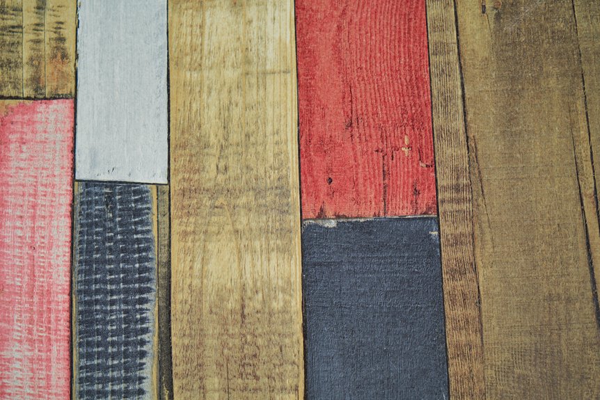
I’ve found that matching wall colors to wood floors starts with identifying your floor’s undertone—whether it’s warm, cool, or neutral. Test paint samples directly on your walls using 12-inch swatches, then observe them throughout the day under natural and artificial light. Light wood floors pair well with crisp whites or soft grays, while dark floors work against lighter walls. The key is creating contrast without clashing. There’s much more to discover about specific color combinations for your space.
Identify Your Hardwood Floor’s Undertone

Why does your floor look different in morning light than it does at night? That’s because your hardwood carries undertones—those hidden colors that shift with lighting. I’ve discovered the easiest way to spot them: grab a white sheet of paper and place it directly on your floor. Whatever color appears most is your undertone. You’ll find three categories: cool (blue, green, purple), warm (yellow, orange, red), or neutral (balanced both ways). I recommend checking your floors in both natural daylight and artificial lighting to confirm what you’re seeing. This simple step matters because matching wall colors to these undertones creates harmony in your space. Understanding your floor’s true undertones guides everything that comes next.
Wall Color Balance: Why It Transforms Your Wood Floors

I’ve learned that choosing the right wall color isn’t just about aesthetics—it’s about making your beautiful wood floors truly shine. When you create contrast by selecting wall shades that are several tones lighter or darker than your floor, you’re framing your flooring like a piece of art, and this shift becomes more dramatic depending on your room’s natural and artificial lighting. The same warm beige wall that looked perfect in the showroom might appear muddy or washed out once you’re home, so I always test samples directly on your walls and observe them throughout the day to see how morning light, afternoon sun, and evening lamps affect the final result.
Contrast Enhances Floor Beauty
Have you ever walked into a room where the wood flooring practically glows while everything else fades into the background? That’s the power of contrast.
I’ve learned that pairing darker floors with lighter wall colors creates visual interest. Deep wood tones shine against crisp whites or light neutrals, highlighting grain patterns and creating visual depth. Here’s what I recommend:
- Choose wall colors several shades lighter or darker than your flooring
- Balance warm undertoned floors (red, yellow, orange) with cool wall tones like light grays or soft blues
- Pair cool undertoned floors (blue, gray, green) with warmer wall colors such as creams or warm beiges
This approach makes your flooring the star attraction rather than blending into the walls. The contrast doesn’t overwhelm—it harmonizes beautifully.
Lighting Impact On Tone
When you pick a paint color in the store and bring it home, does it suddenly look completely different? That’s lighting at work. I’ve learned that warm bulbs—those yellow and amber tones—can shift cool wall colors toward beige or peach. Meanwhile, cool bluish lighting can make warm walls look harsh.
With light wood floors, I choose cooler whites and soft grays that prevent rooms from feeling washed out under any lighting. Dark wood floors need brighter tones like crisp whites, which lighting can soften or intensify depending on bulb warmth.
I always test paint samples in my actual space at different times of day. Morning light differs from afternoon light, and evening lamps create their own effect. These small shifts change how my walls look against my floors.
Paint Colors for Light Wood Floors

I’ve found that pairing light wood floors with classic neutrals like Pure White and Ice Cube creates that fresh, airy feel you’re probably after, while colors like Tradewind and Olympus White add subtle cool undertones that keep the whole room harmonious. When I tested samples in my own space, I discovered that lighting really does shift how these colors look—what seemed perfect in the paint store appeared slightly different once I got it on the wall at home. The key is sticking with whites, soft grays, or cool blues to avoid clashing with any warm yellow tones in your flooring, which’ll give you a polished, coordinated look that lasts.
Classic Neutral Pairings
Light wood floors work beautifully with fresh, clean neutrals, and that’s why you’ll find some of your most versatile options. These colors create a neutral backdrop that feels both inviting and lasting. When you choose these shades, you’re building a foundation that works with almost any décor style you’ll want later.
Consider these classic pairings:
- Pure White walls brighten the space and highlight your flooring’s natural grain
- Ice Cube delivers crisp sophistication without feeling cold or sterile
- Soft greens like Sea Salt add subtle warmth while maintaining that airy feel
These colors perform differently depending on lighting conditions. The shift between morning natural light and evening artificial light varies noticeably. Sampling directly on your walls matters—you’ll see exactly how each color performs in your specific space before committing.
Cool Undertone Accents
Ever wonder why some wall colors make your light wood floors look dull instead of luminous? Cool undertones work well for this. When I held a white sheet beside my light wood floors, I realized they had subtle blue and purple undertones I’d missed before.
That’s when I understood the connection. I painted my walls in pure white and ice cube tones, and my floors immediately appeared brighter. I also tried soft blues and pale greens as accents, which complemented my flooring’s cool undertones without overwhelming the space.
The key is avoiding taupe or beige with yellowish undertones—I learned this when one wall choice made everything look muddy. Now I match my walls to those cool undertones to create that airy, crisp backdrop I prefer.
Wall Colors for Gray-Toned Hardwood

When you’re working with gray-toned hardwood, what wall colors will actually complement it instead of fighting against it?
Choosing the right wall color affects your overall aesthetic. You’ll want to avoid matching your walls to your floor—that creates a flat, boring look. Instead, I recommend:
- Warmer off-white shades that balance cool gray tones
- Neutral colors like greige or taupe with warm undertones
- Soft, muted tones that add depth without clashing
These neutral options keep your space cohesive and welcoming. When I painted my own walls a warm cream against gray hardwood, the room felt less sterile and more inviting. The key is counteracting the coolness of your floors while maintaining harmony throughout. You’re creating a foundation for a home that feels both grounded and gracious.
Wall Colors for Dark Wood Floors

How do you keep a room with dark hardwood from feeling too heavy? Choosing the right wall colors is important. Crisp whites and light neutrals create beautiful contrast that highlights your floor’s depth without overwhelming the space. Off-white and cream work wonderfully too, keeping things airy and sophisticated.
If you want drama, consider deep colors like navy or emerald, but only with plenty of natural light. Warm beige and taupe walls soften dark floors nicely, creating cozy atmospheres in bedrooms and living rooms.
The key rule: pick wall colors several tones lighter than your floor. This balance prevents the room from feeling cramped. Avoid dark, saturated wall colors that compete with your flooring and shrink the space visually.
Cooling Your Walls: Red and Cherry Wood Floors

When you have red or cherry wood floors, cool gray walls work well for creating balance. Shades like Colonnade Gray are sophisticated enough to let your beautiful wood grain stand out without competing for attention. Pairing these cooler tones with your warm flooring makes both elements look better, and that’s how you create a room that feels well-designed and cohesive.
Cool Gray Wall Palettes
Why does matching wall colors to cool gray flooring feel so tricky? I’ve discovered that the key is understanding balance. Cool gray floors need warmer wall colors to prevent your space from feeling cold and flat.
Here’s what I’ve learned works best:
- Light creams and soft beiges provide subtle warmth without competing with your flooring
- Warm whites create breathing room and make spaces feel larger and more inviting
- Taupe or warm greige accent walls introduce depth while maintaining harmony
I tested samples in my own home and found that natural daylight shifts cool gray walls toward blue and green undertones. That’s why testing matters. Avoid matching gray wall colors to your floor—you’ll create a dull, monochromatic look. Instead, choose warmer neutrals that complement and balance your cool gray flooring.
Balancing Warm Wood Tones
The richness of red and cherry wood flooring demands a different strategy than cool gray. Balancing these warm tones requires choosing wall colors with cool undertones. Your wall color palette should include crisp whites, cool grays, or soft blues that contrast beautifully without overwhelming the space.
When I selected off-white or light gray walls for my cherry floors, the contrast made the wood’s grain visible. I avoided warm creams and beiges, which only intensified the warmth and made rooms feel heavy. Instead, I found that lighter blues or olive-tinted neutrals created balanced environments with sophistication.
Neutral ivory and pale gray walls also work well, letting the flooring remain your primary visual element. This approach creates harmony while maintaining visual interest and preventing your room from feeling overly warm.
Grounding Walls for Golden and Amber Floors
How do you keep golden and amber floors from making your walls feel washed out or too bright? Choosing the right wall color creates balance and makes your space work well together.
What works:
- Beige, ivory, or cool gray walls anchor golden floors without competing for attention
- Avoid yellowy undertones that clash with amber hues; choose neutrals with subtle warmth instead
- Go several shades lighter or darker than your flooring to maintain harmony
I tested samples in my own home and discovered that natural daylight shifts how warm these colors appear. Navy, emerald, or charcoal walls also work well, providing bold contrast while staying grounded. The key is viewing your wall color samples in actual lighting conditions before committing. This approach keeps your space looking put-together and welcoming.
Make Your Floors Pop: When and How to Use Contrast

Sometimes the best way to showcase your beautiful flooring is to deliberately make it stand out from your walls, and strategic contrast does exactly that. When I paired my deep mahogany floors with crisp white walls, the grain became the room’s focal point. You don’t need matching colors—you need balance.
| Floor Type | Dark Wall Shade | Light Wall Shade | Visual Result |
|---|---|---|---|
| Orange-toned | Charcoal grey | Soft white | Moody, balanced |
| Dark wood | Off-white | Cream | Highlighted grain |
| Light wood | Cool grey | Snowbound | Warm contrast |
For your wall colors, consider orange-toned floors with one dark grey and one light grey shade. This approach creates depth without overwhelming your space. You’re not fighting your flooring—you’re celebrating it.
How Does Lighting Change Wall Color With Wood Floors?

You’ve picked your wall color to balance your floors, but here’s what many people miss: that perfect shade you selected in the paint store will look completely different once you get it home.
Lighting changes how your walls appear. Here’s what happens:
- Cool whites shift warmer under incandescent bulbs, while bright daylight reveals true undertones
- Morning light differs dramatically from evening light, changing your wall’s appearance throughout the day
- The same color reads entirely different across rooms based on light sources
Natural daylight shows you reality. Test your samples in actual lighting conditions—both morning and evening—before committing. What looks balanced at noon might clash by dinner. Cool-toned walls with warm wood floors need evaluation under all lighting scenarios you’ll experience daily.
Testing Colors in Your Space Before Committing
I’ve learned that testing paint colors in your actual room is the only way to see how they’ll really look, because lighting and your existing flooring affect the results. You’ll want to grab sample chips from the paint store, tape them to your walls next to your wood floors, and check them at different times of day—morning sunlight hits differently than afternoon or evening light. I also recommend using peel-and-stick sample swatches or painting large poster boards with your top color choices, then moving them around your space to see how they interact with your furniture and that wood grain you’re trying to complement.
Sample Chips and Lighting
Why should you test color samples before painting your entire wall? Lighting changes everything, and I’ve learned this the hard way. What looks perfect in the store can surprise you at home.
I recommend these sampling strategies:
- Get free color chips from Sherwin-Williams and tape them directly onto your wall next to your wood flooring
- Test peel-and-stick options in multiple rooms to see how natural and artificial light affects the colors throughout the day
- Leave samples up for at least 48 hours, observing them in morning, afternoon, and evening lighting
Your flooring’s undertones reveal themselves differently depending on light conditions. By sampling colors in your actual space, you’ll catch any clashing before committing. This straightforward step saves time, money, and frustration while helping your walls work well with your wood floors.
Peel & Stick Application Methods
Once you’ve narrowed down your color choices, peel-and-stick samples let you test them directly on your walls without any commitment. I recommend applying 2–3 patches in different areas of your room, spacing them about 12 inches apart at eye level. This approach helps you see how each color interacts with your wood flooring’s undertones throughout the day.
Leave your peel & stick color samples up for at least 24 hours. Check them during morning light, afternoon brightness, and evening artificial lighting. You’ll notice how warm or cool tones shift depending on the time. When you’re ready to remove them, they peel away cleanly without damage.
This method makes color selection a straightforward process rather than guesswork.
Real Space Evaluation Importance
Peel-and-stick samples give you a starting point, but your actual room is where the real decision happens. Lighting changes everything—what looks perfect at noon might feel off at 6 PM. You’ll want to:
- Test samples on multiple walls for 5–7 days, observing how natural and artificial lighting shifts the color
- Compare at least three shades (light, medium, dark) against your actual flooring to see true contrast
- Document photos and notes about mood, brightness, and how wood grain reads with each choice
When I tested colors in my living room, I discovered that warm undertones I loved in daylight felt too orange under evening lights. Taking time to really see how colors perform in your space means you’ll feel confident, not second-guessing your choice later.
Coordinating Wall Colors in Open Floor Plans

Since open floor plans connect multiple rooms without walls between them, the colors you choose for your walls need to work together across the entire space. Coordinating colors creates visual harmony from room to room. Select wall shades that echo your flooring while maintaining contrast—typically two to three shades lighter or darker works well.
| Floor Tone | Wall Color | Result |
|---|---|---|
| Light wood | Soft gray or warm white | Airy, unified feel |
| Gray wood | Pale beige or greige | Balanced, sophisticated |
| Dark wood | Cream or light tan | Warm, inviting contrast |
When your floors have warm undertones, pair cool wall colors to prevent a muddy appearance. This balance keeps your open floor plan feeling connected throughout.
Accent Walls and Trim: Drawing Attention to Your Best Features

How can you draw the eye toward your room’s best features without overwhelming the space? Accent walls work well for this purpose. Pairing a darker wall with light floors creates depth, while a lighter accent wall complements dark floors. Test your color choices in your actual lighting conditions first—the results will vary based on natural and artificial light in your room.
Consider these approaches:
- Pair cladding and hardwood combinations like Earth RIVA MAX 10″ flooring with lighter wall tones for a balanced rustic-contemporary style
- Add contrasting trim such as white baseboards on warm wood tones to frame your floors elegantly
- For orange-toned floors, choose grey or white walls with cool undertones and include gold or teal accents
These strategic choices highlight focal areas like fireplaces or dining zones without overpowering your room’s natural beauty.
Adding Depth: Wallpaper, Shiplap, and Texture With Wood Floors

While accent walls and trim draw attention to your room’s focal points, adding texture and pattern extends that strategy further. I’ve found that wallpaper with subtle patterns or bold motifs works well with hardwood floors like RIVA MAX 10″ planks, creating depth in living rooms and bedrooms. Shiplap and cladding textures are effective options too. When I installed shiplap over my fireplace, it highlighted my floor’s warmth. Dark wood-paneled walls paired with hardwood flooring emphasize an organic beauty that feels cohesive and comfortable. These textural elements build visual interest without overwhelming the space. Consider using cladding as an accent wall in high-impact areas like dining spaces. This approach lets your floors stand out while building the inviting atmosphere you’re seeking.
Room-by-Room Color Pairing: Kitchen, Living Room, and Bedroom Examples

What wall color works best in your kitchen, living room, or bedroom depends on your wood flooring’s undertone and how you use the space.
Matching hardwood colors to wall tones creates cohesive rooms that function well for daily living. Consider these room-specific approaches:
- Kitchens with orange-toned floors: Pair grey or white walls with grey and black accents to maintain brightness
- Living rooms: Use one dark and one light shade together, testing options like Skyline Steel or Repose Gray under actual lighting
- Bedrooms: Incorporate warm accents of gold and teal for moody, elegant spaces
Get free color chips and test light wall colors beside your flooring before committing. Virtual color consultations help you tailor selections to your specific hardwood colors and lighting conditions, resulting in a room that looks deliberately designed rather than mismatched.
Common Mistakes When Pairing Wall Colors With Wood Floors

You’d be surprised how often people choose wall colors that actually clash with their flooring instead of complement it. I’ve watched homeowners paint warm gray walls only to discover they’d overwhelmed their orange-toned floor. The mistake? Ignoring undertones entirely. When you pair warm floors with warm walls, the room feels suffocating and one-dimensional. Another common error I see is matching gray floors with gray walls, which creates a flat, lifeless space. Your floor deserves a partner that balances it. Test paint samples in your actual room’s lighting before committing. Daylight and artificial light shift colors dramatically—what looks perfect at the store might disappoint at home. These small steps prevent costly repaints and keep your floor looking its best.